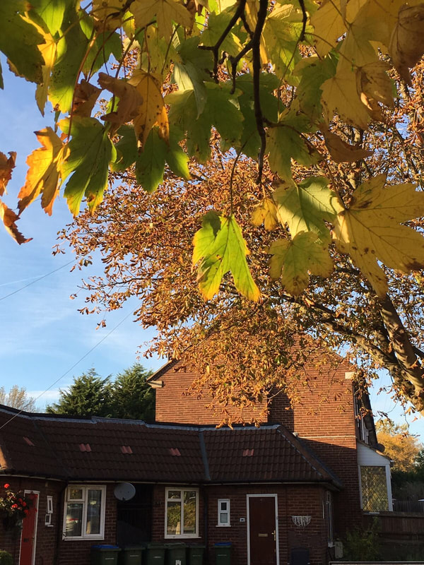
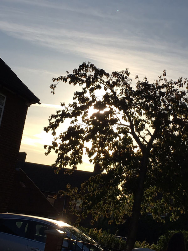
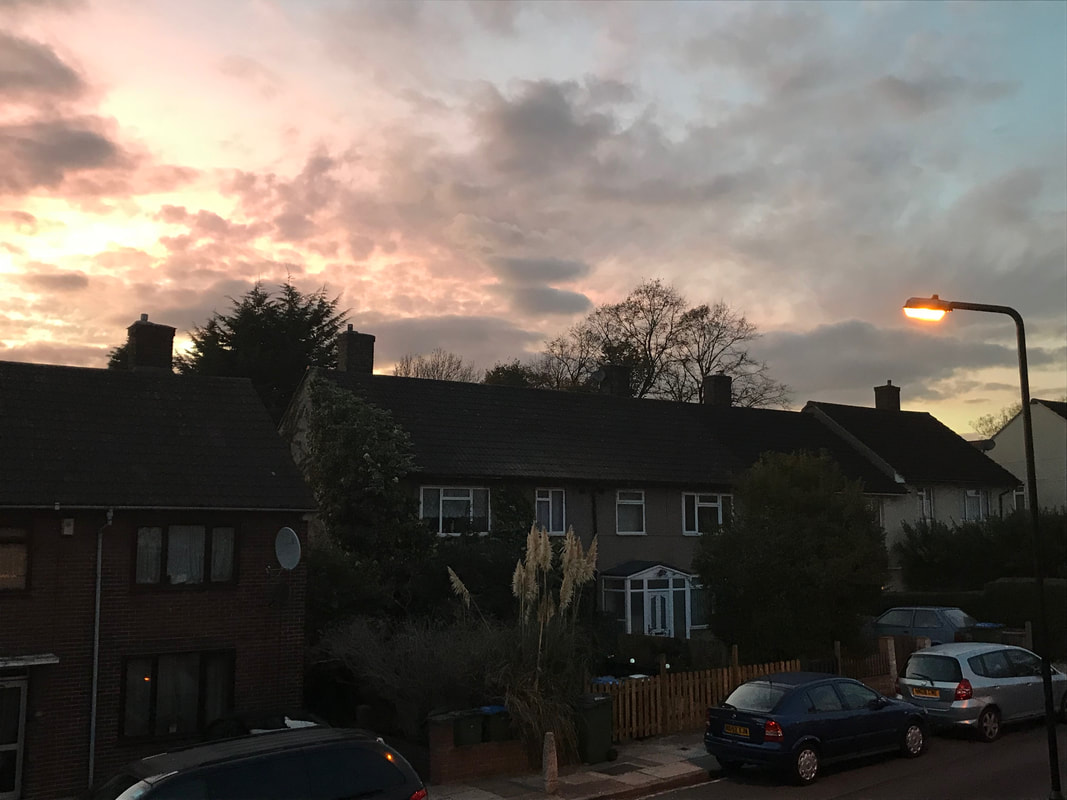
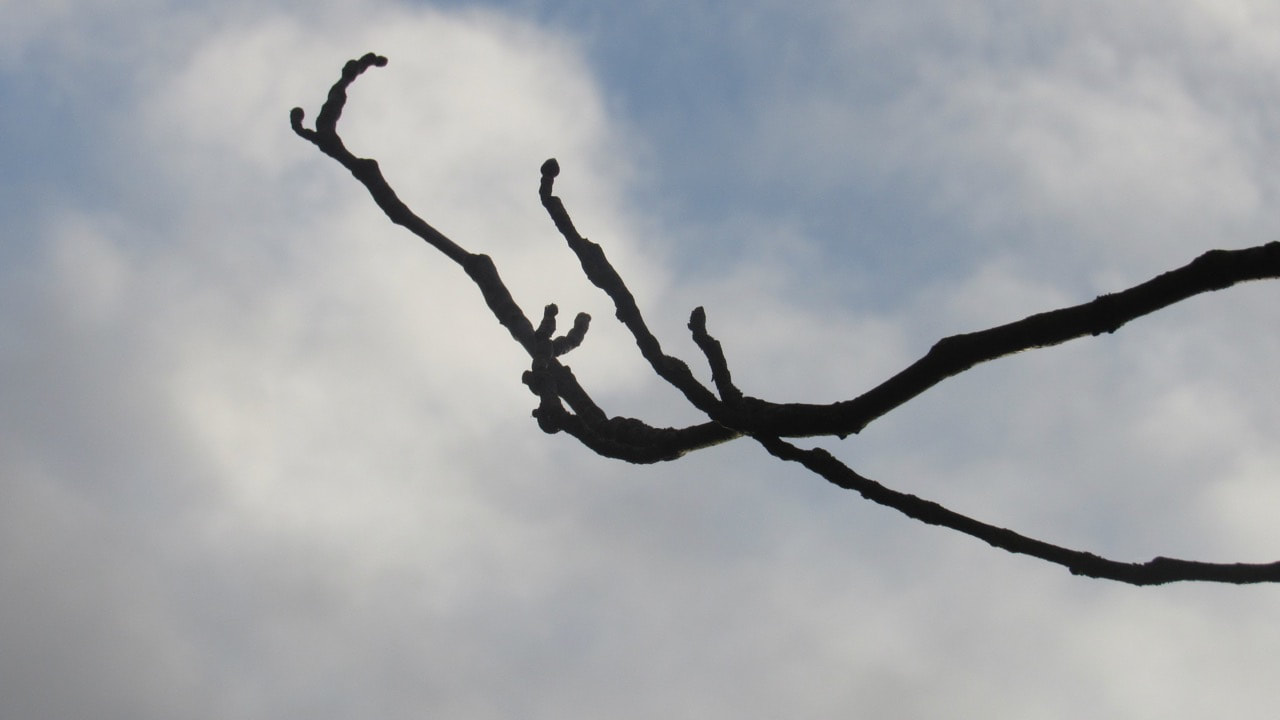
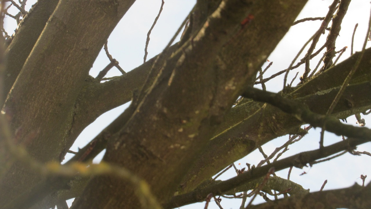
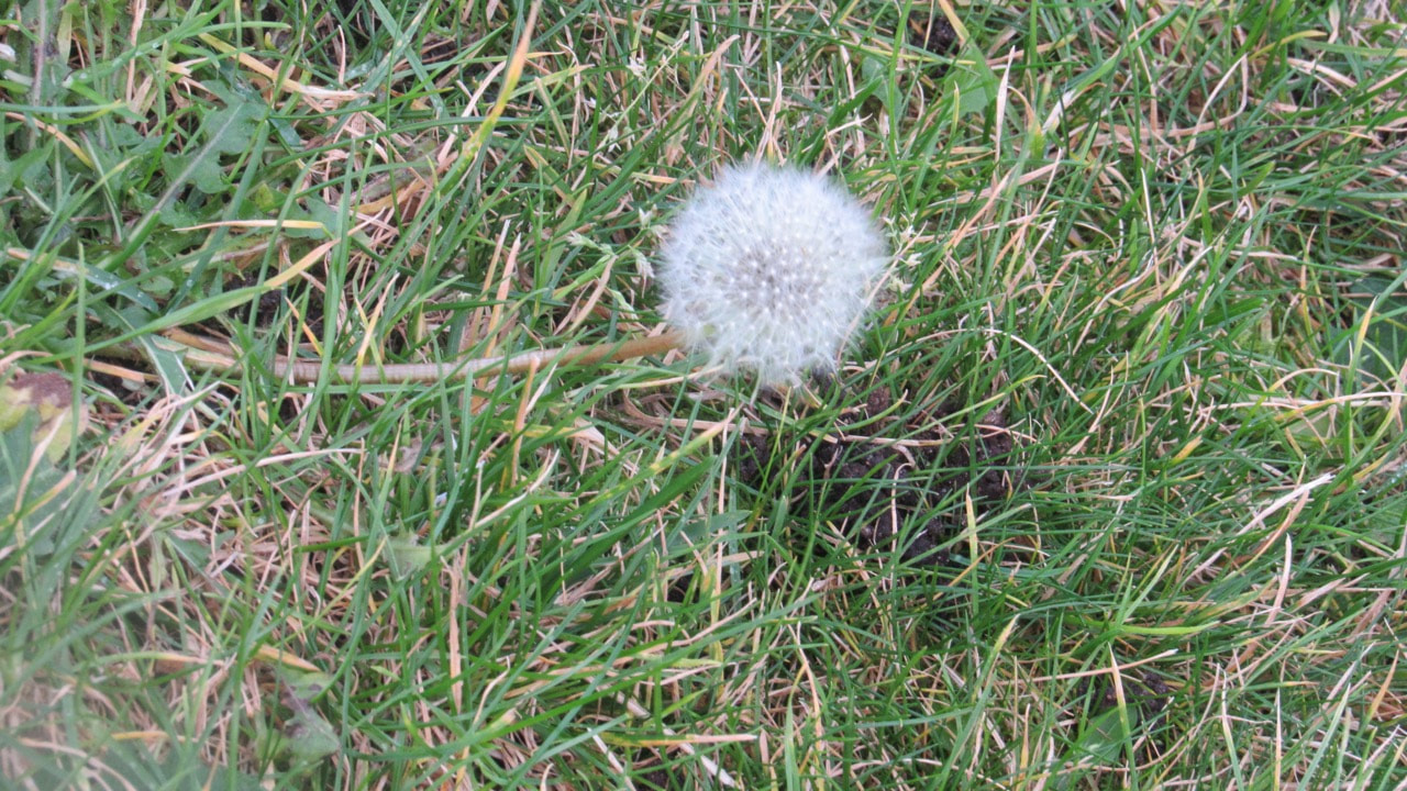
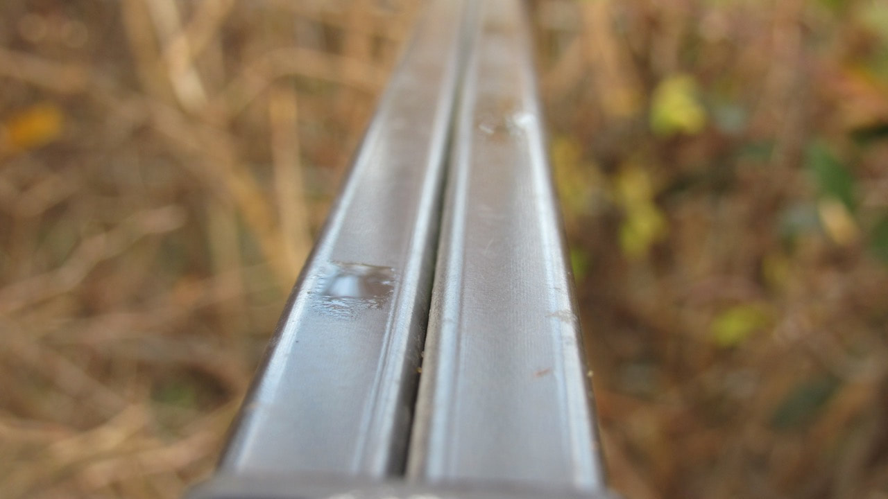
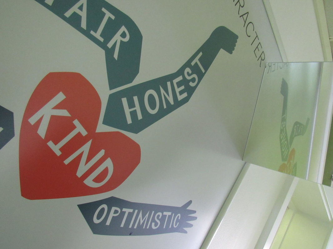
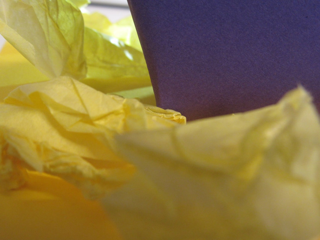
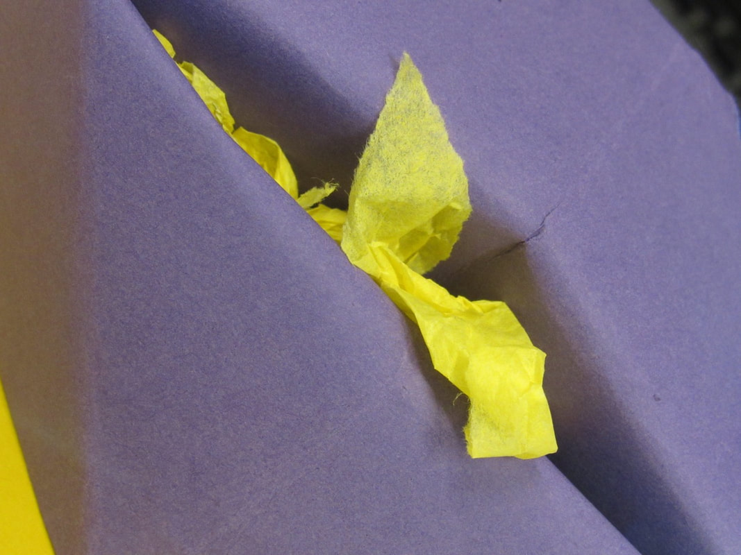
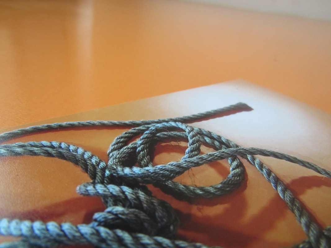
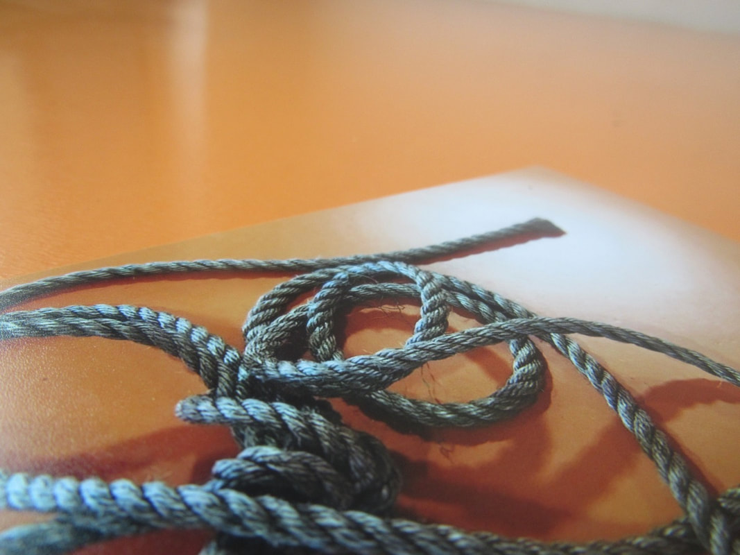
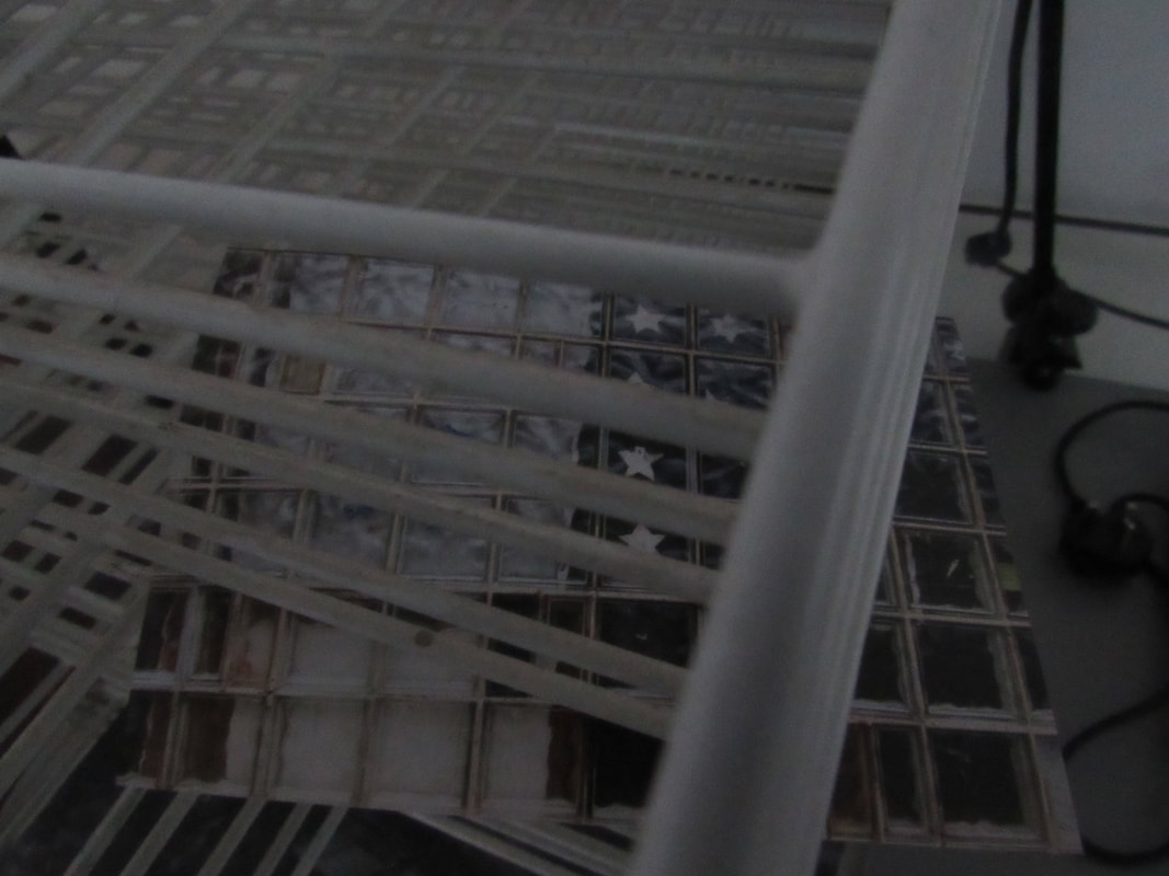
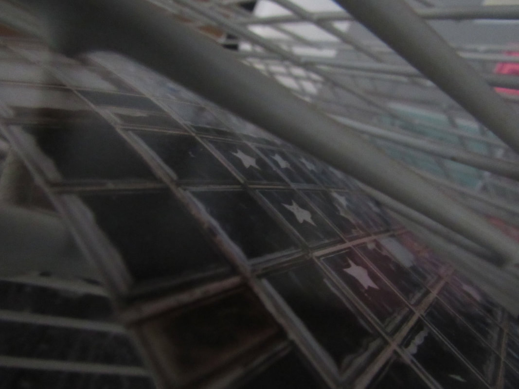
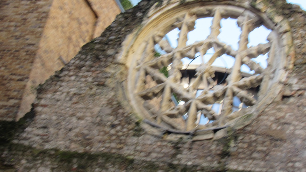
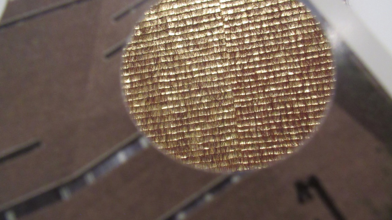
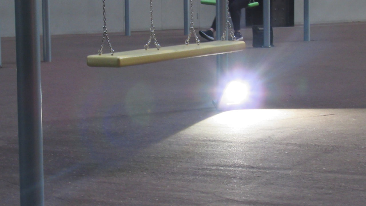
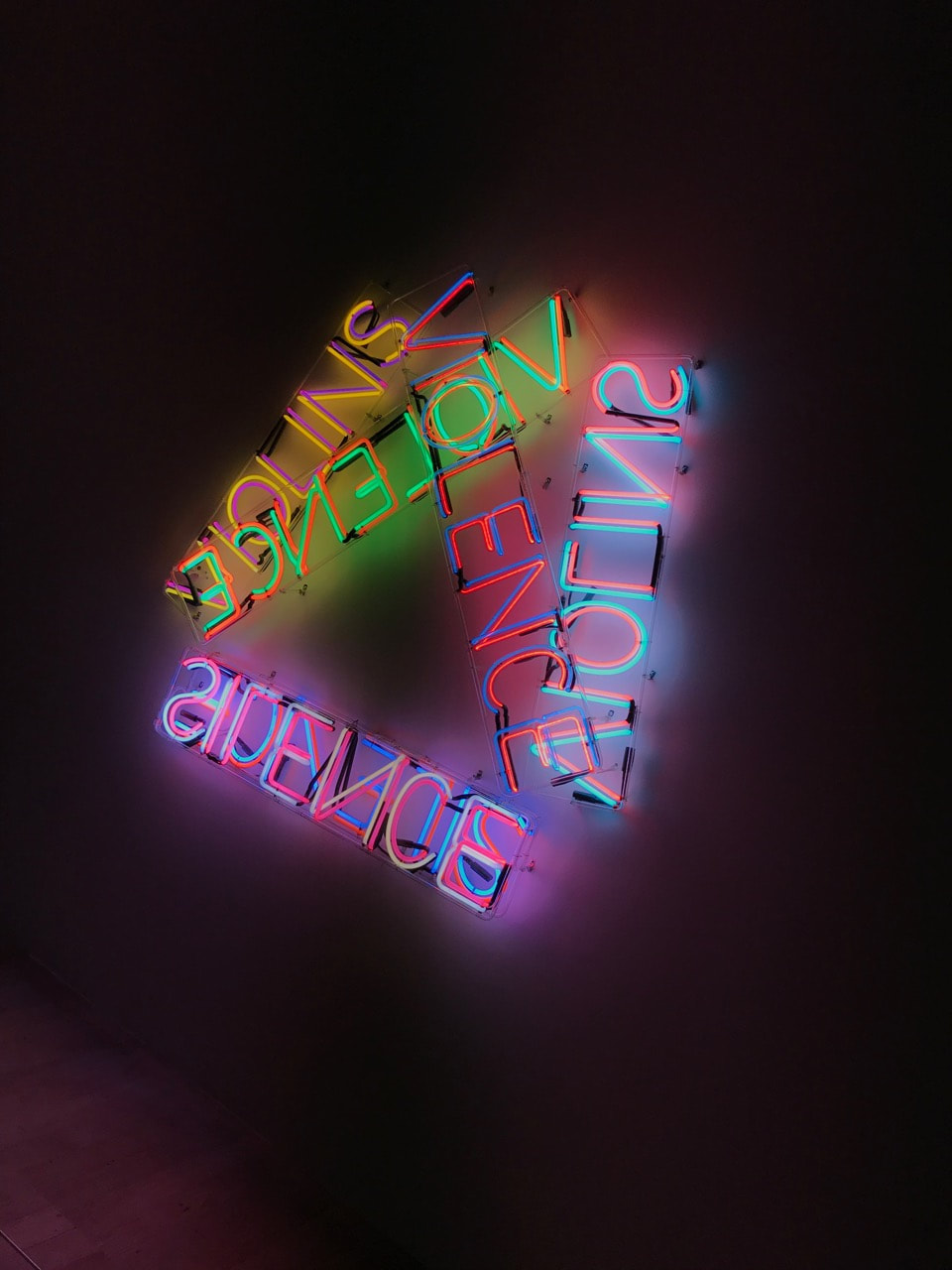
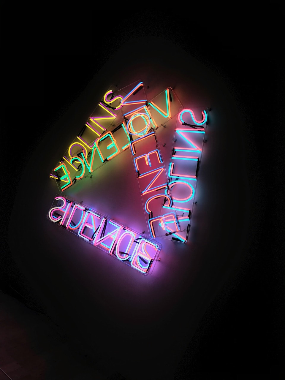
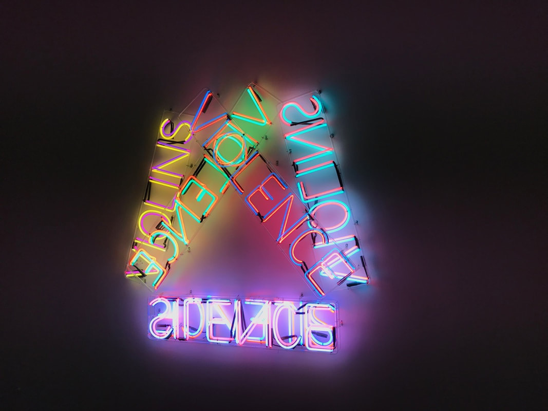
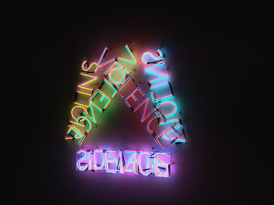
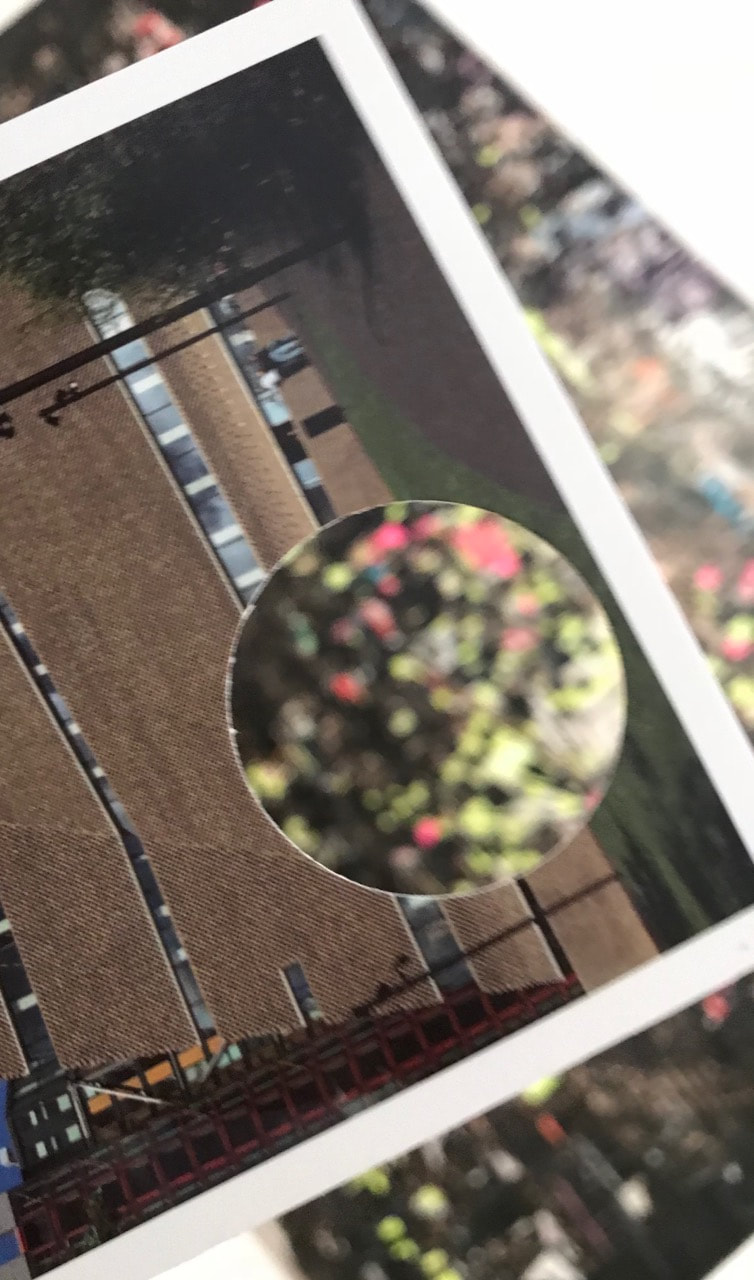
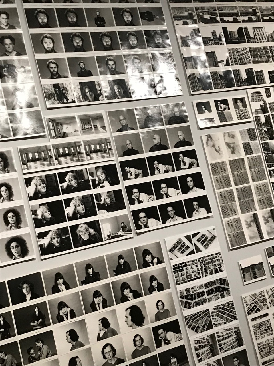
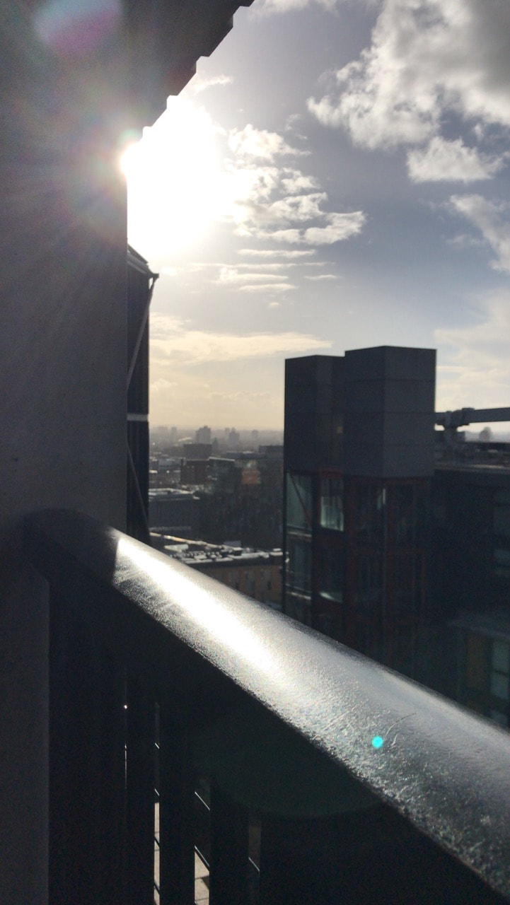
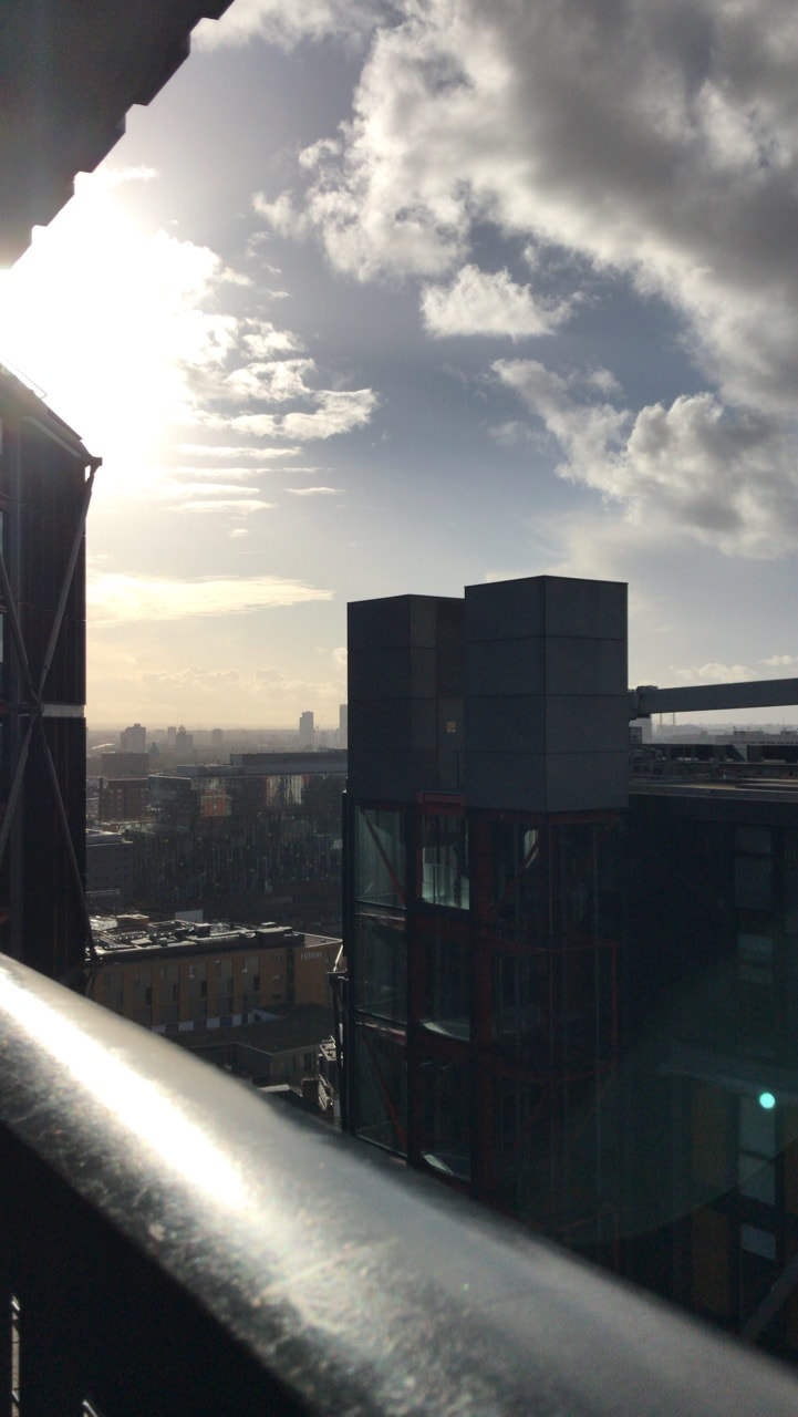
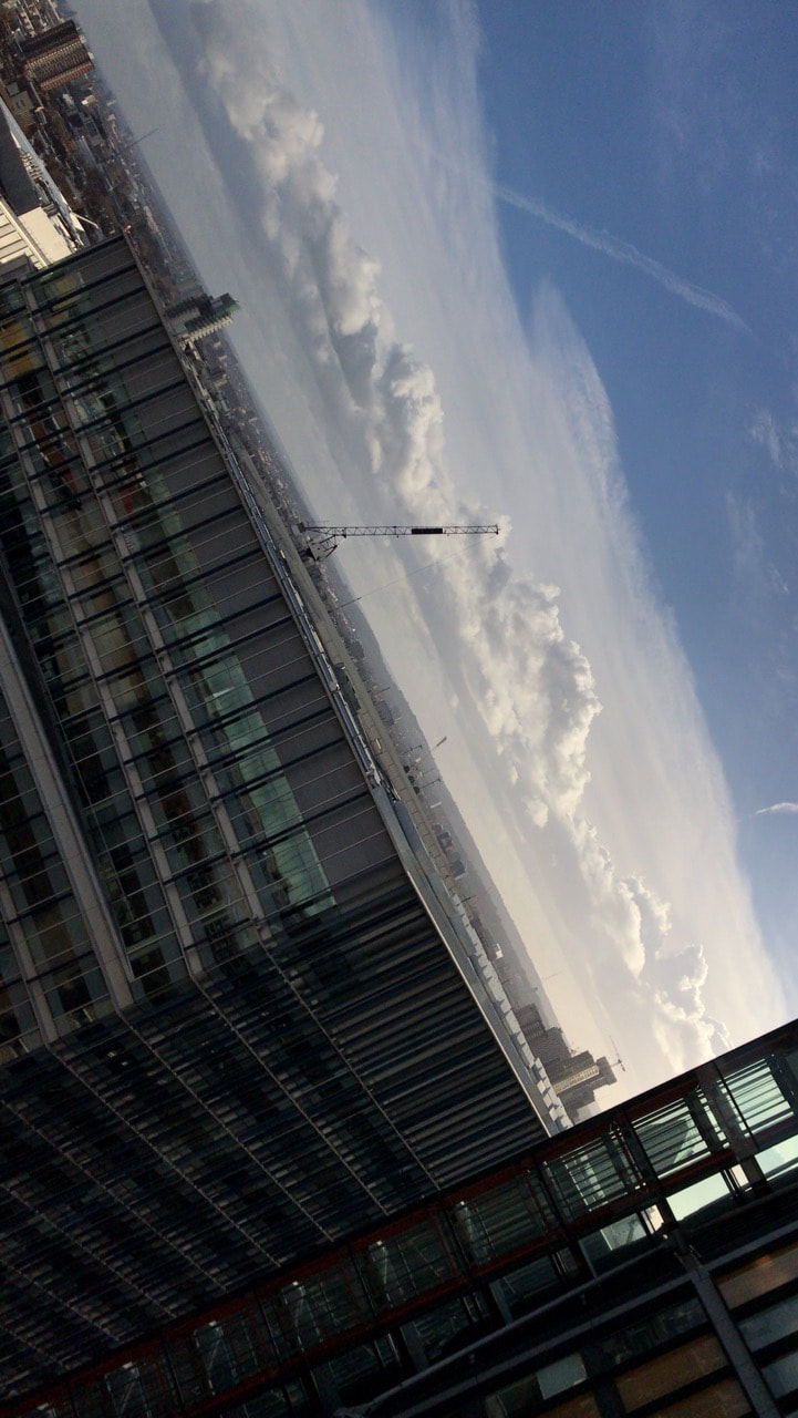
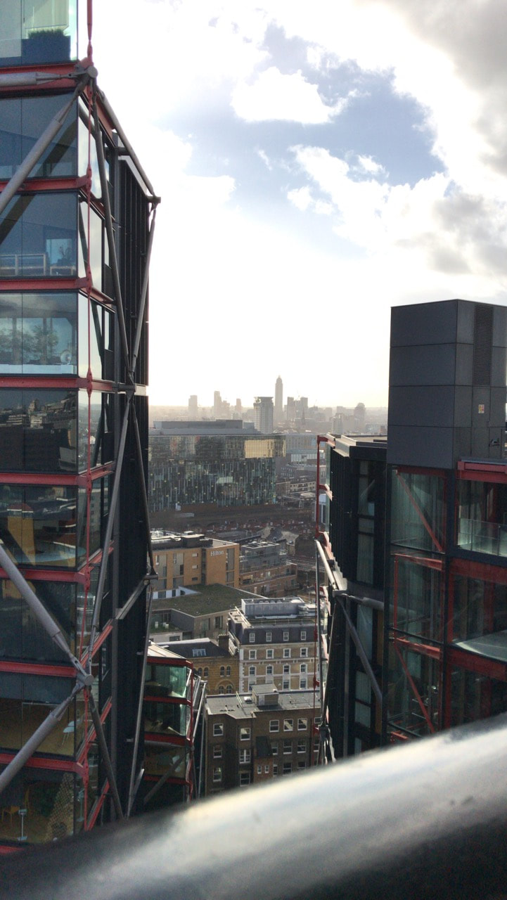
Edges Pictures:

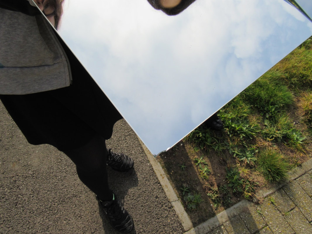
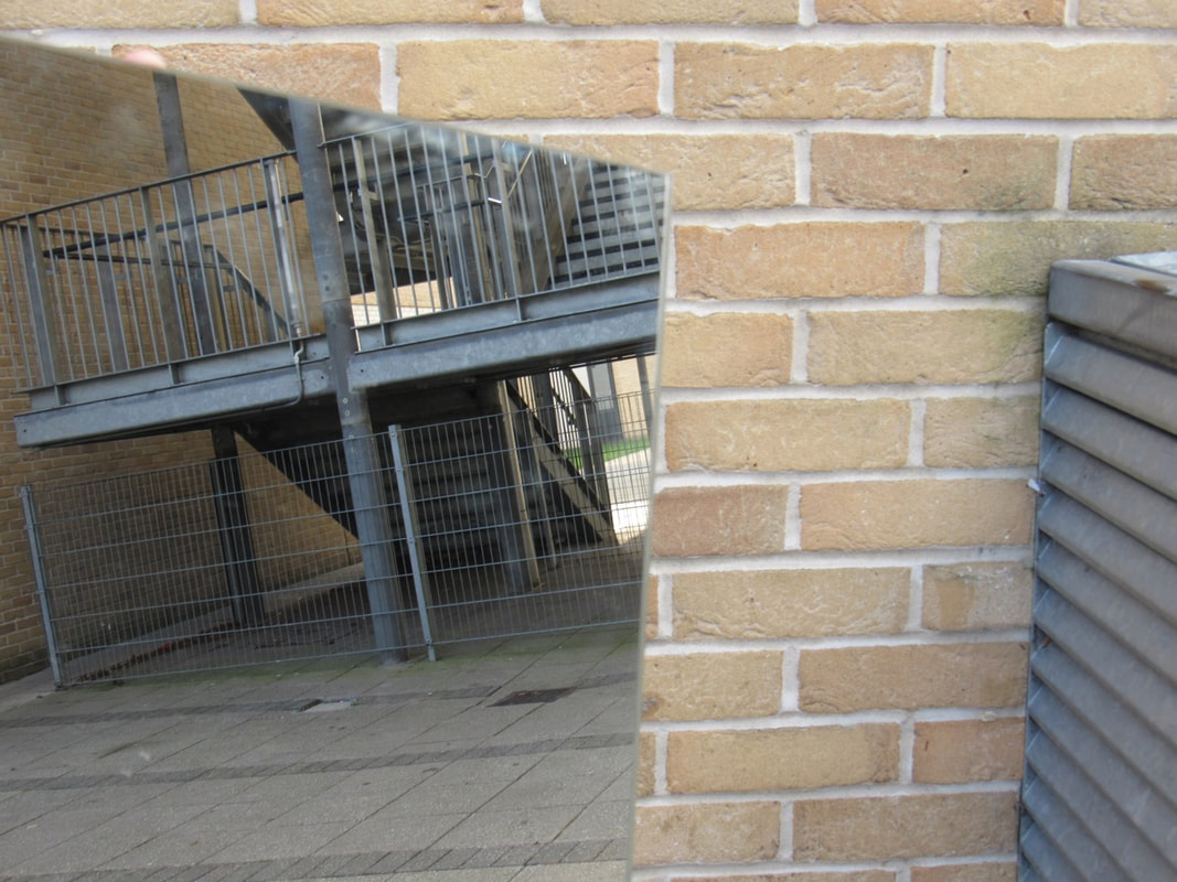
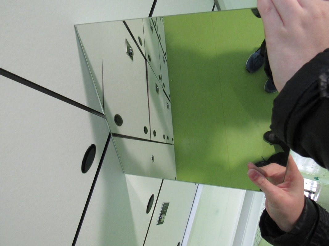
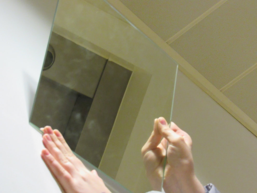
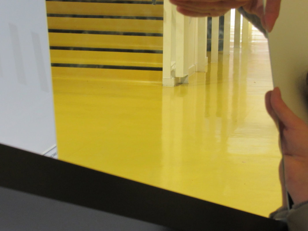
Edges Mirror Pictures:
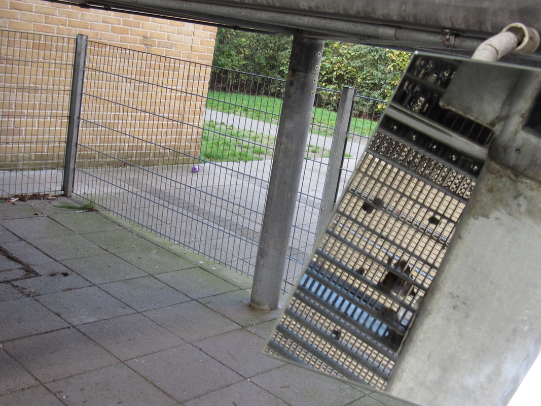
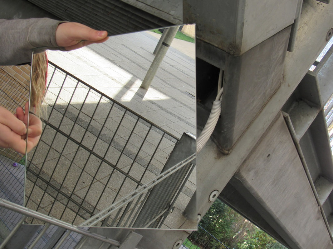
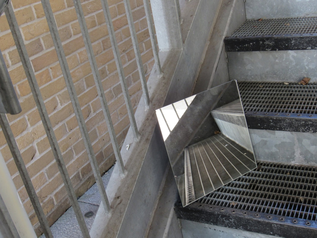
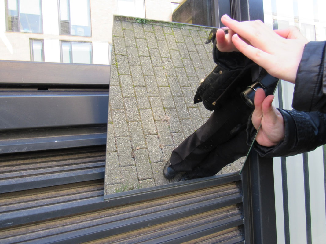
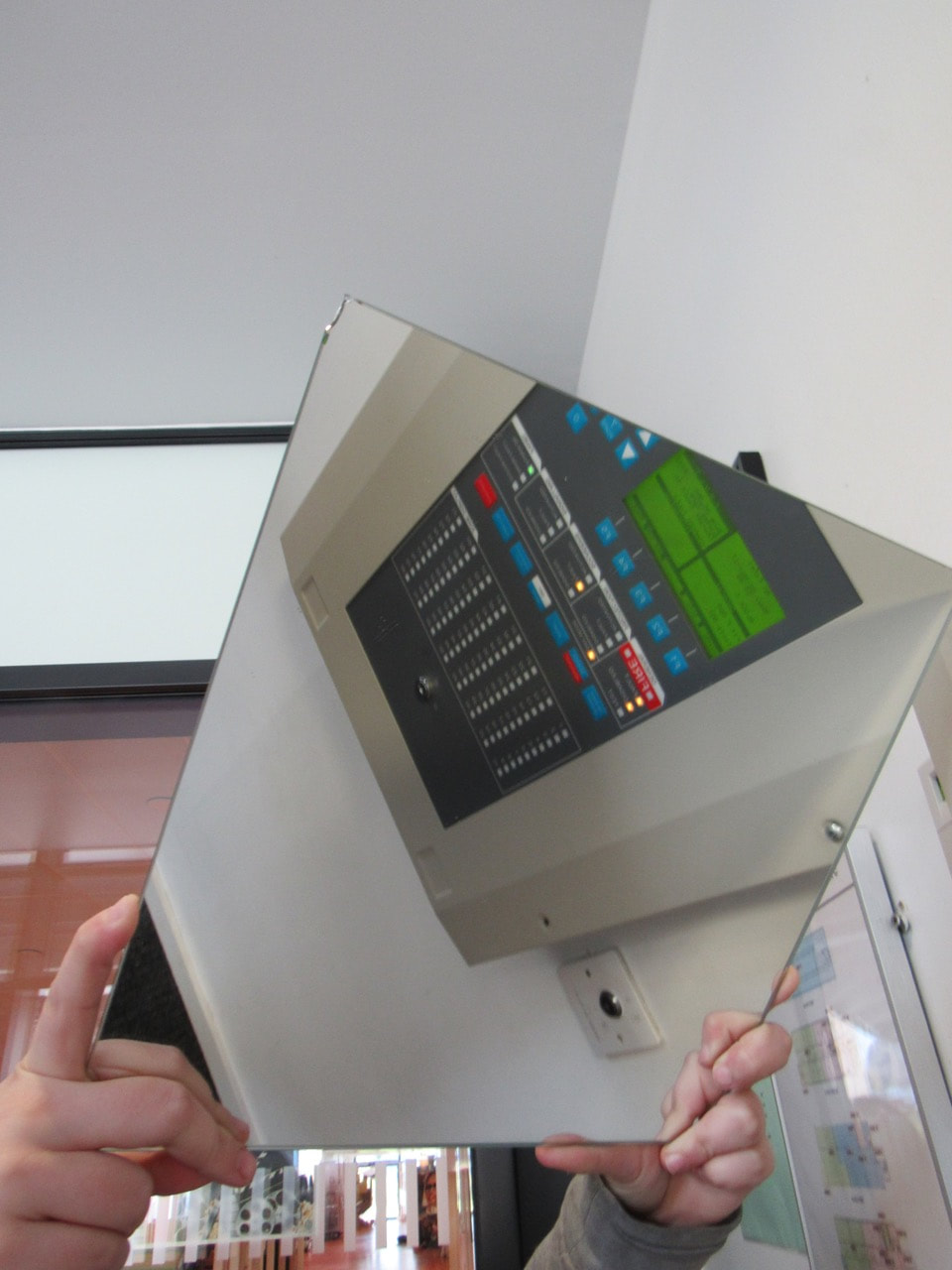
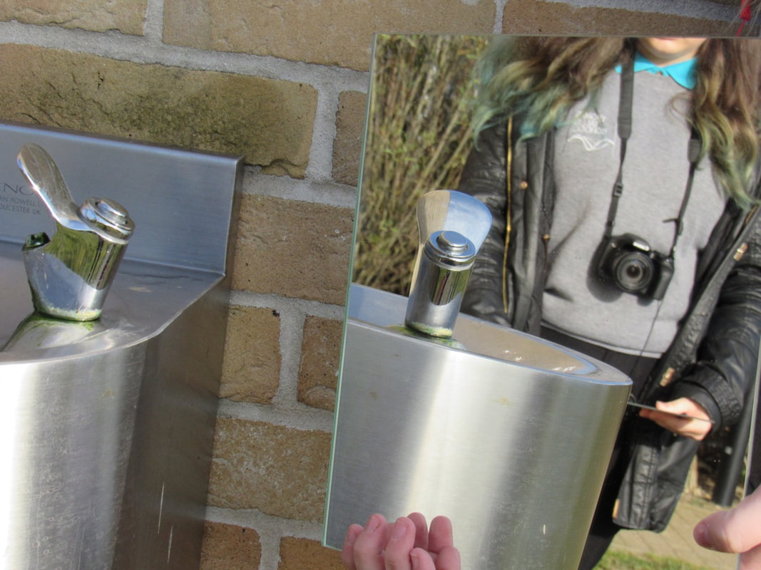
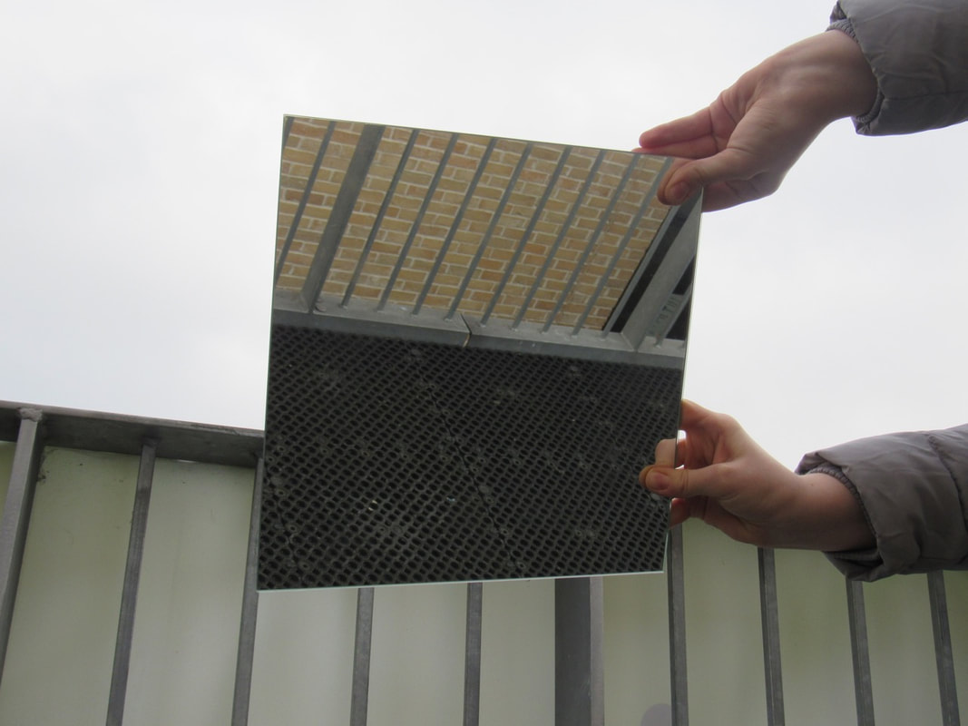
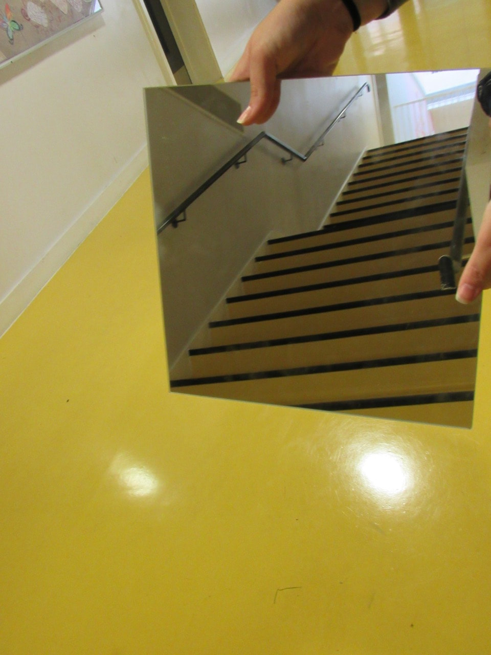
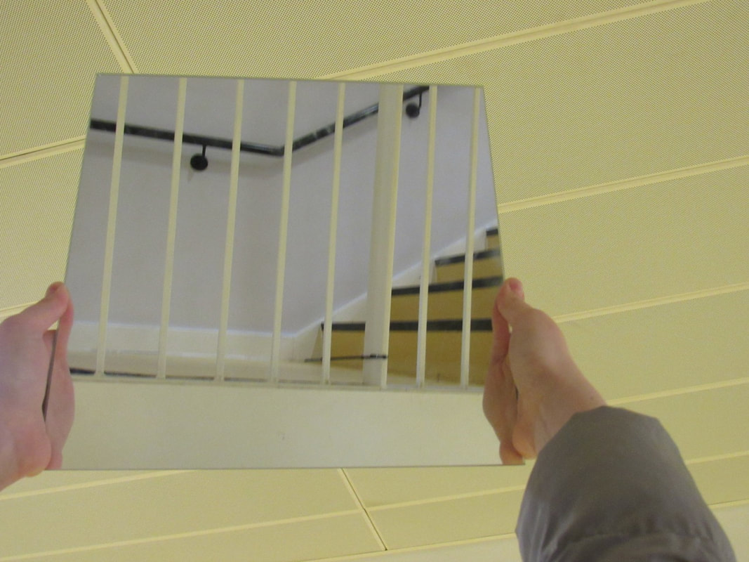
WWW & EBI:
I really like these pictures and the interesting way to use the mirrors, but I think I can improve them by trying to not put the hands in the photo. (might cut them on photoshop)
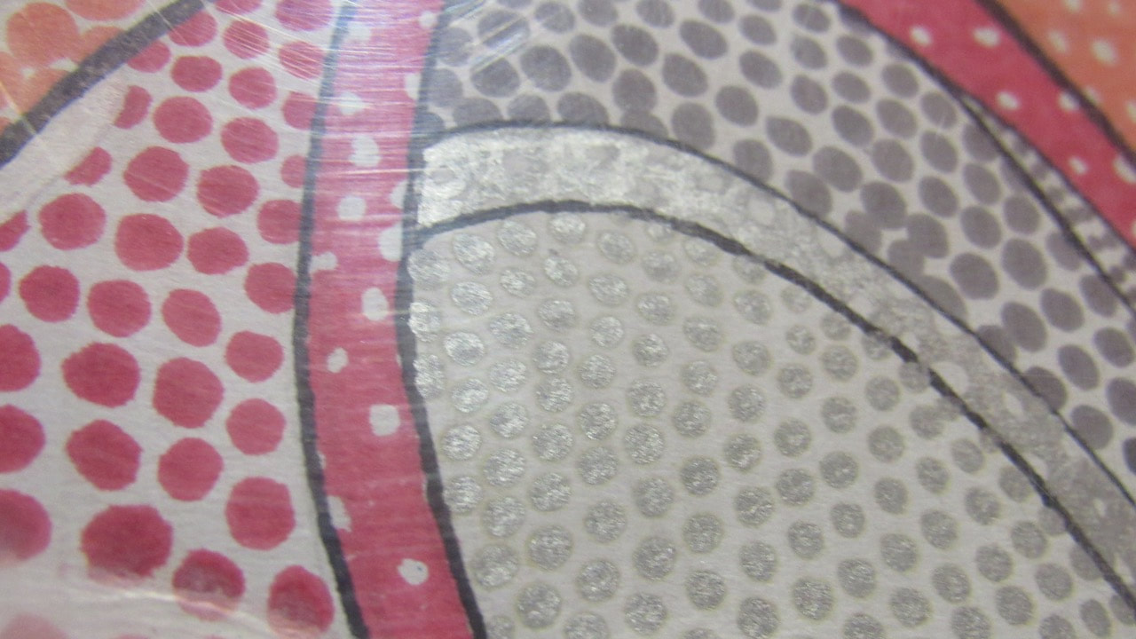
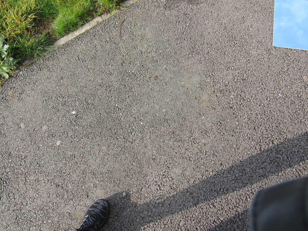
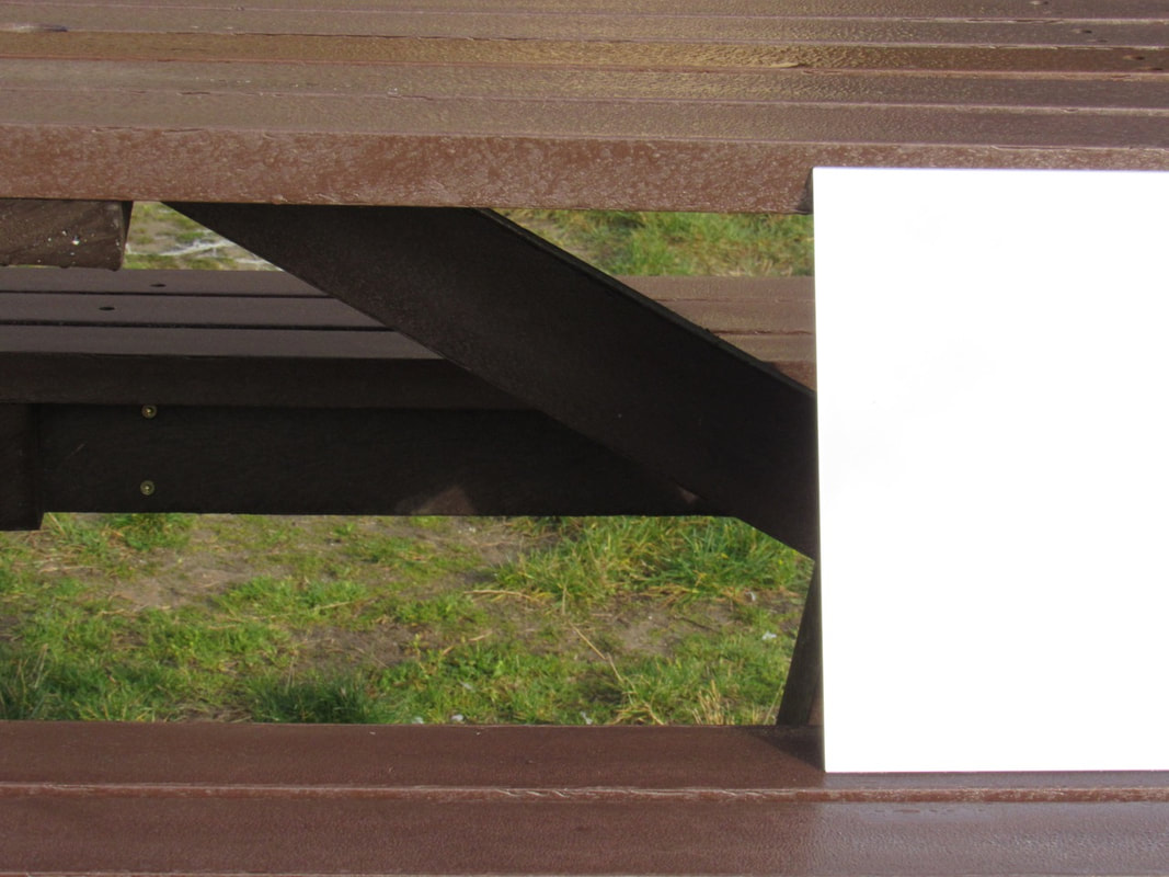
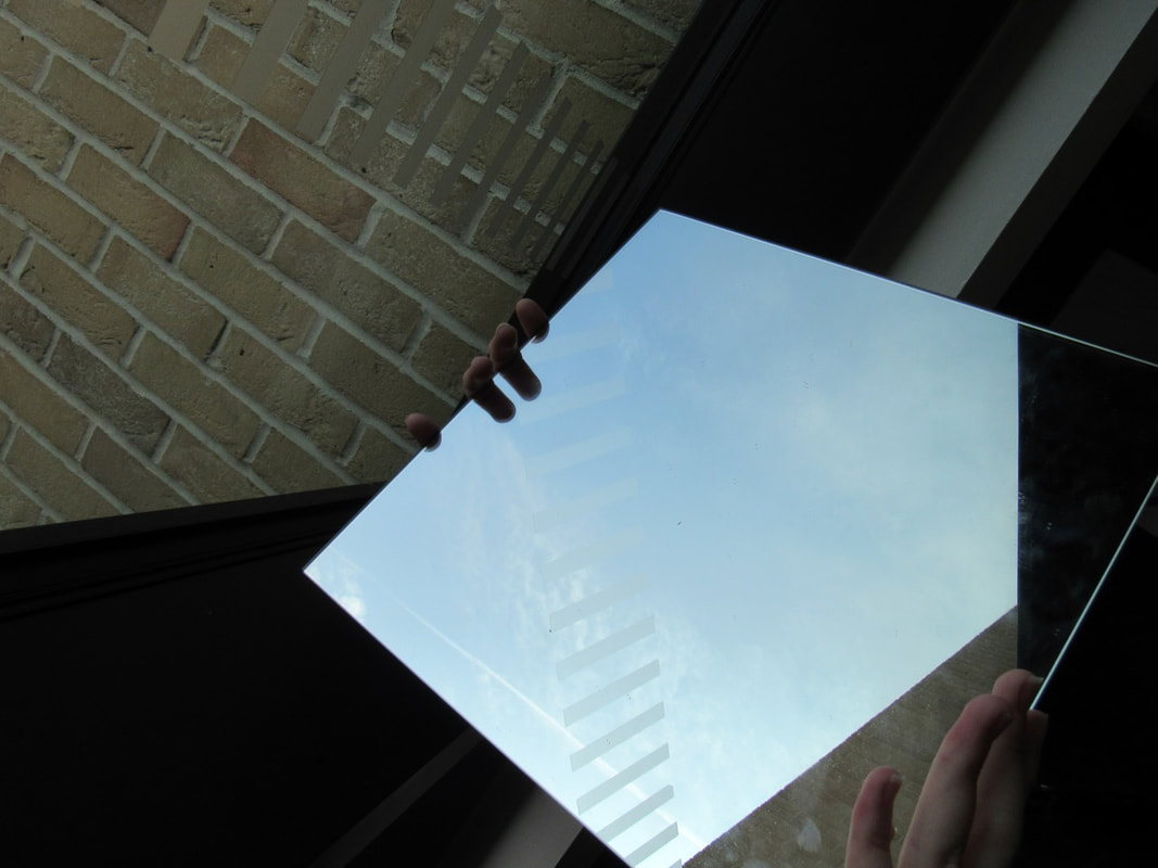
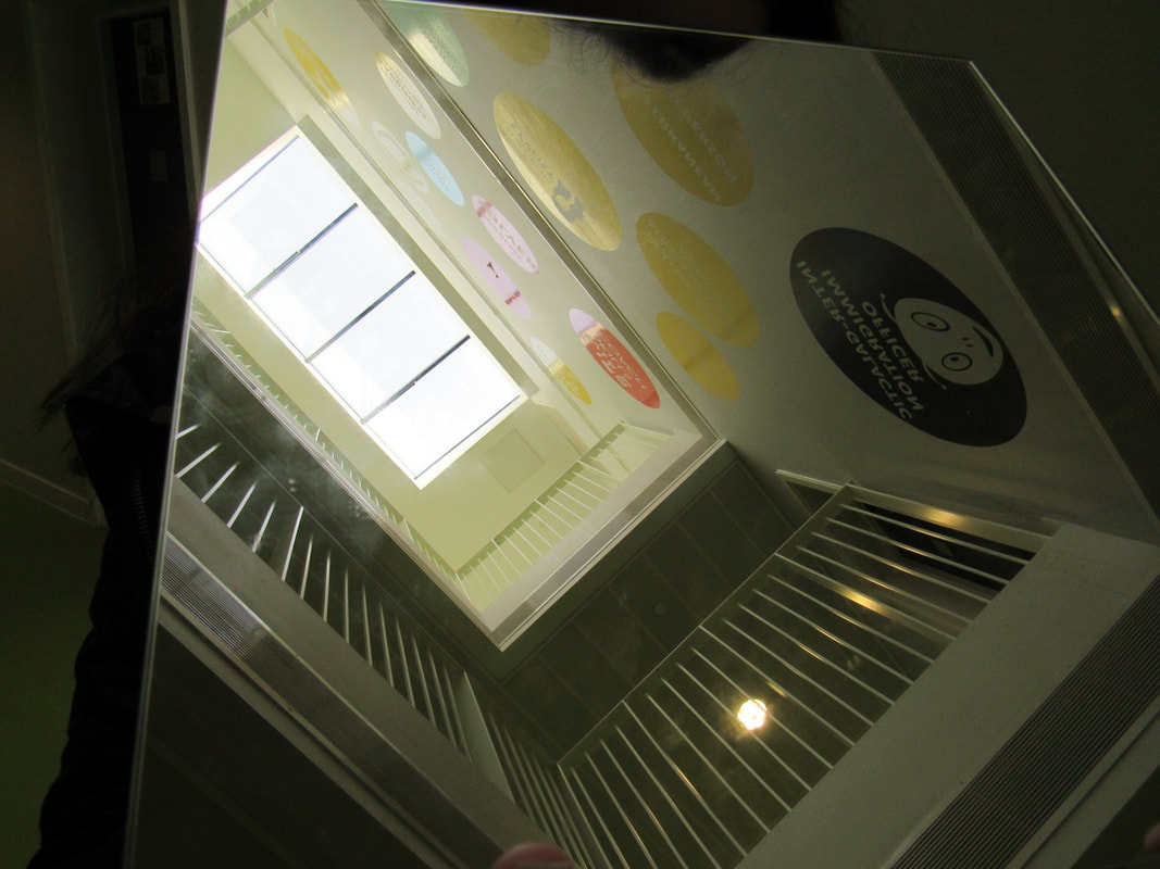
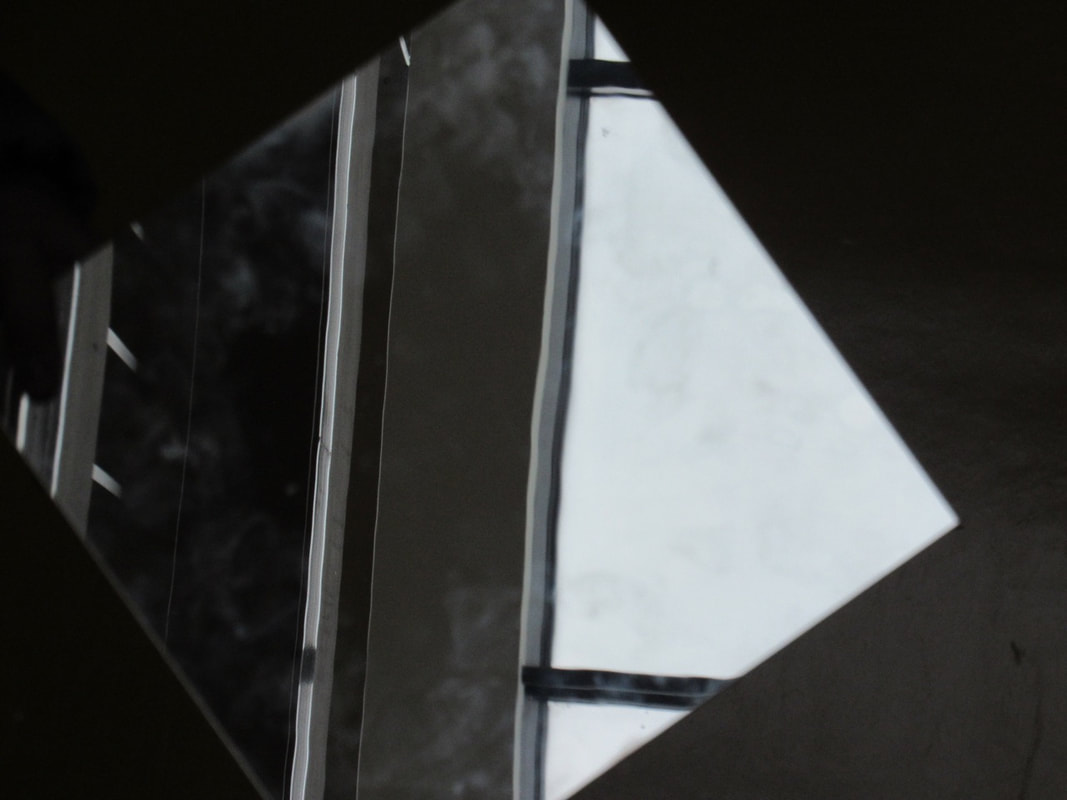
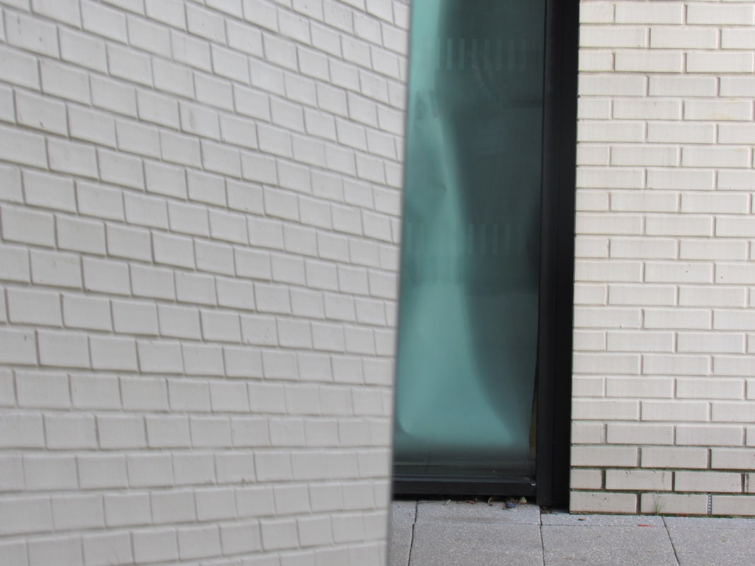
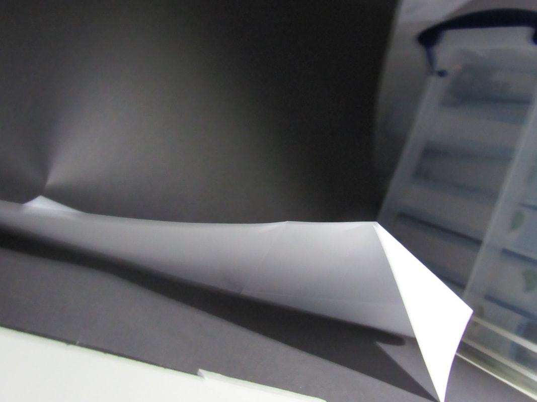
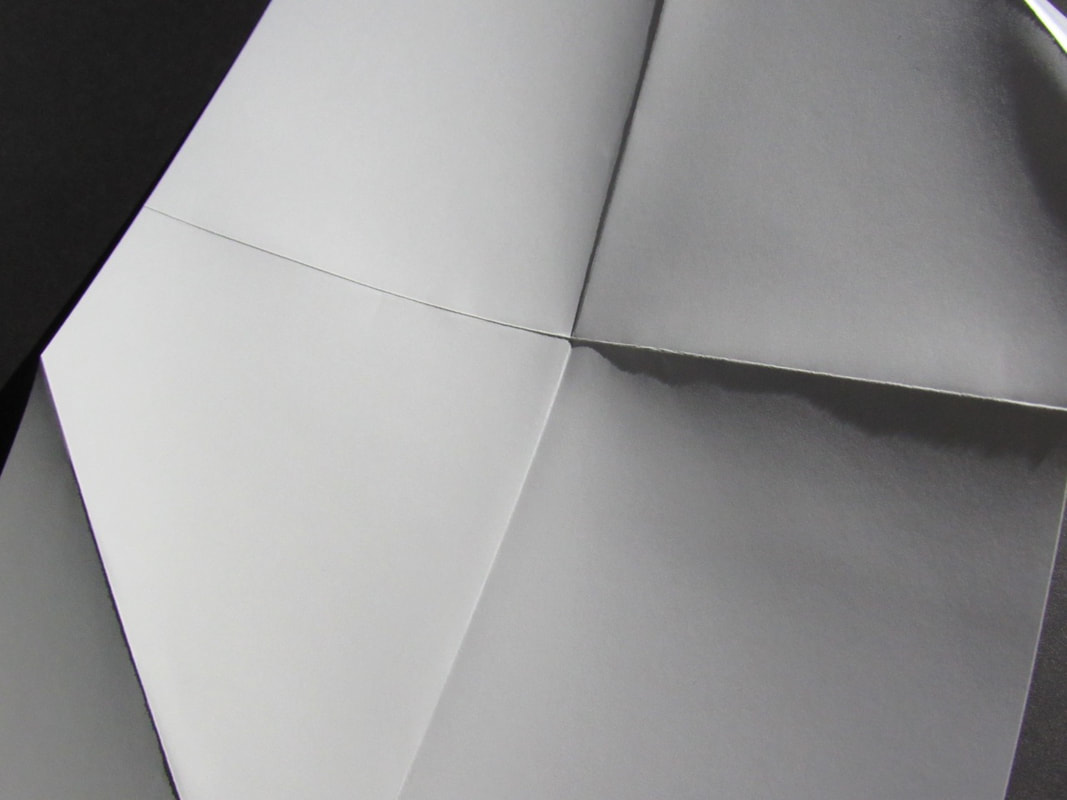
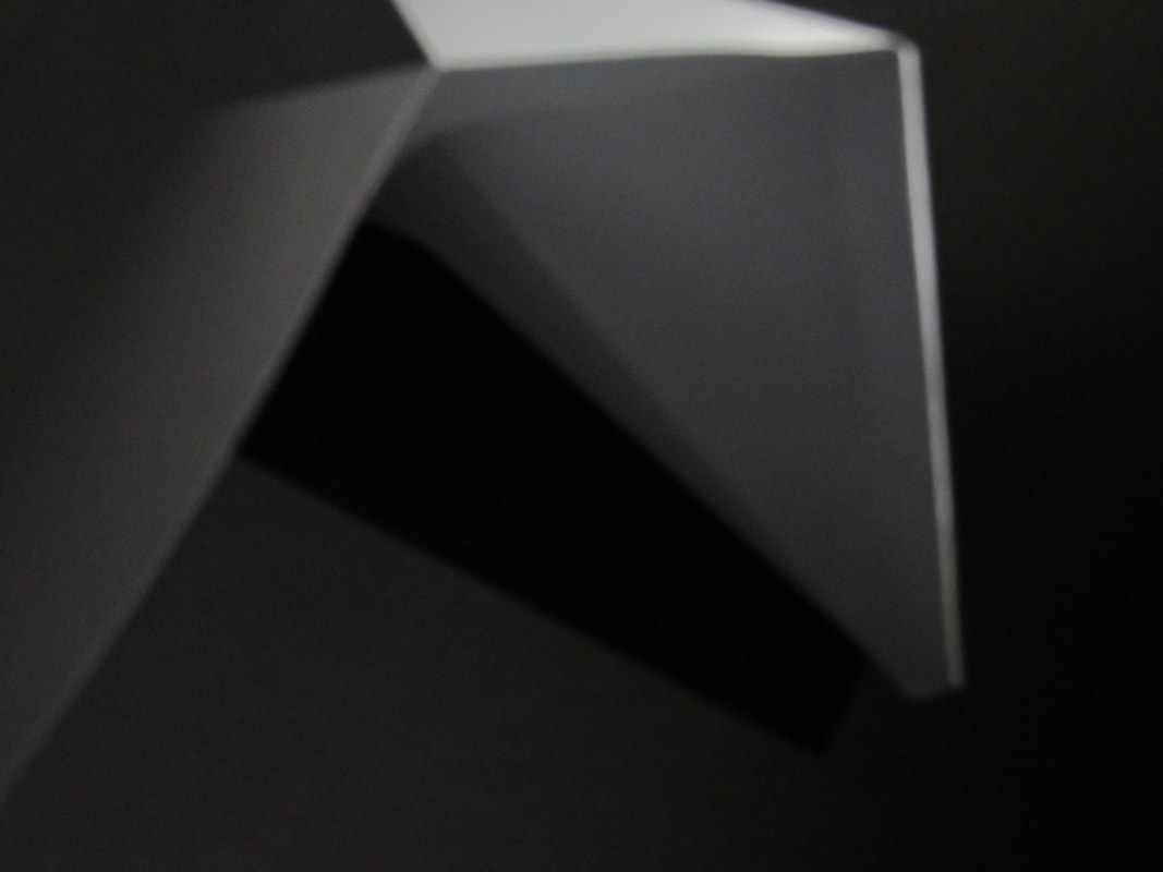
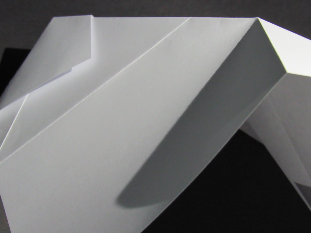
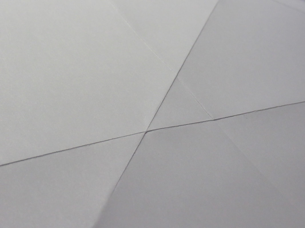
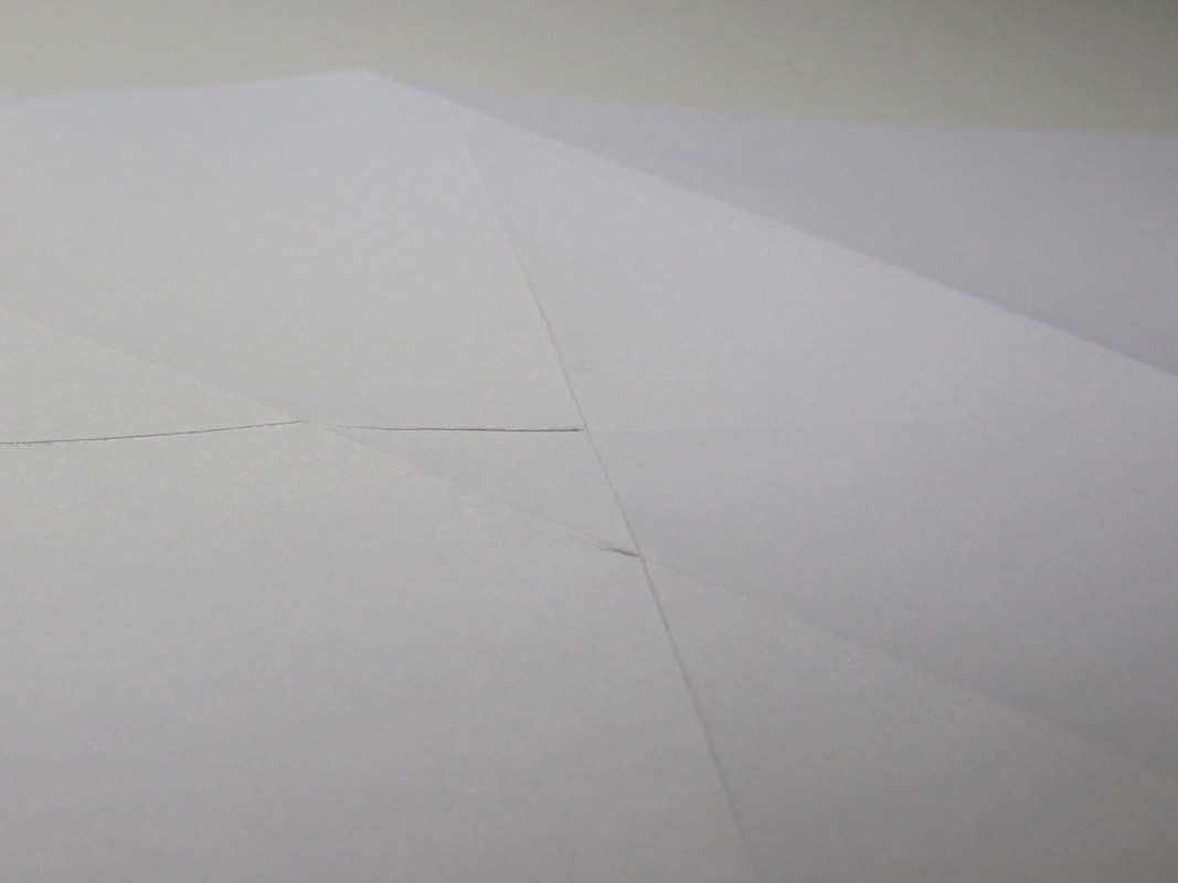
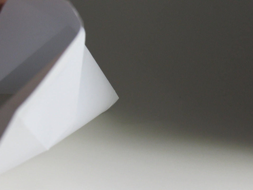
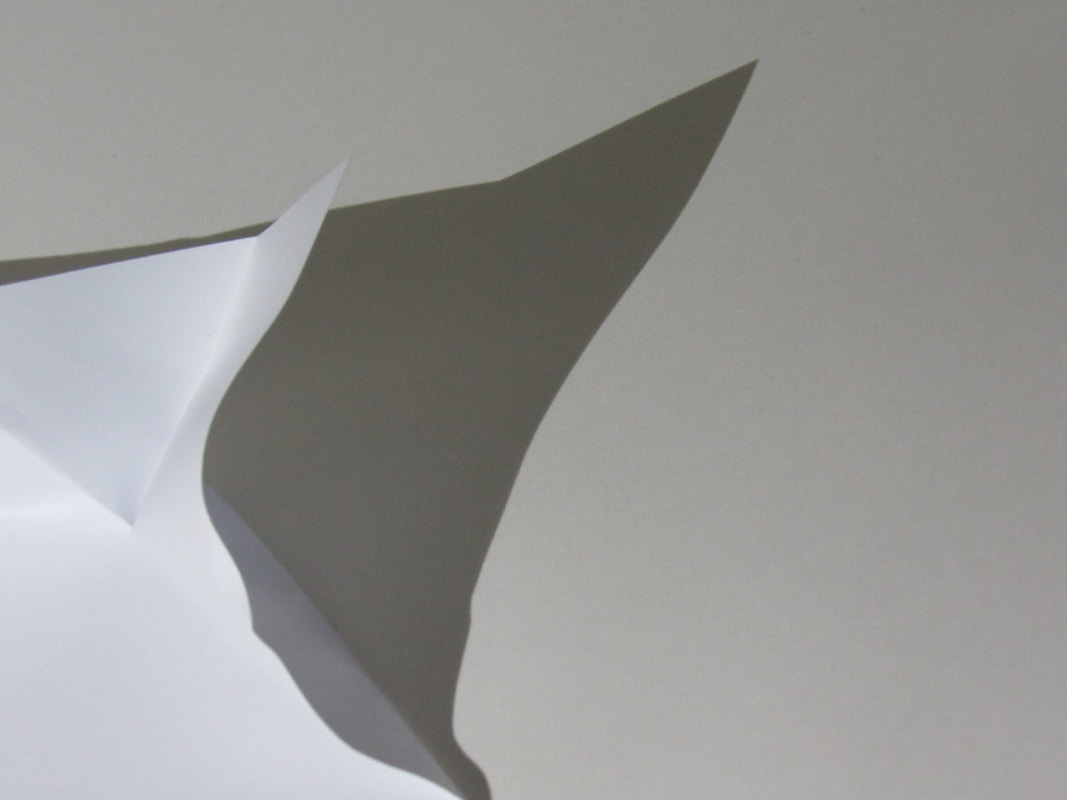
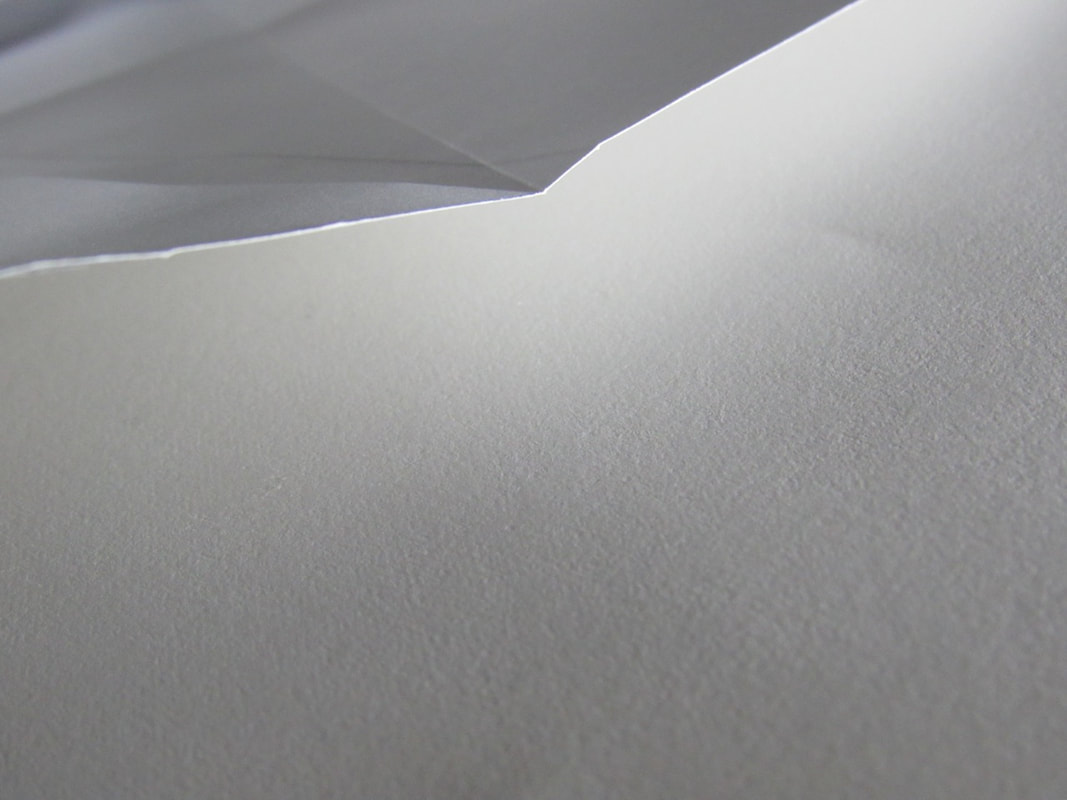
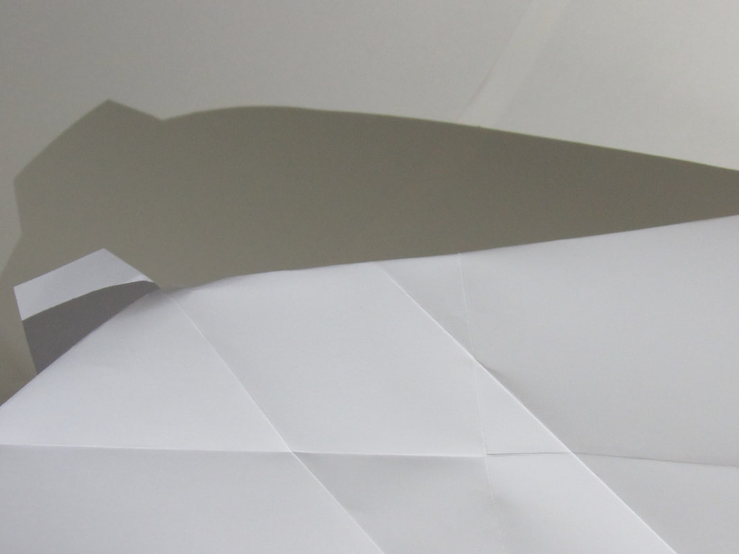
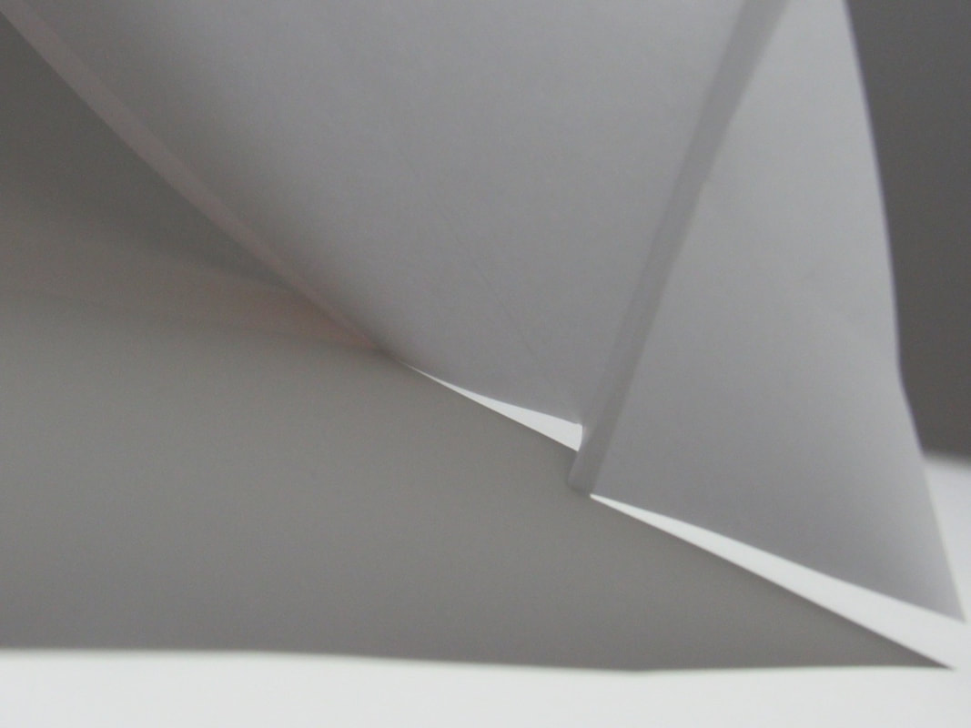
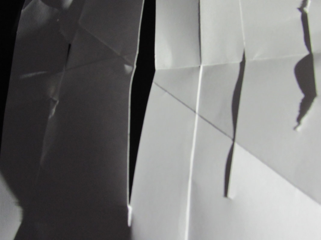
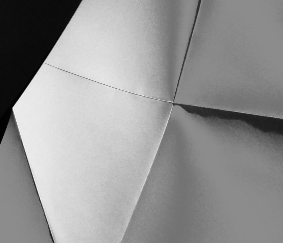
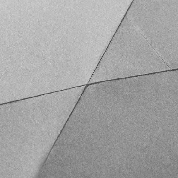
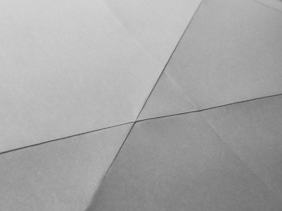
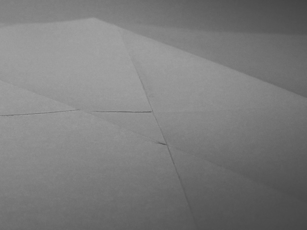
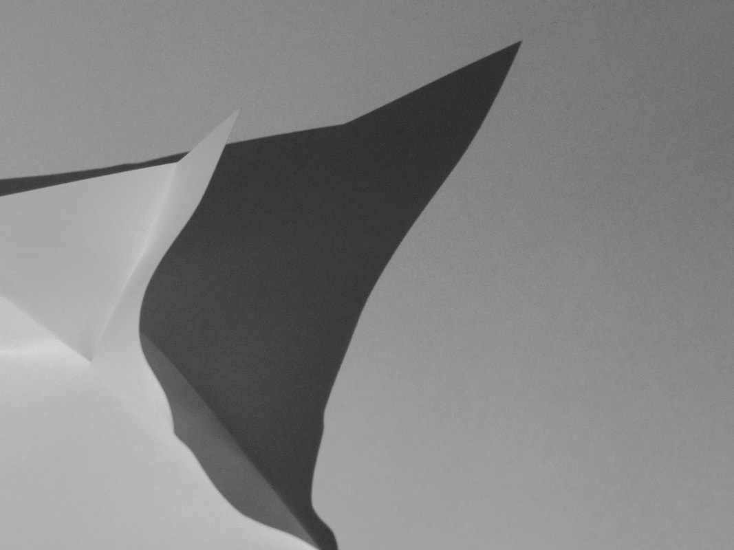
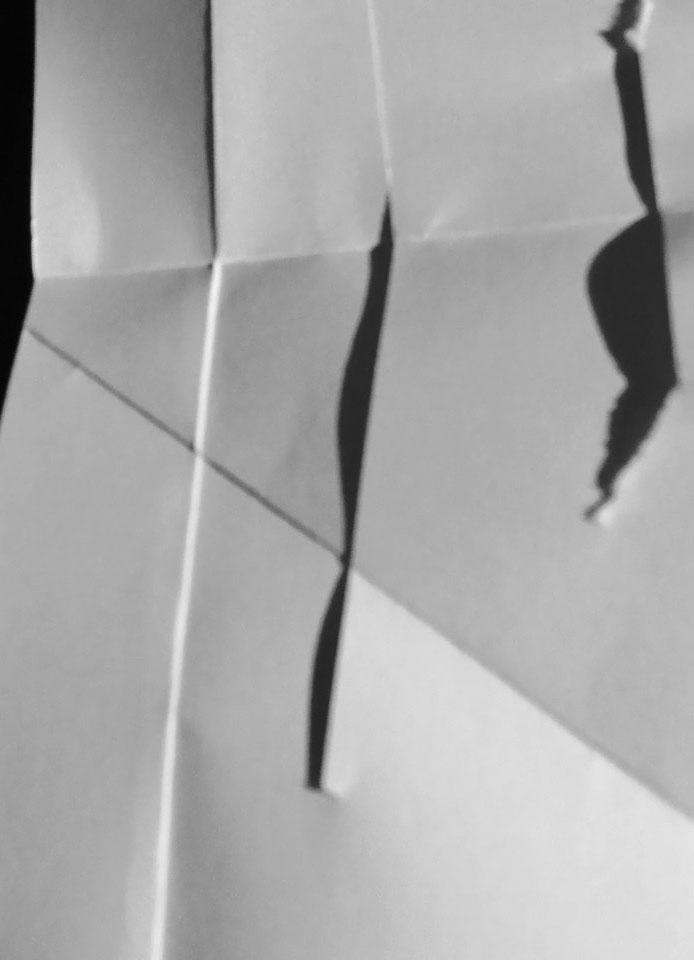
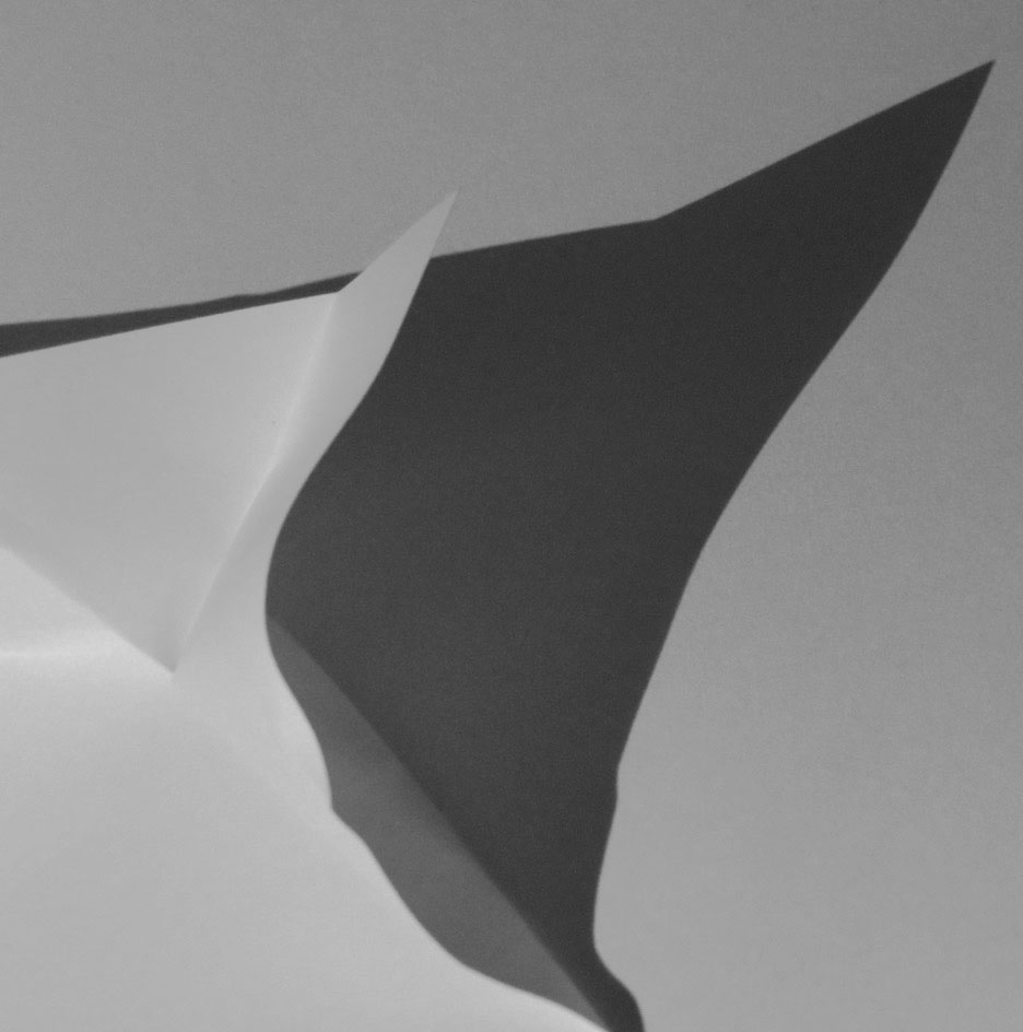
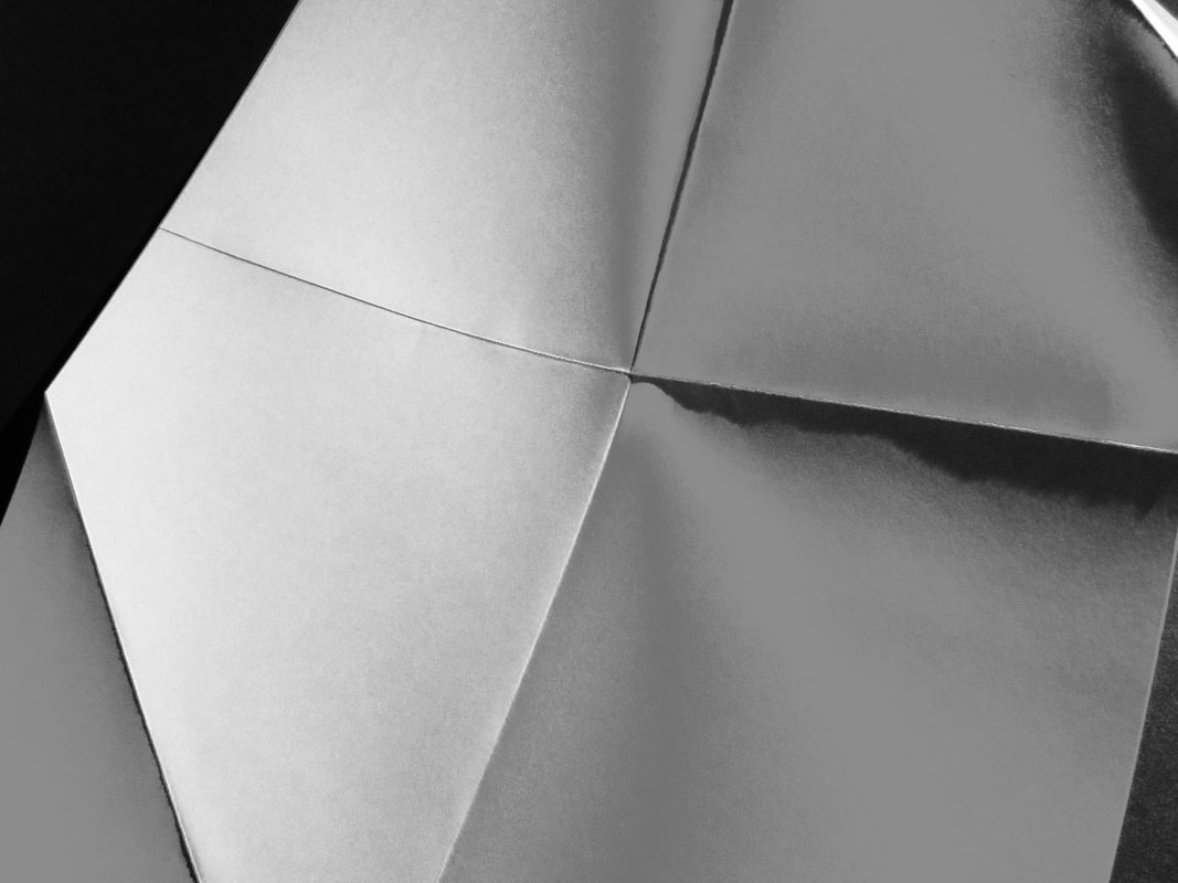
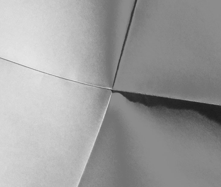
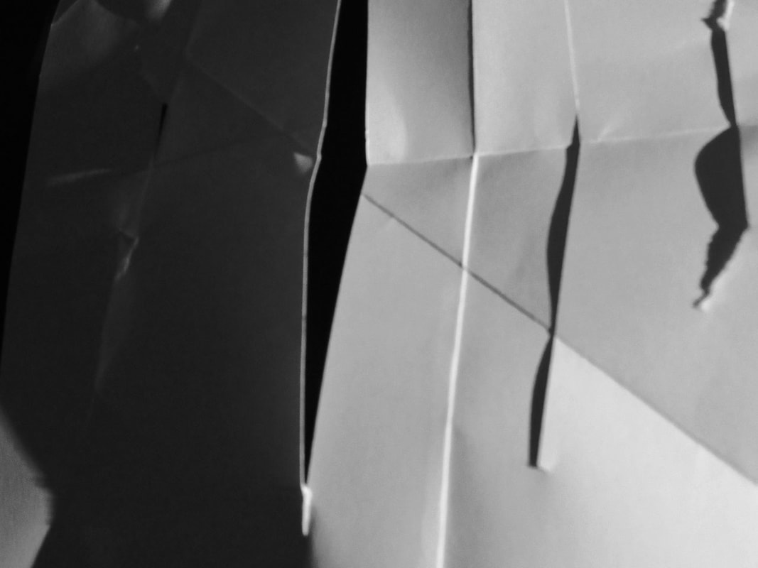
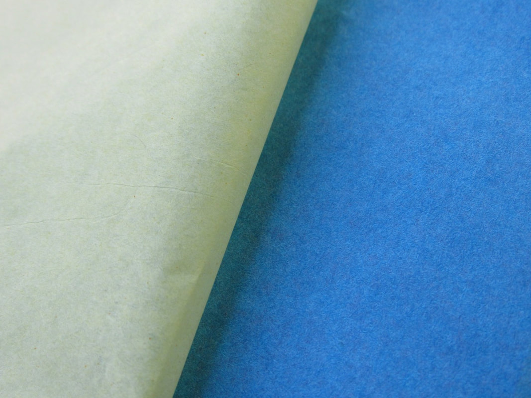
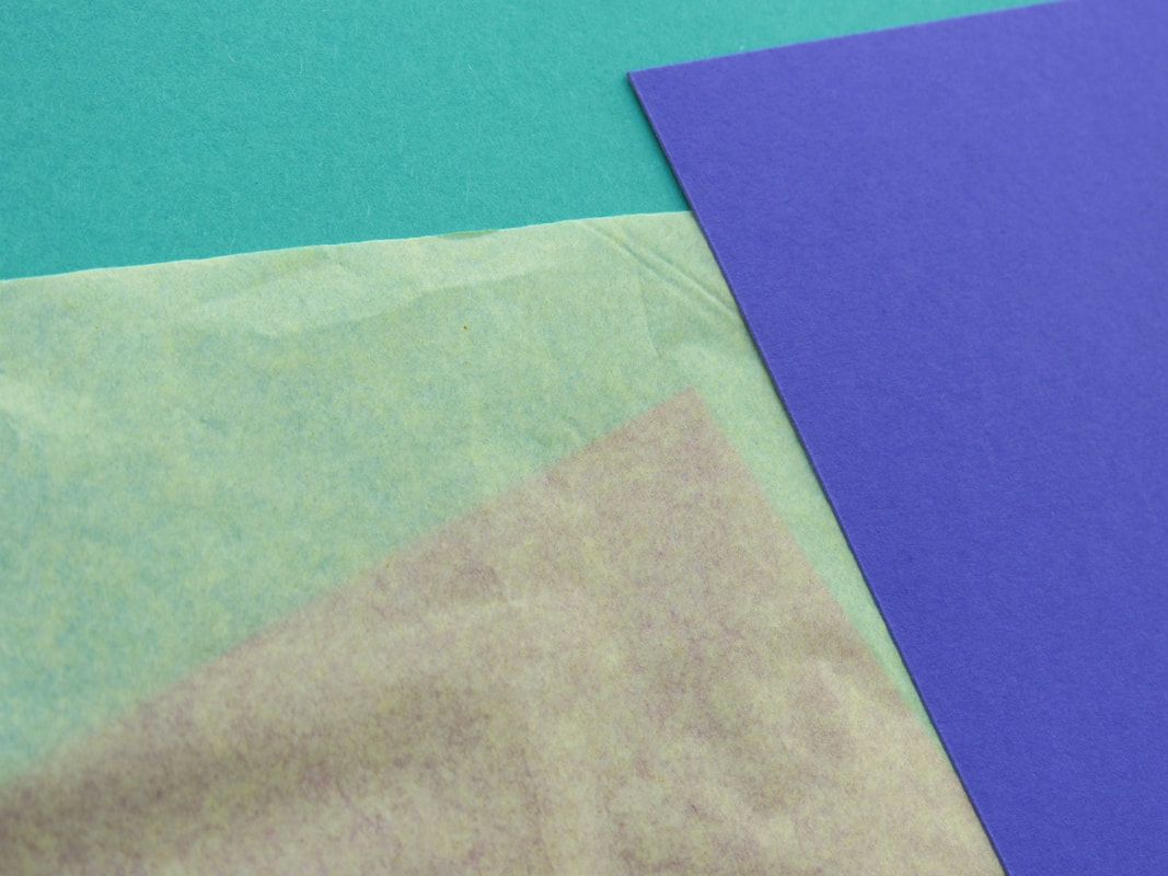
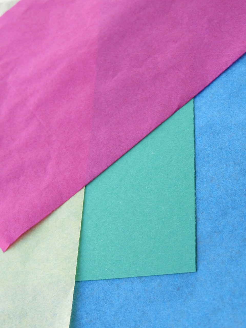
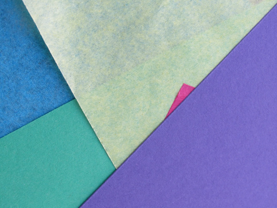
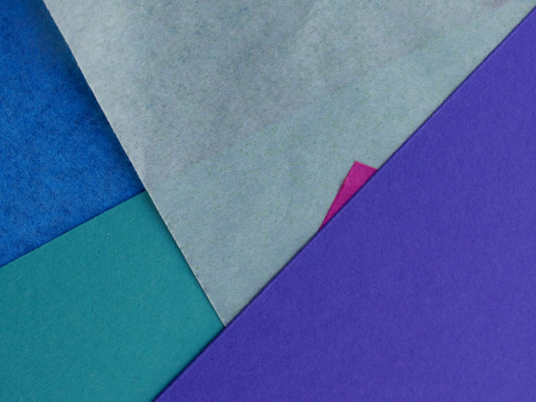
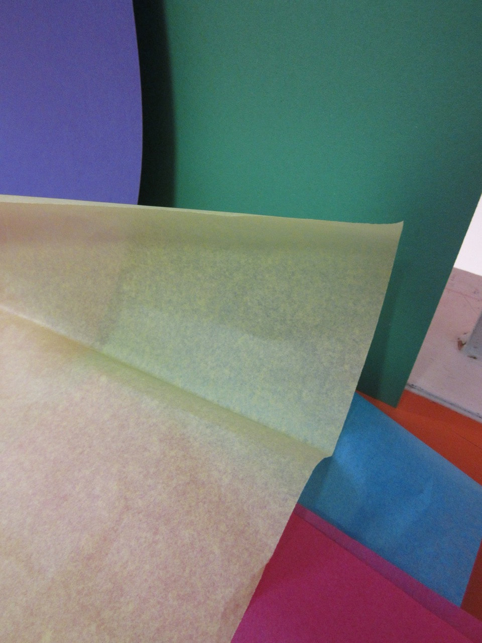
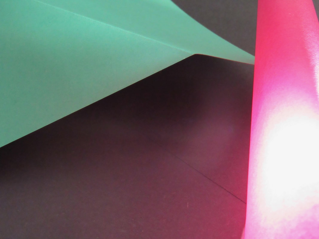
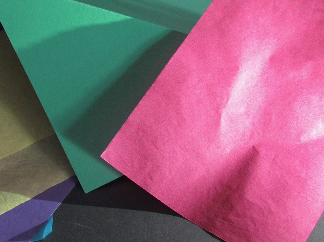
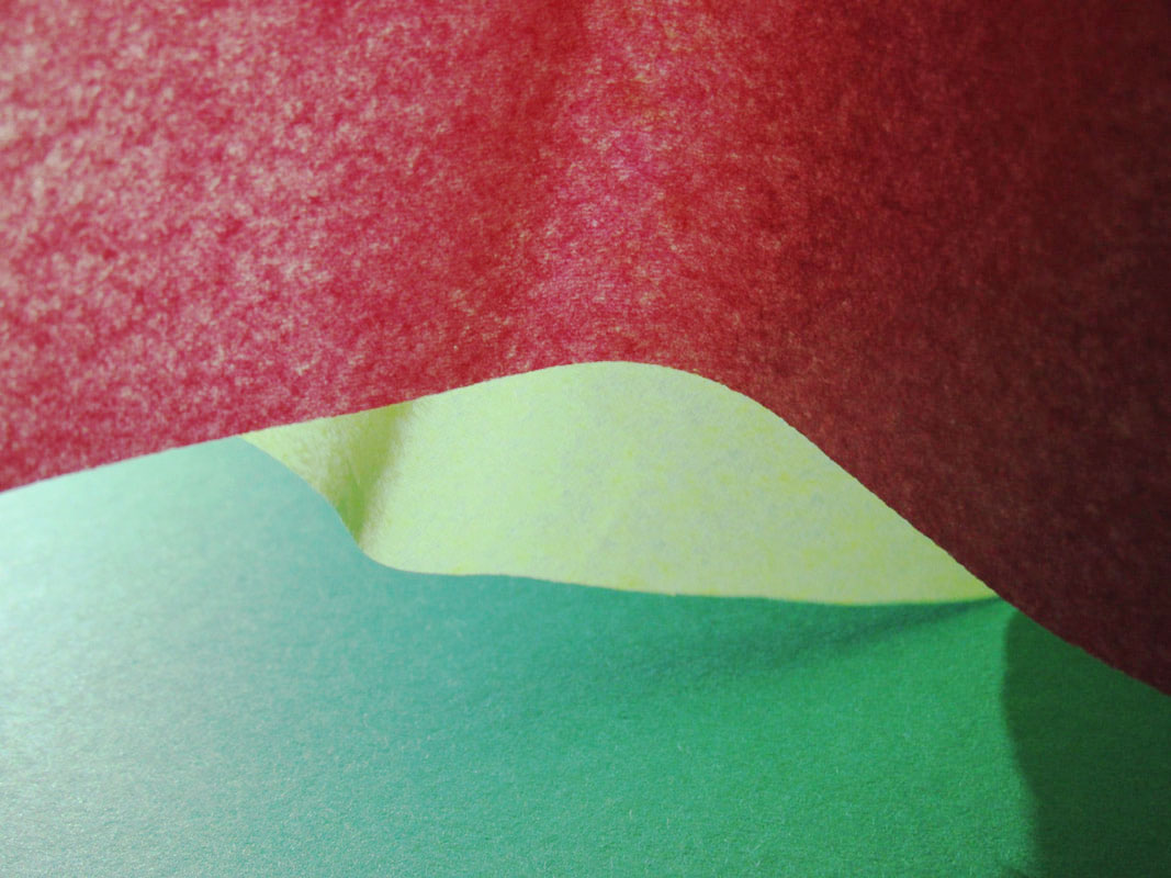
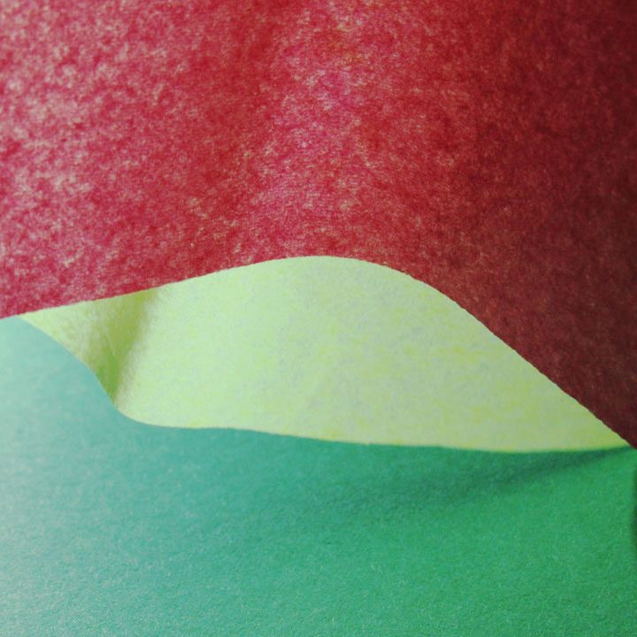
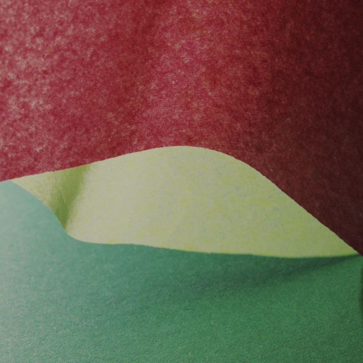
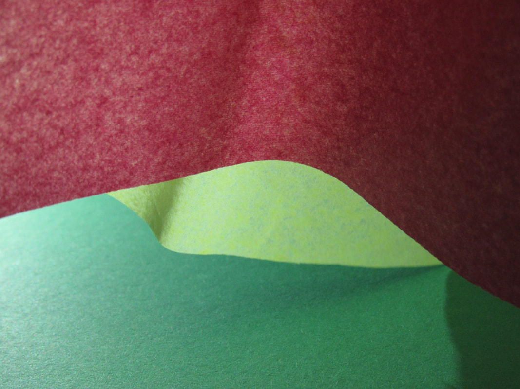
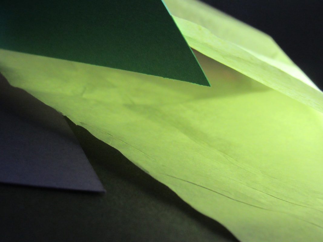
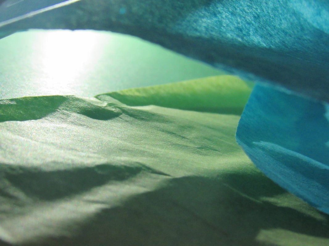
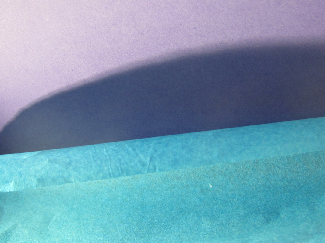
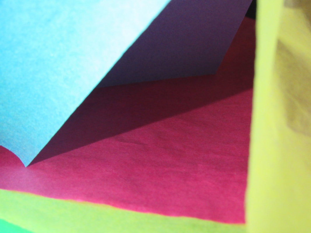
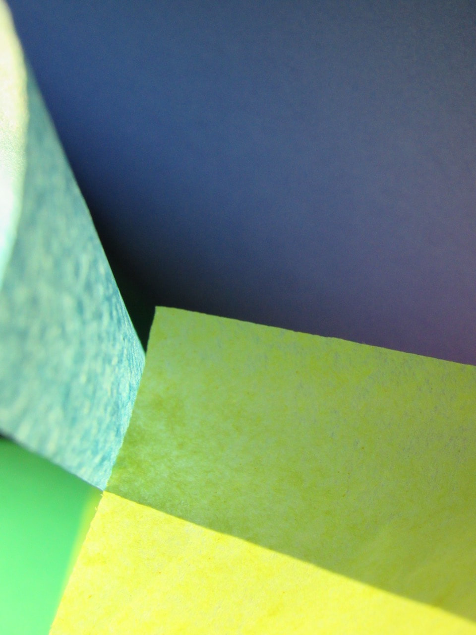
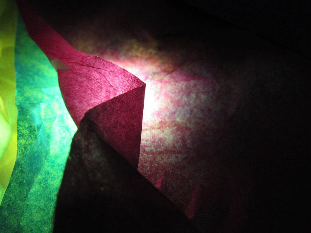
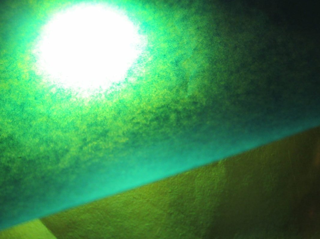
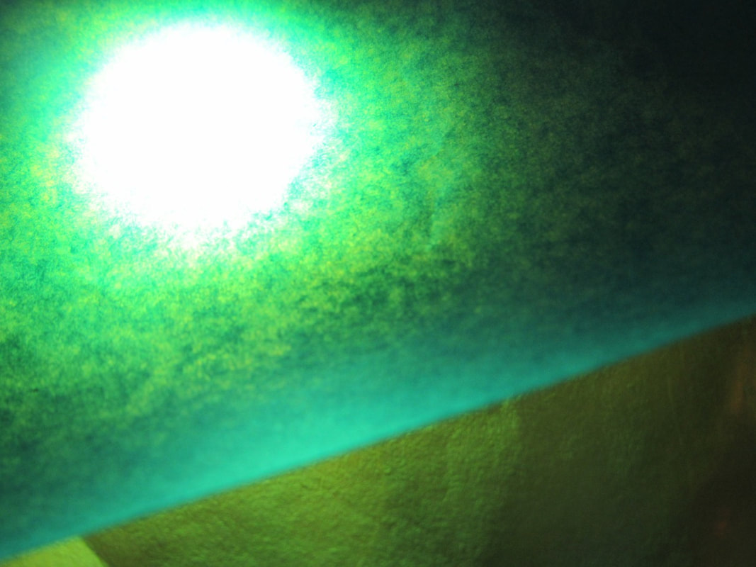
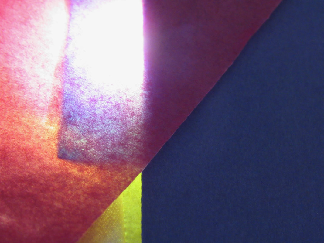
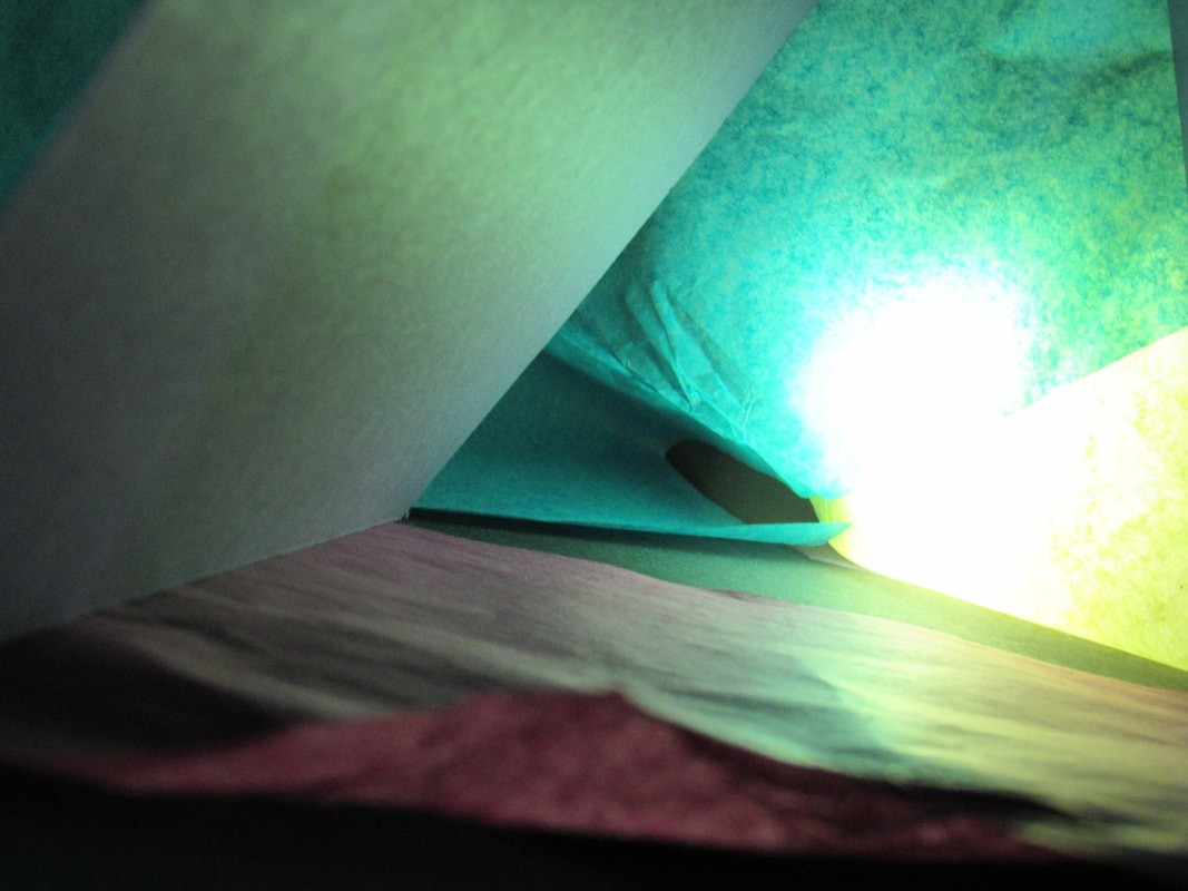
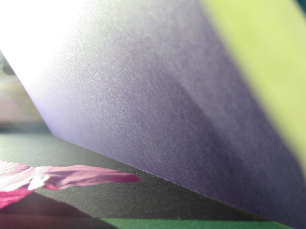
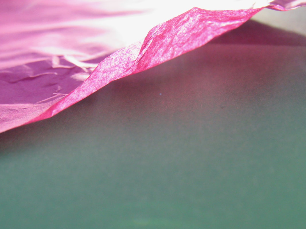
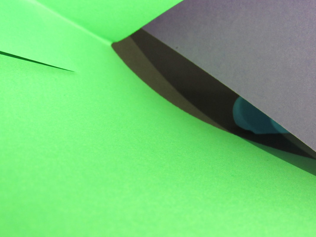
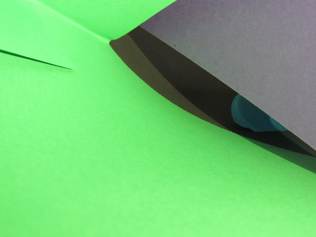
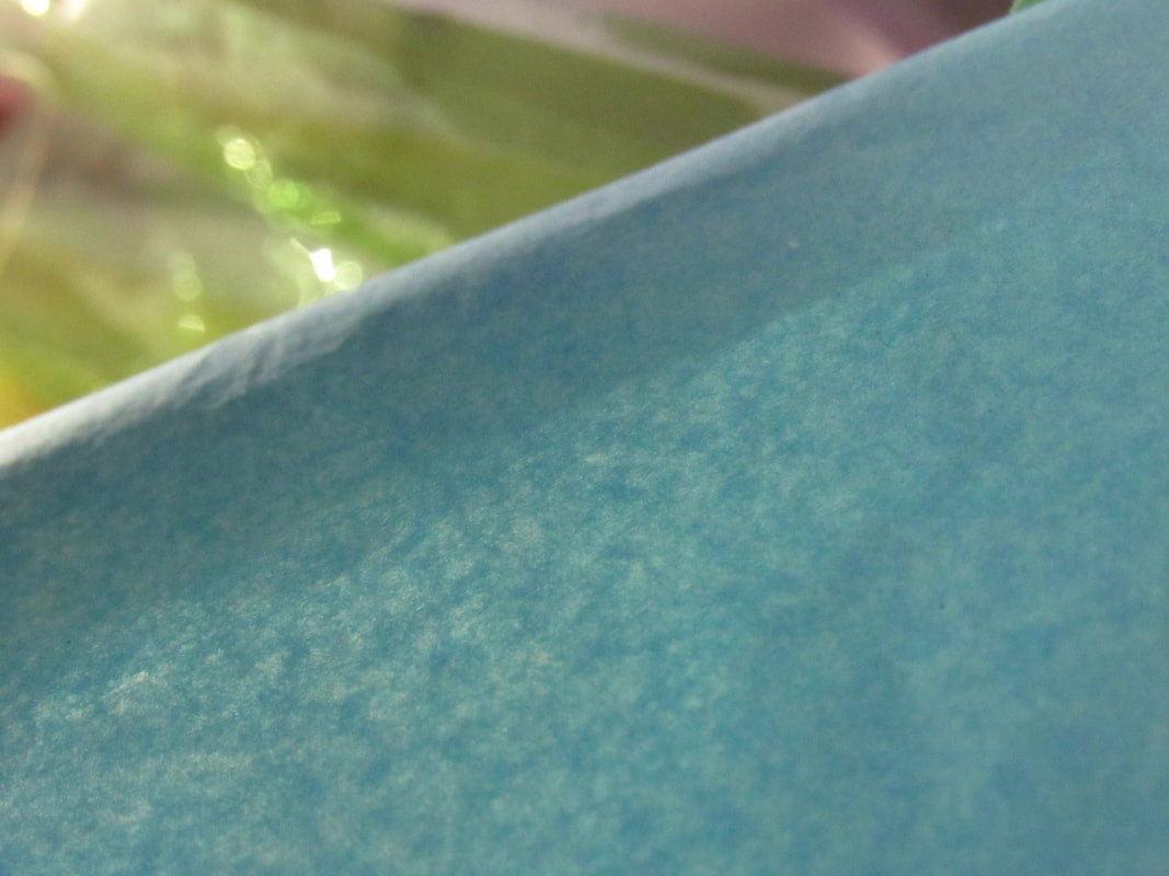
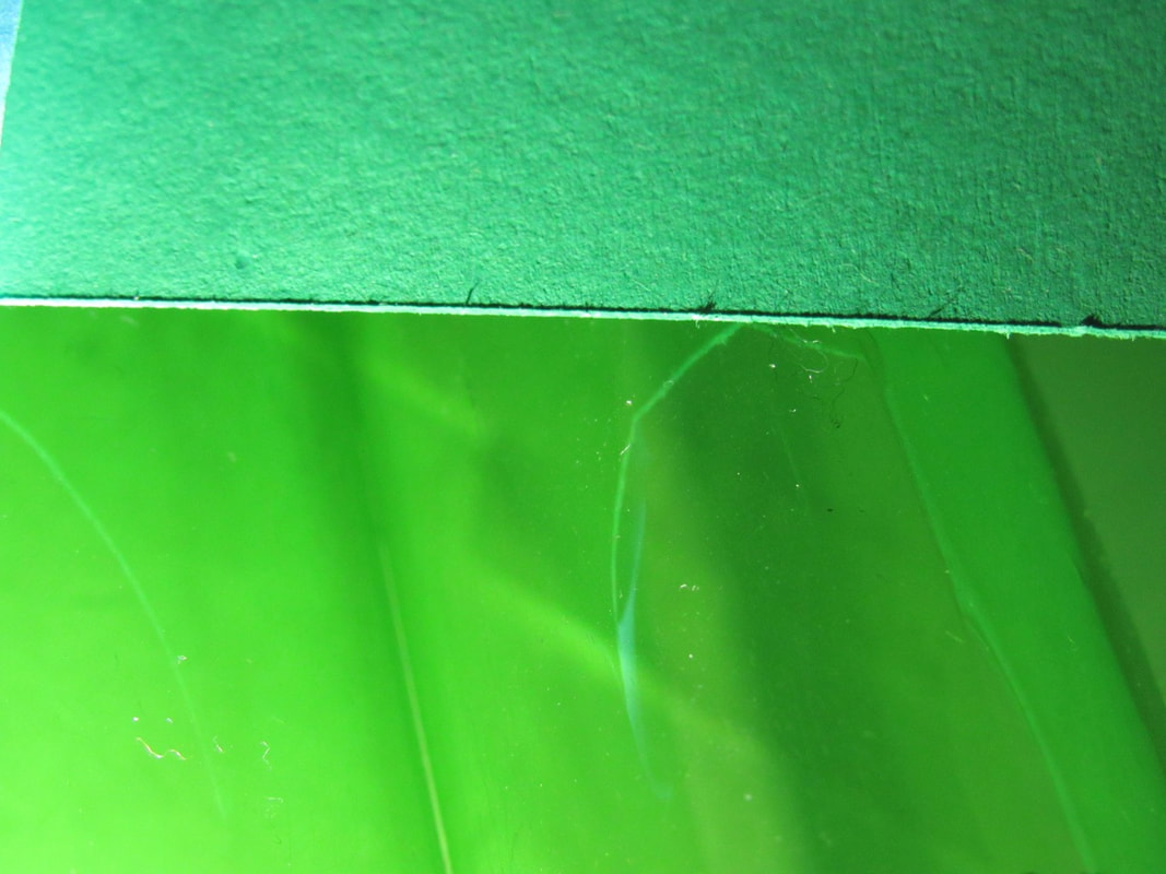
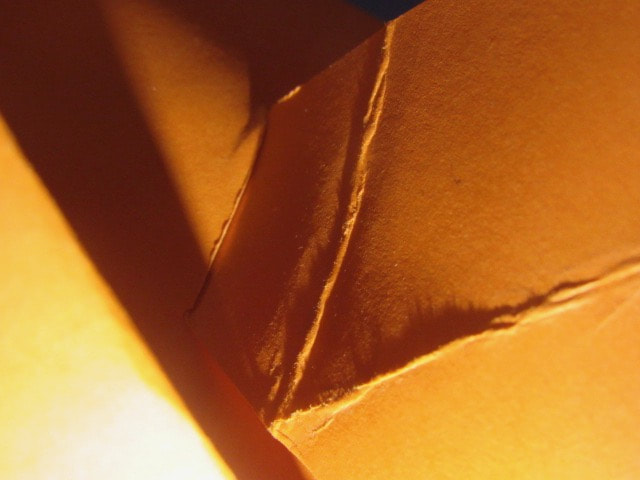
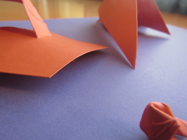
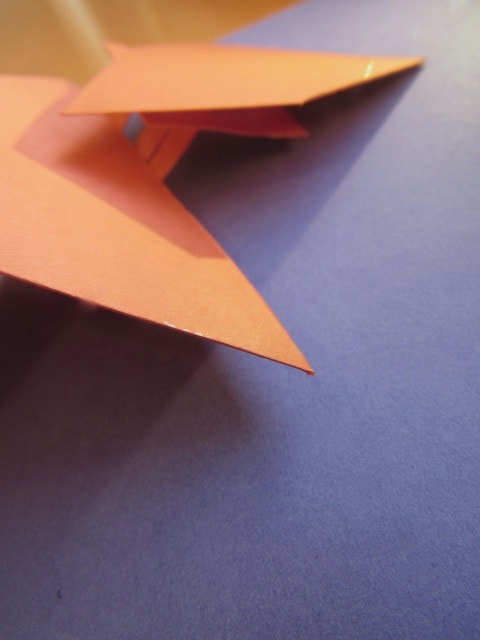
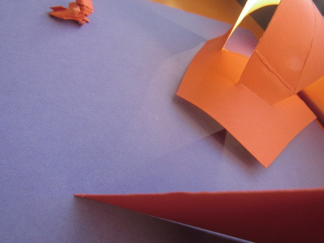
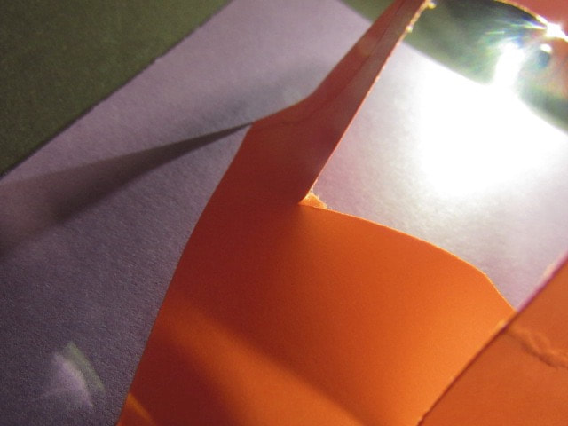
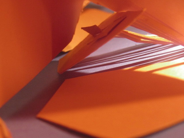
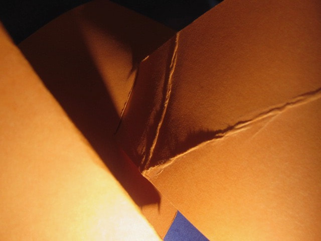
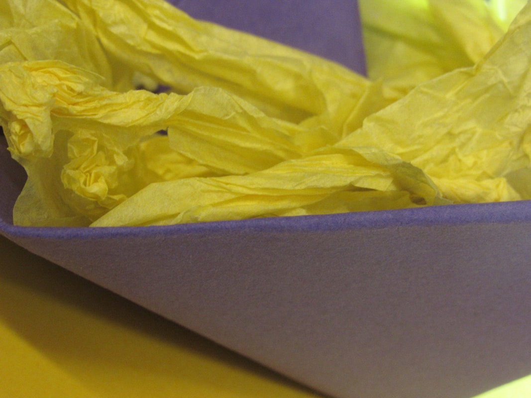
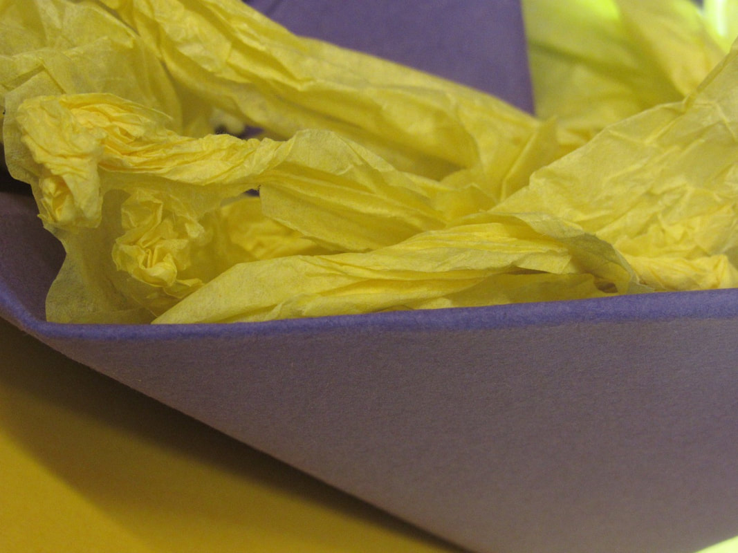
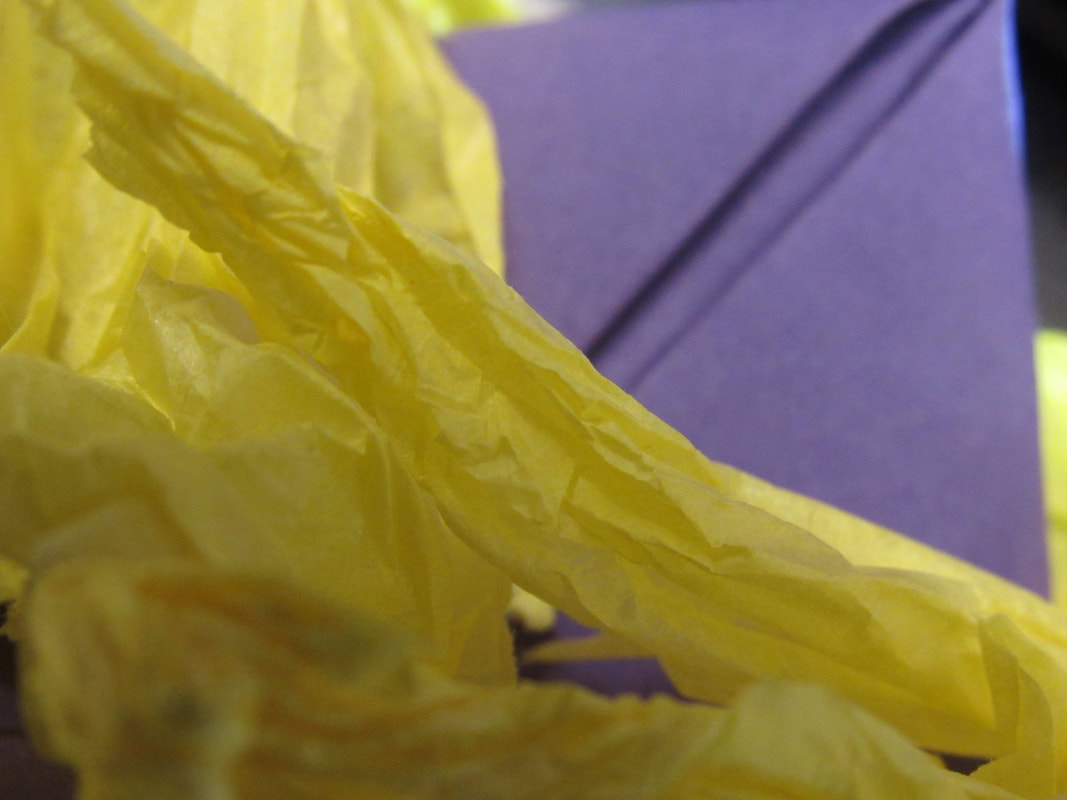
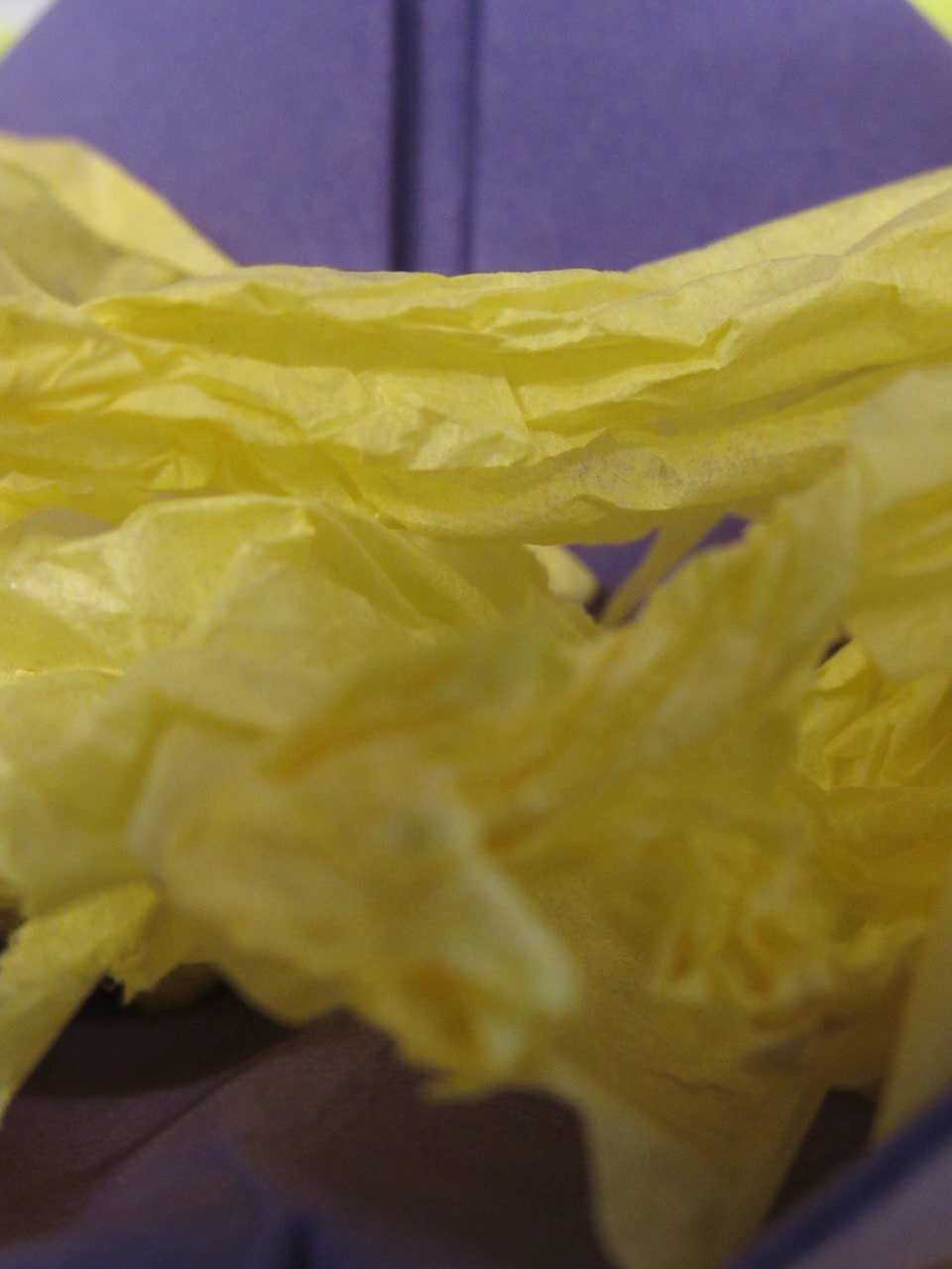
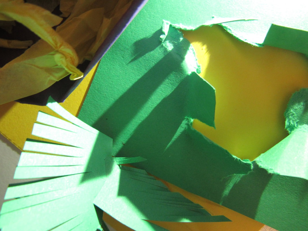
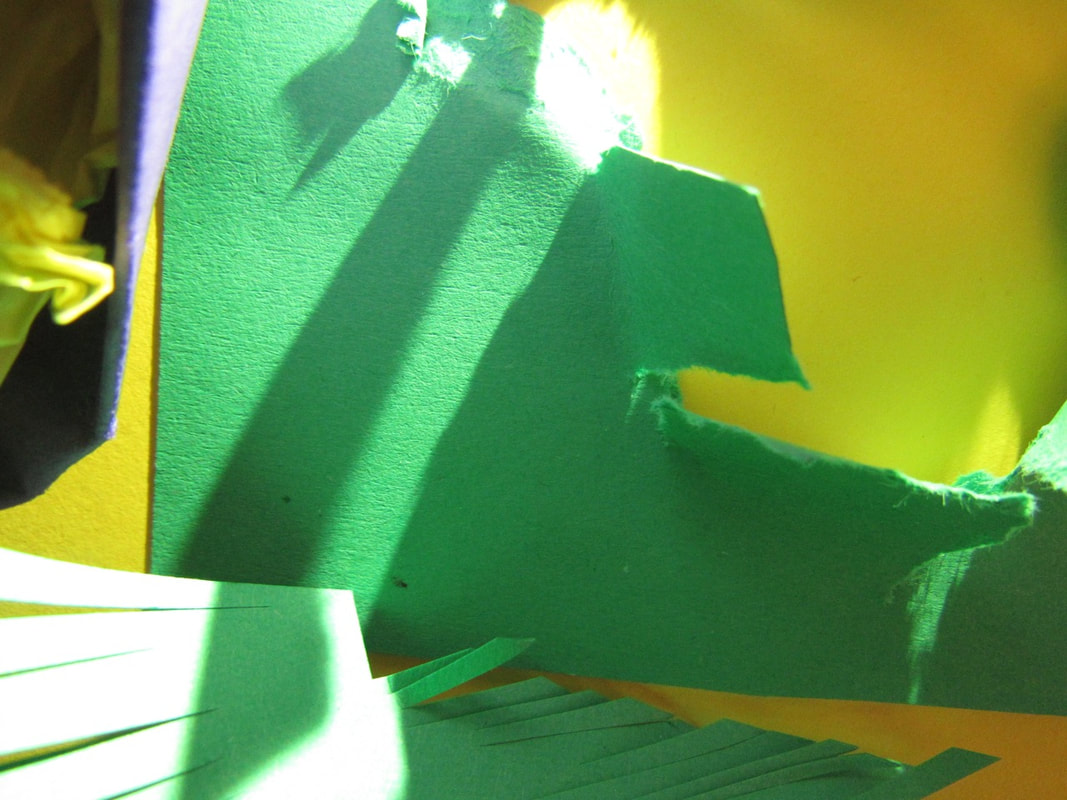
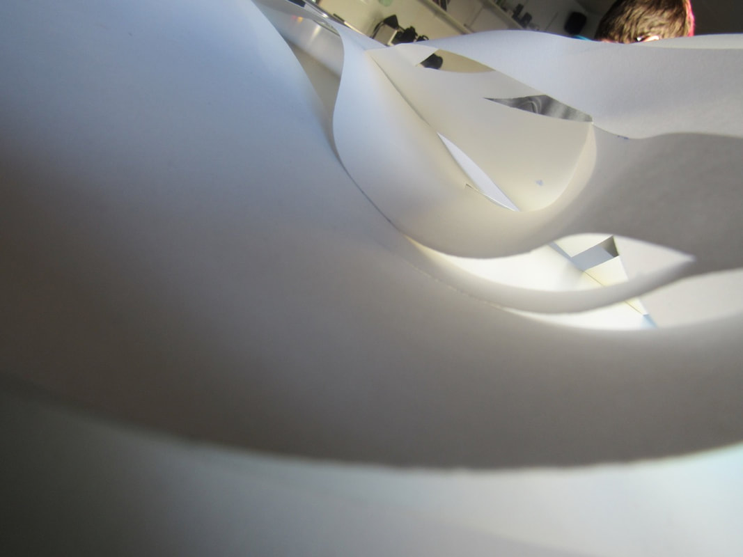
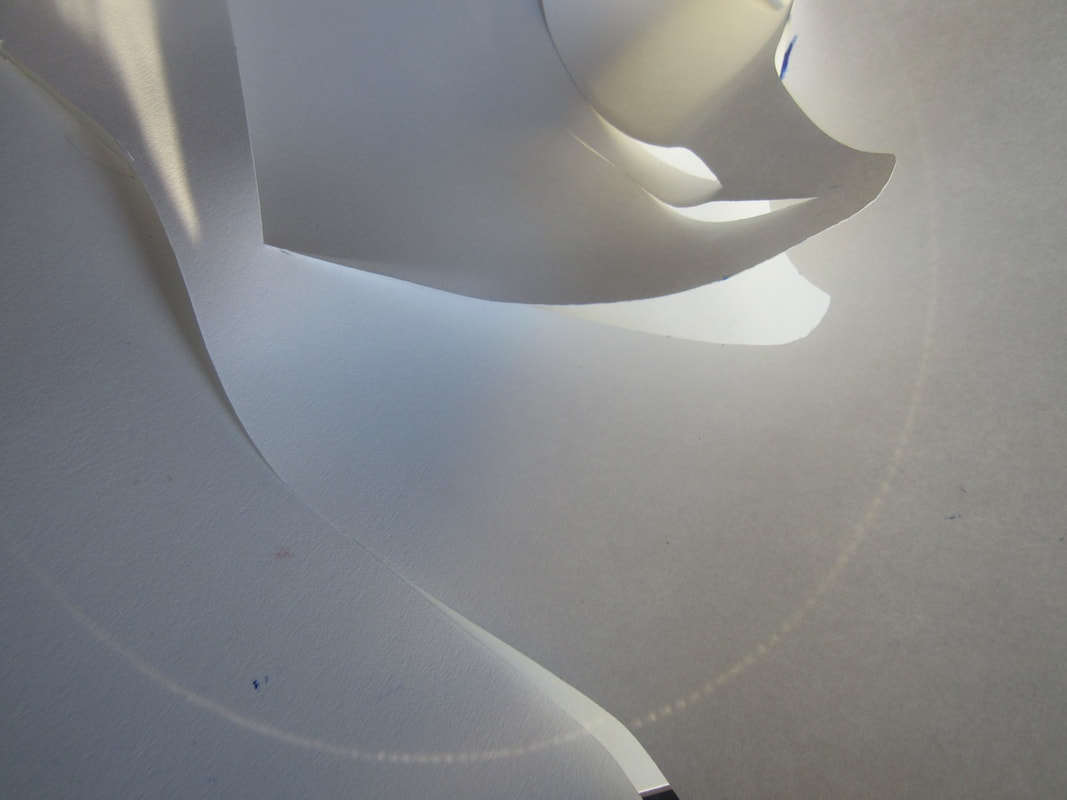
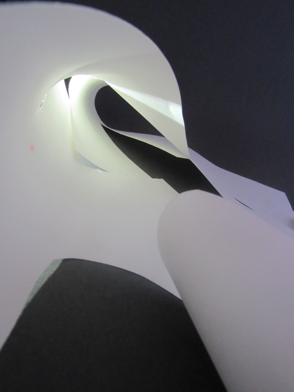
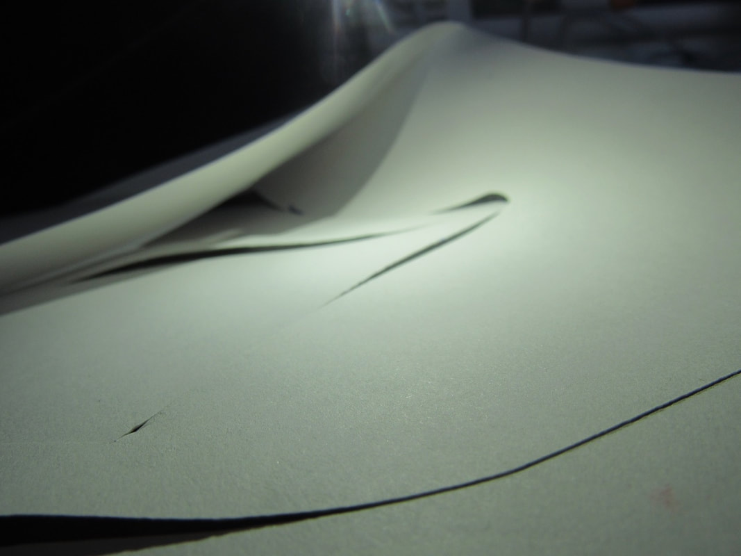
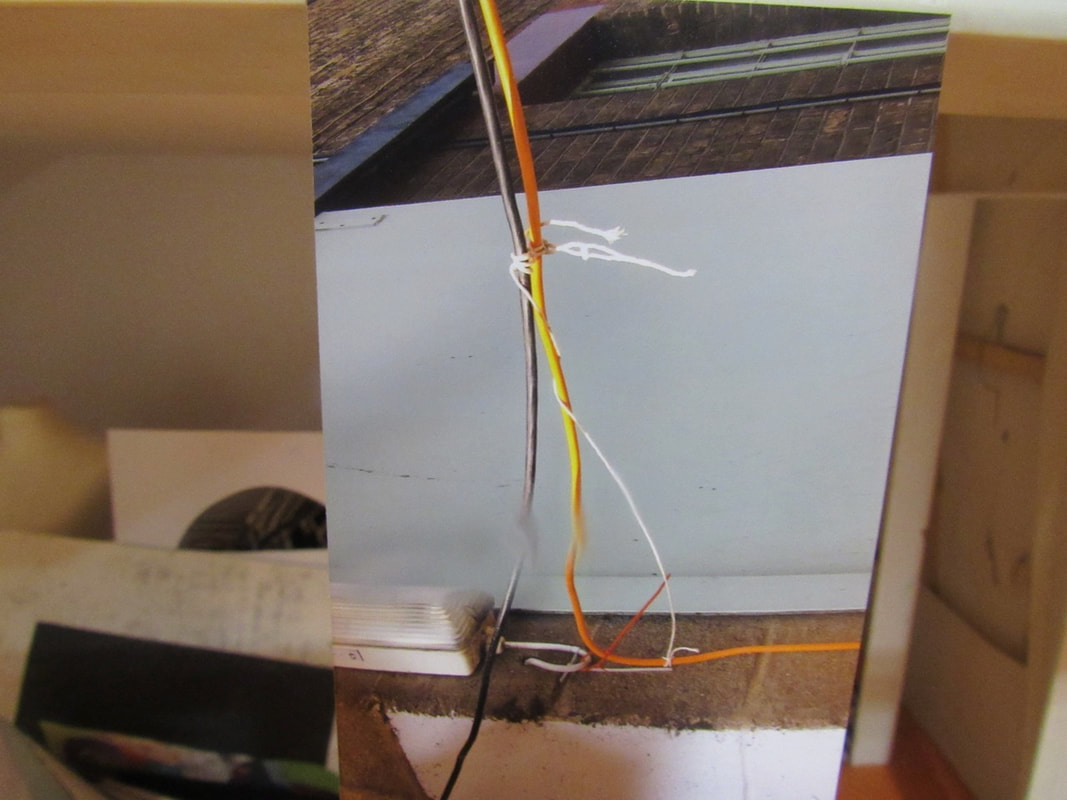
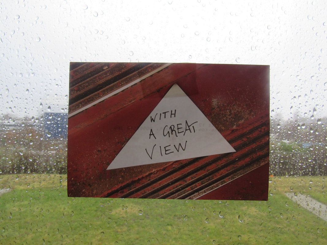
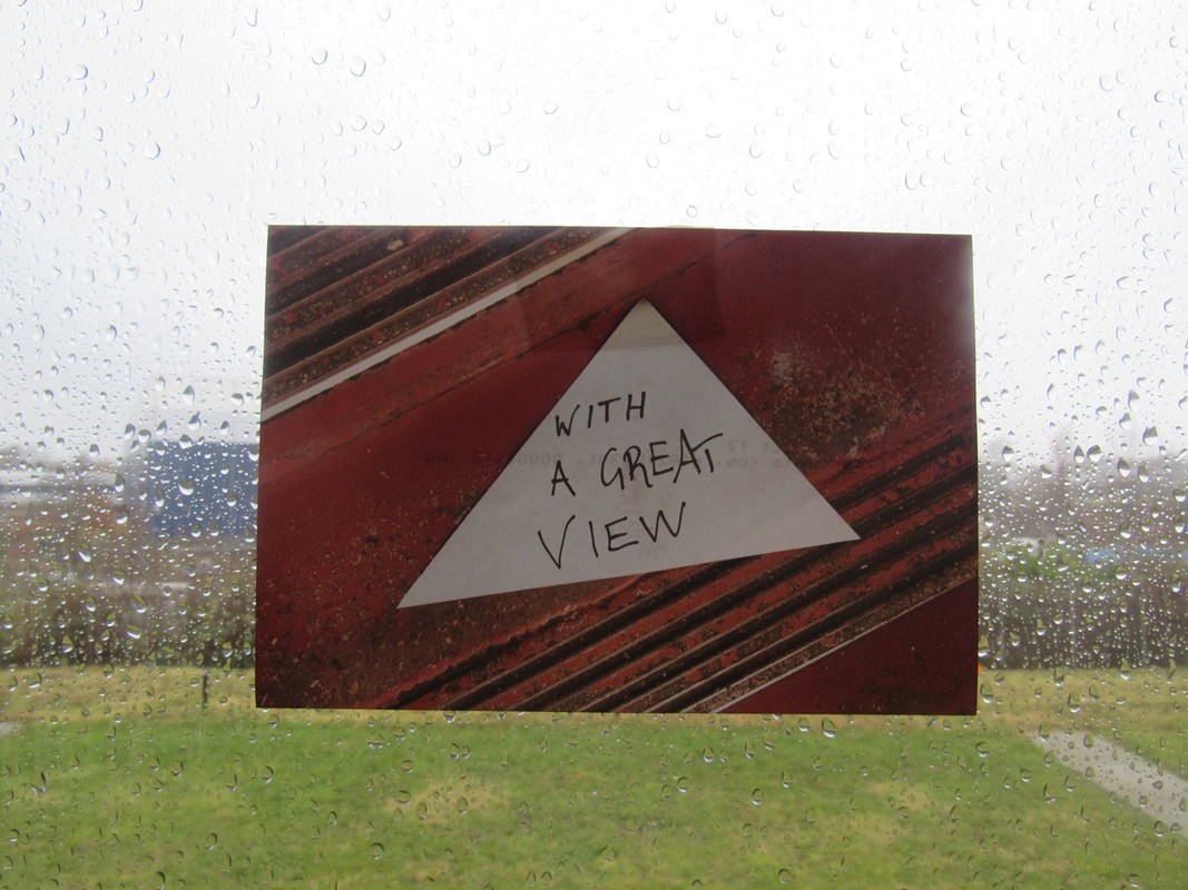
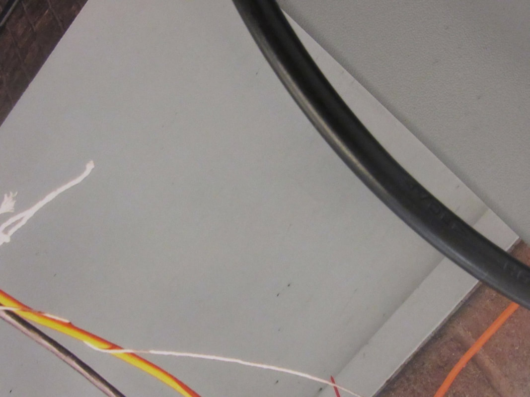
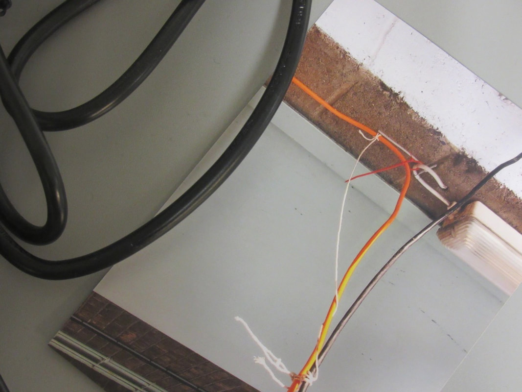
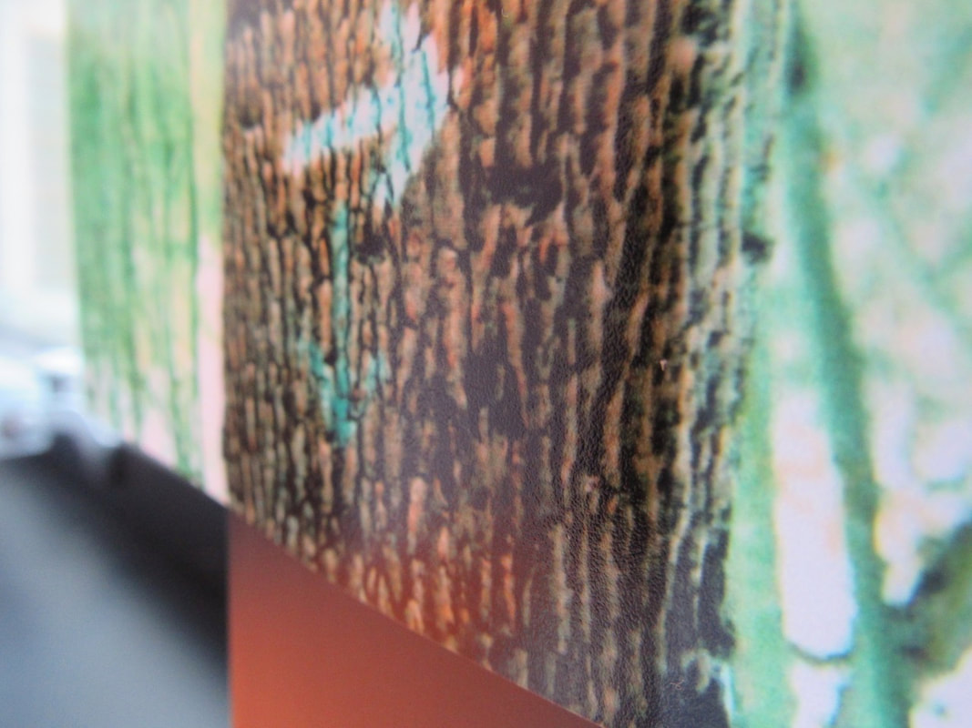
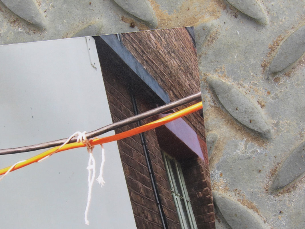
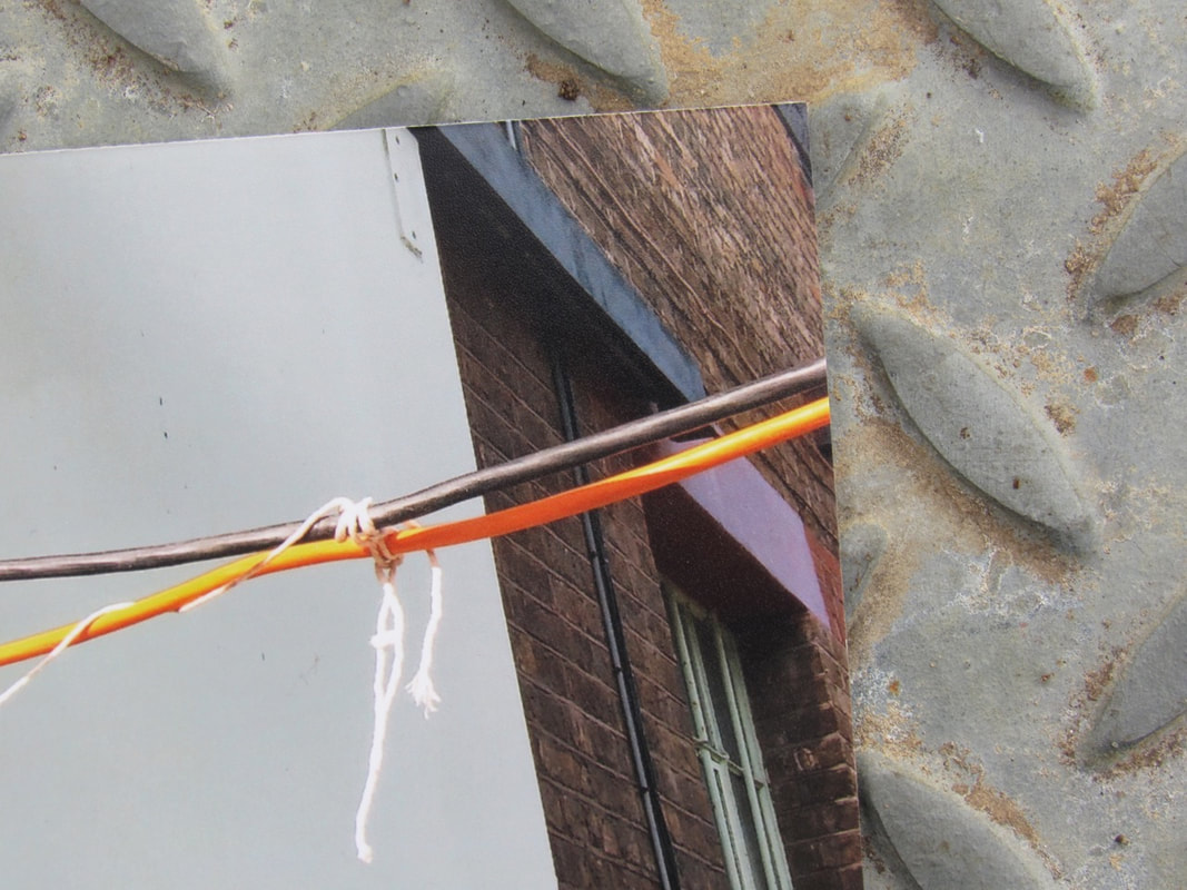
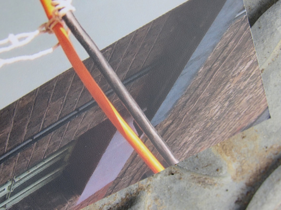
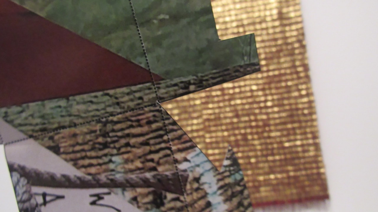
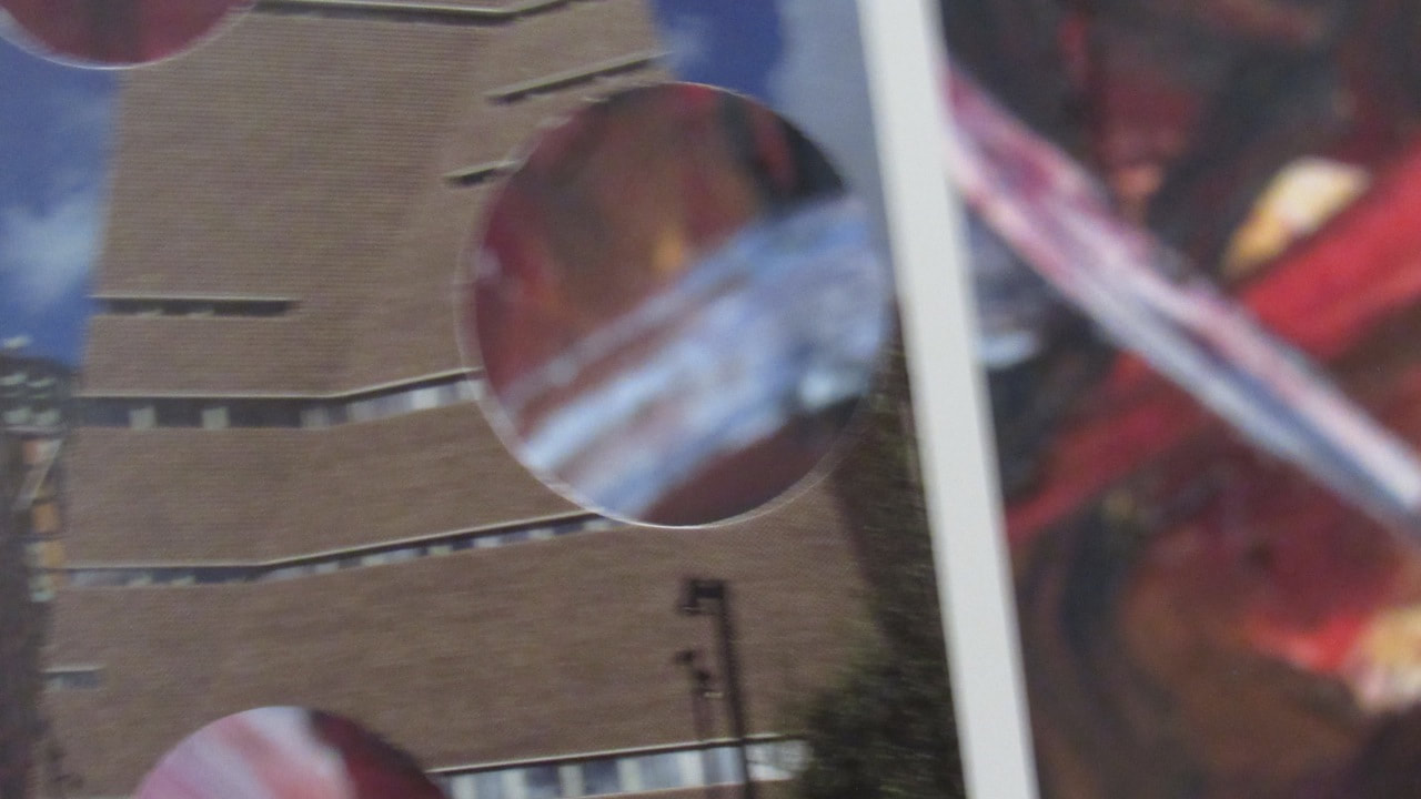
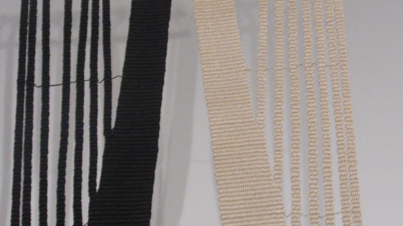
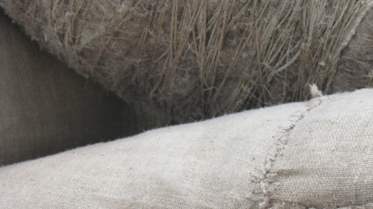
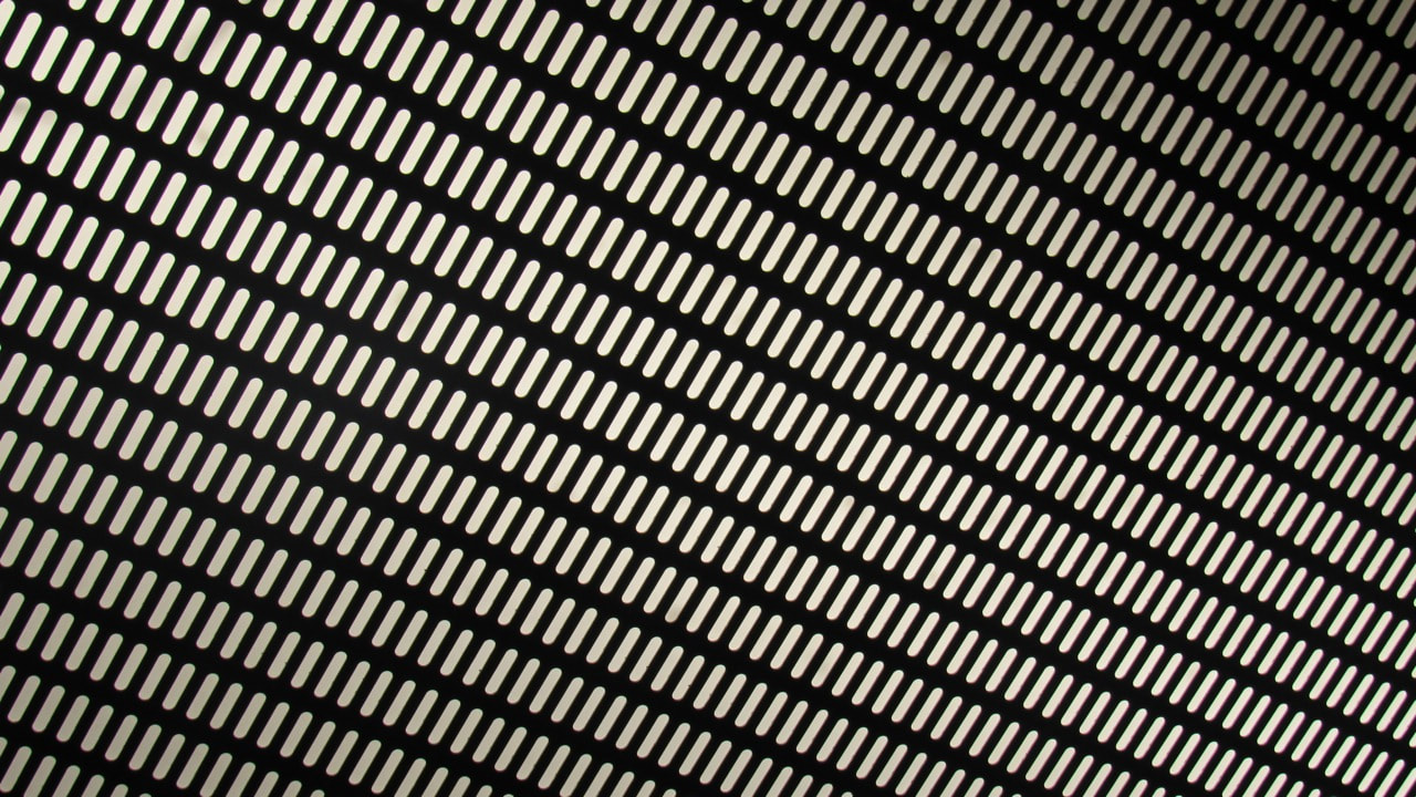
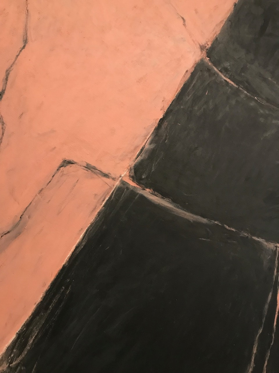
Paper Edges:
Non-photoshop:
Photoshop:


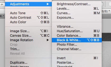
Photoshop Process:
This is the process I did with all the photos. For some of the pictures I had to change the process using more applications.
|
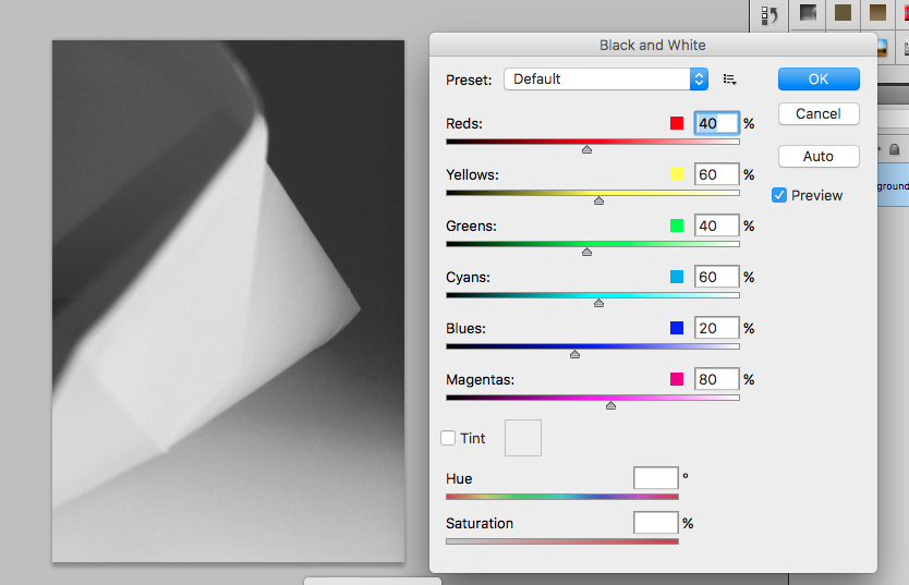
First I put the pictures in black and white.
Menu bar > Image > Adjustments > Black & White. I didn't changed the tones (second screenshot), because I worked with the tones using curves. |
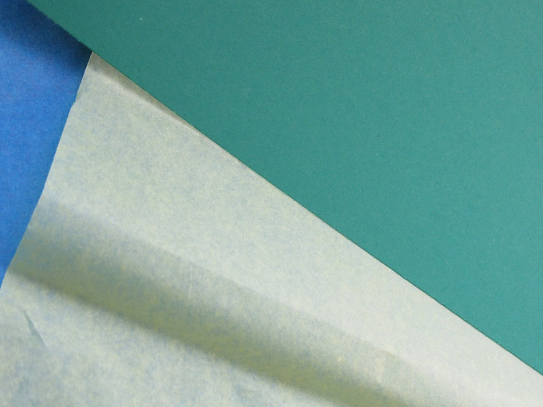
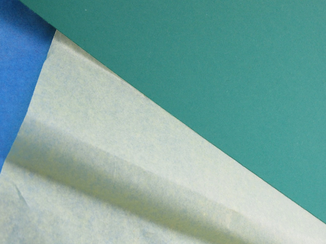
Paper Edges: |
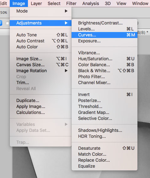
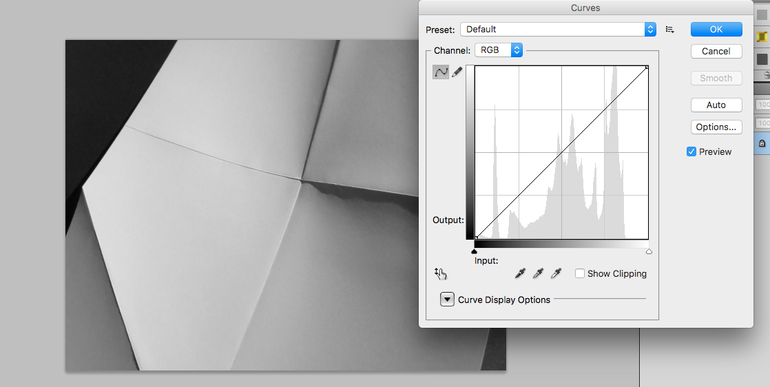
Then I changed the tones (white, black and grey) using curves.
Menu > Image > Adjustments > Curves. I cut some of the pictures to show specific edges.
The pictures that a cut: |


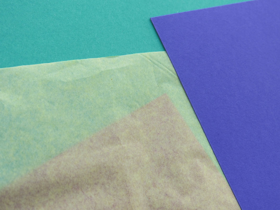


WWW & EBI:
You can clearly see the edges and some shadows, but I'd like to see more of these shadows and to try to do different shapes.
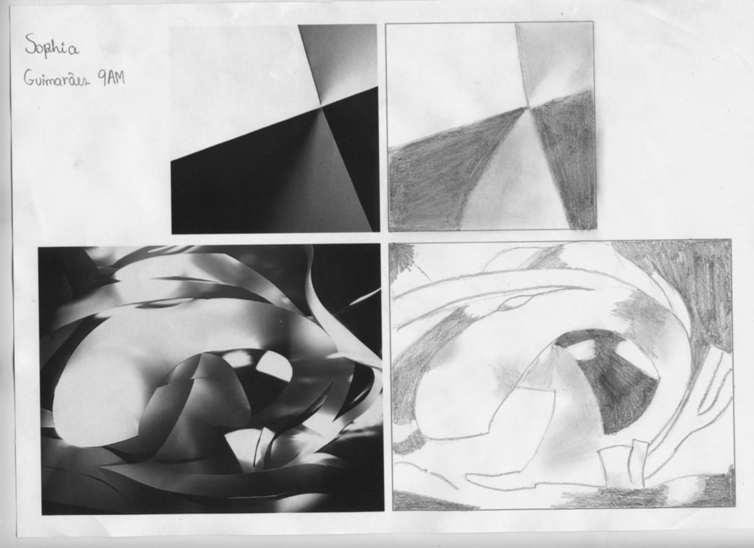
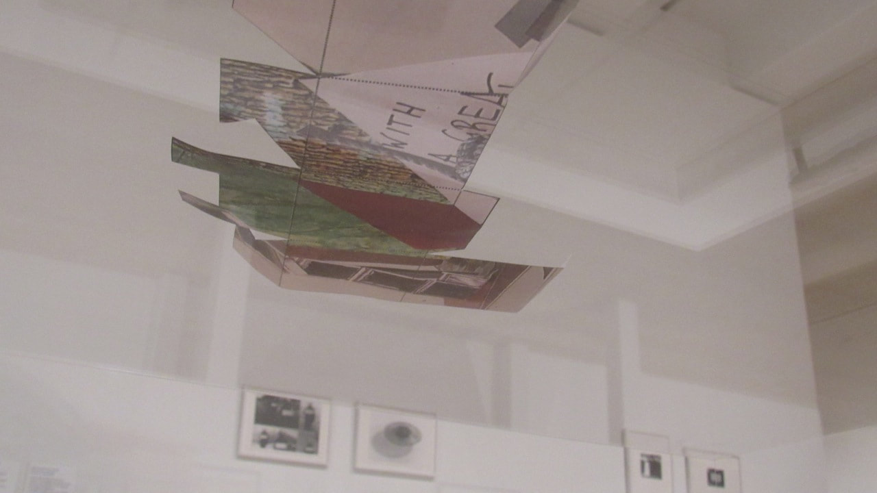
Drawing Paper Edges:
|
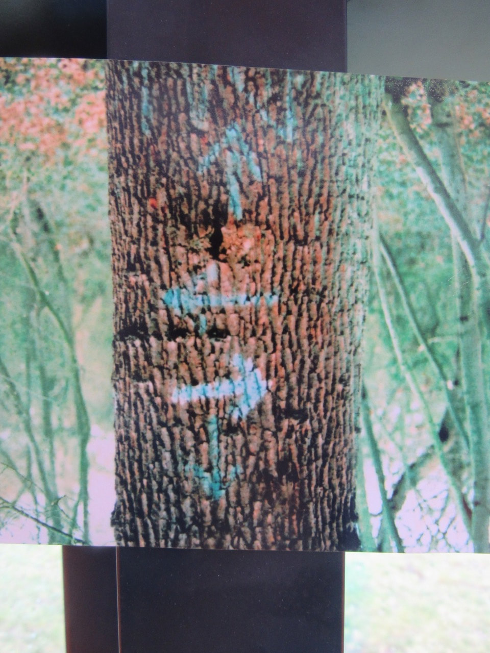
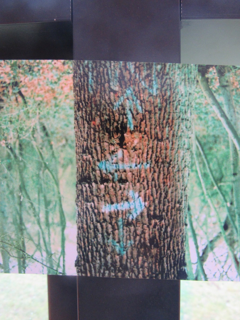
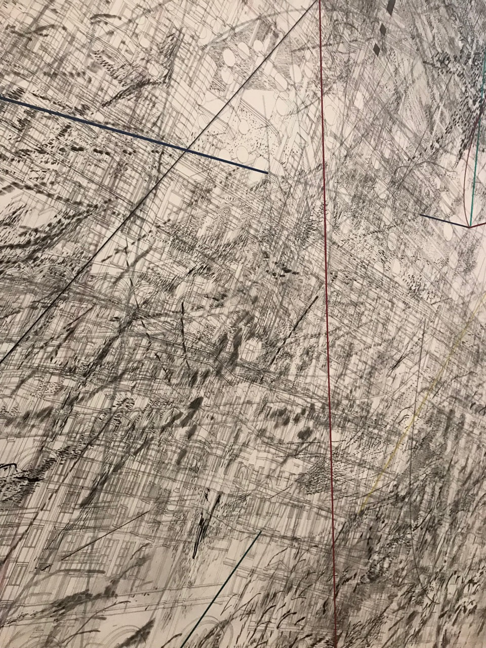
Last lesson Mr Nicholls said to us to look hard to two paper edges pictures and try to draw them. Our focus was in the shadows.
|
Edges Assessment:
We are doing a assessment relate with edges. It will take 6 hours (6 lessons [2 weeks]) to carry two parts.
Part 1 - re-photograph;
Part 2 - sculpture.
Part 1 - re-photograph;
Part 2 - sculpture.
Part One:
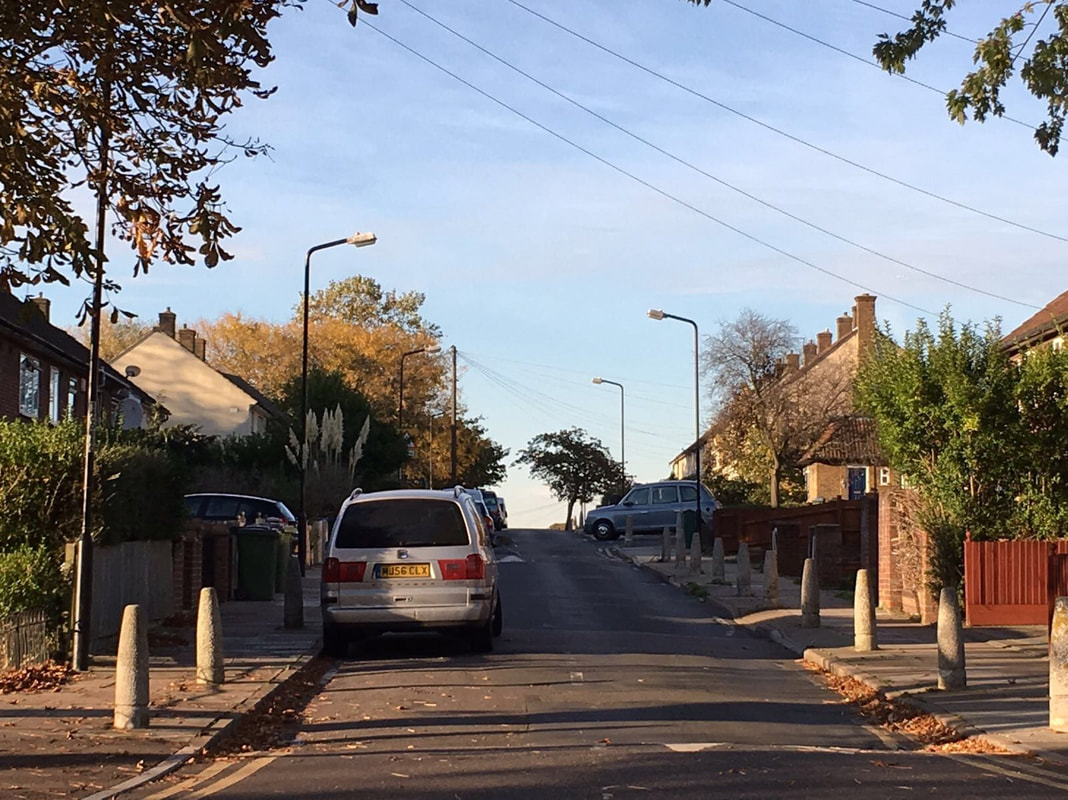
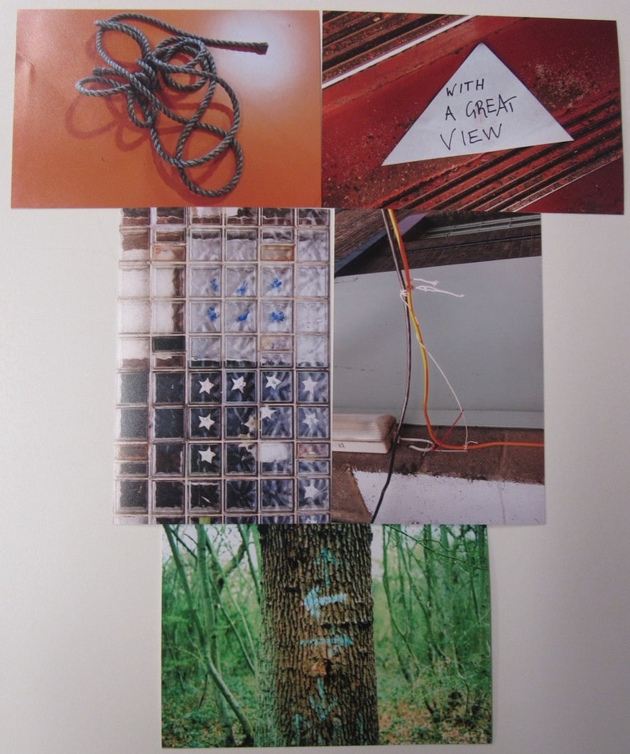
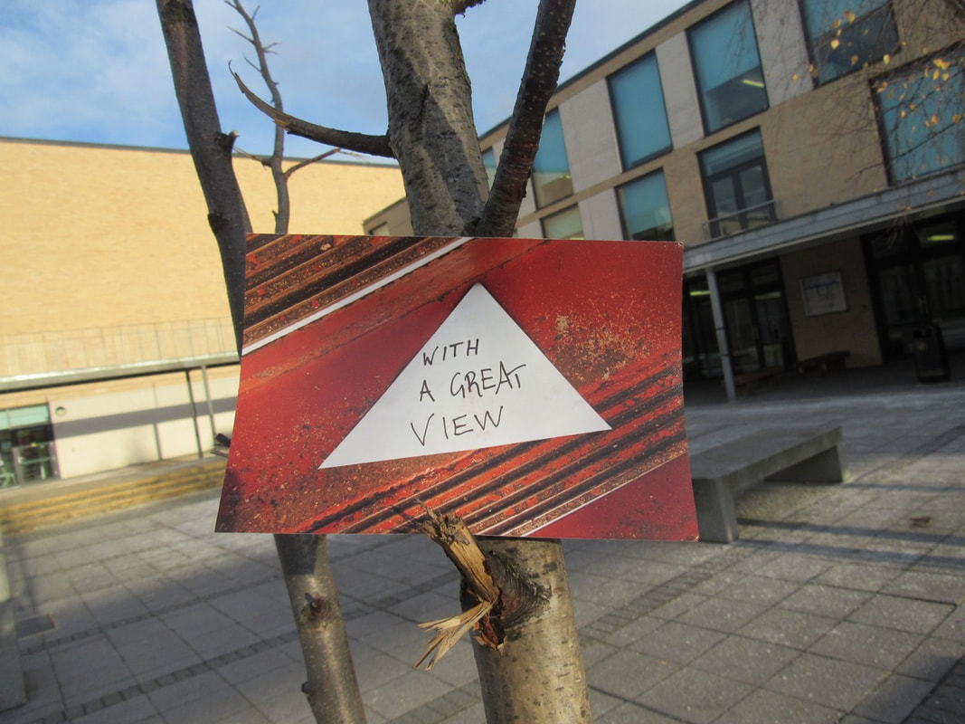
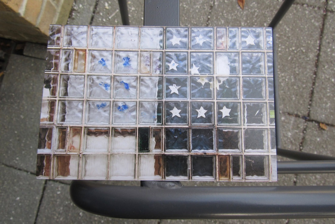
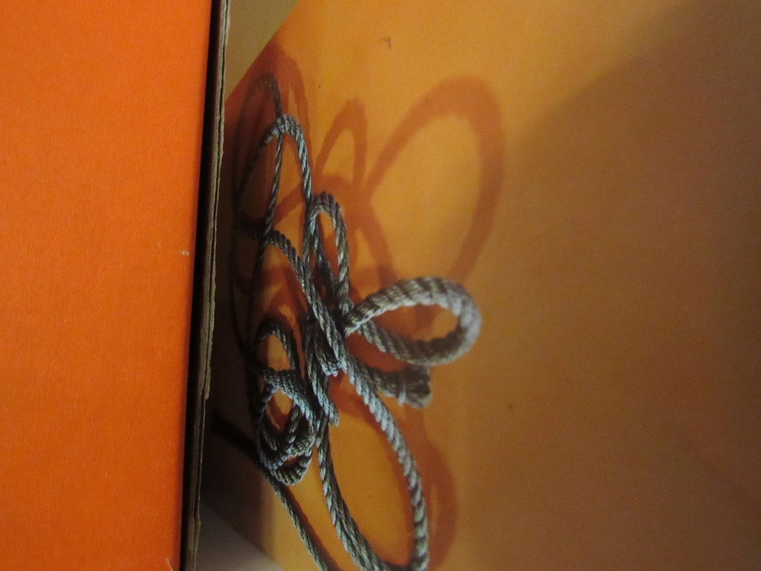
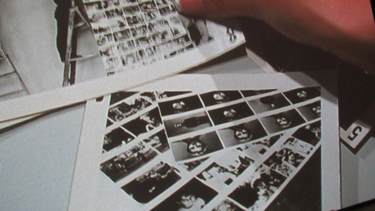
We chose 5 pictures that Mr. Nicholls took and photograph them to made a new picture.
I chose these ones:
We chose 5 pictures that Mr. Nicholls took and photograph them to made a new picture.
I chose these ones:
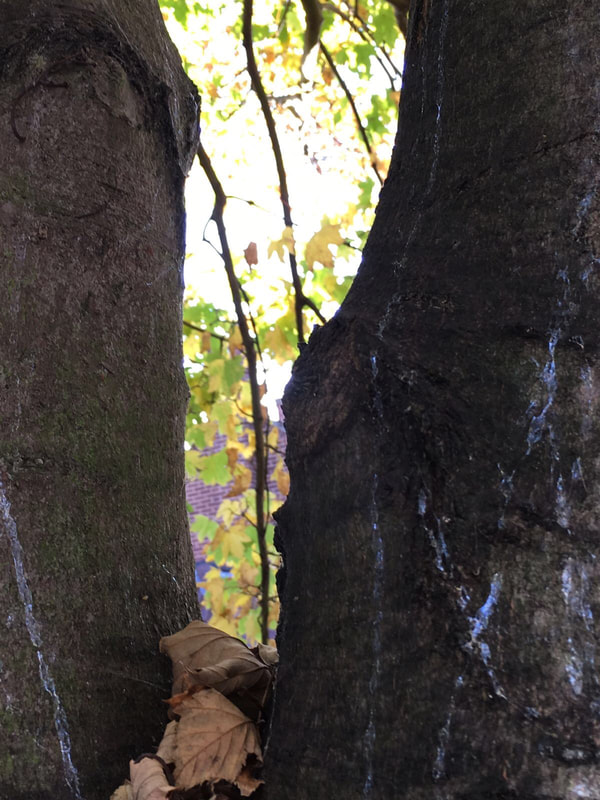
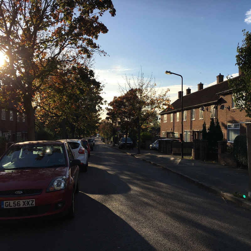
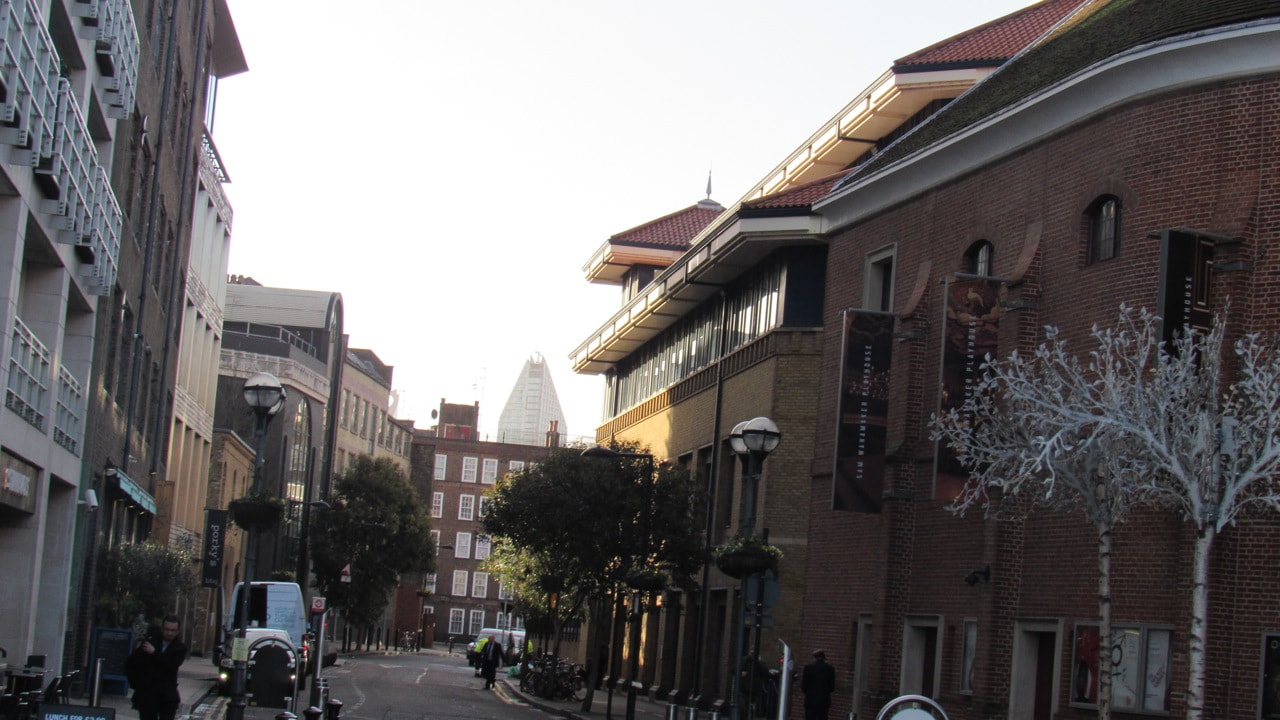
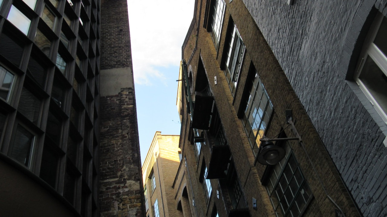
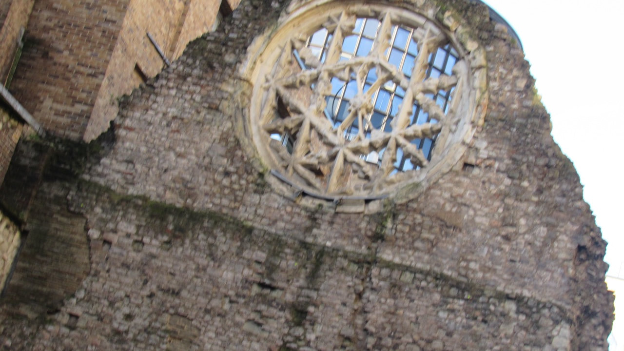
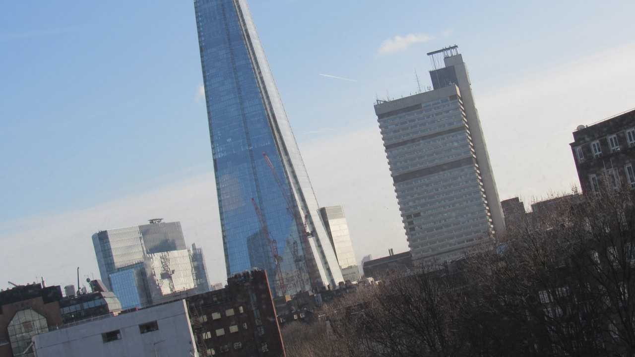
I like the edges and the colours. I had some ideas right when I looked to the pictures. Then, we went around the school to take a few pictures.
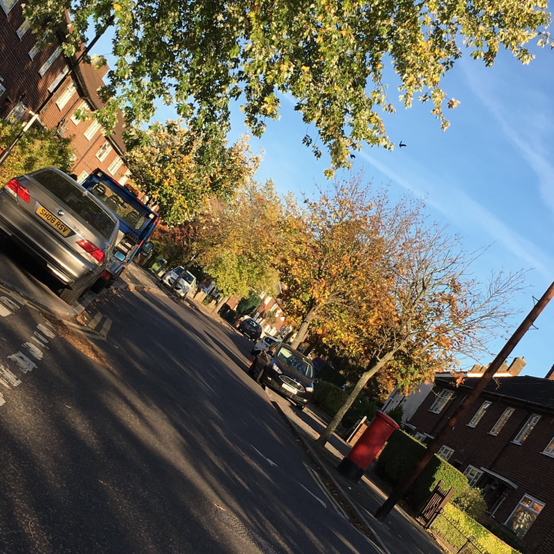
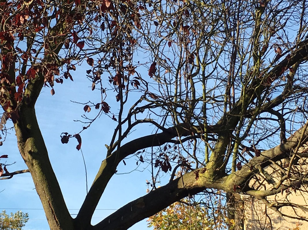
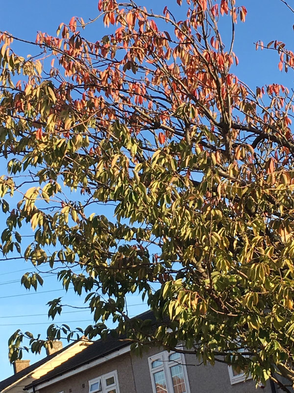
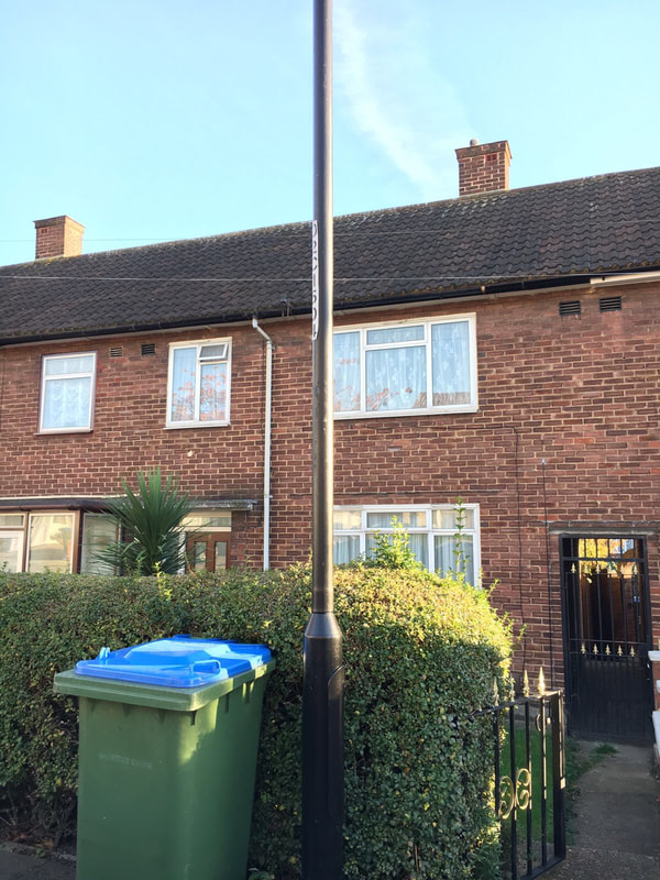
I tried to find places in school that "contrasted" with the colours in the pictures.
These are mine:
I tried to find places in school that "contrasted" with the colours in the pictures.
These are mine:
Evaluating:
WWW&EBI: I think I chose good locations to take the pictures, but I'd like to take more. I'd like to try other camera and/or light angels was well.
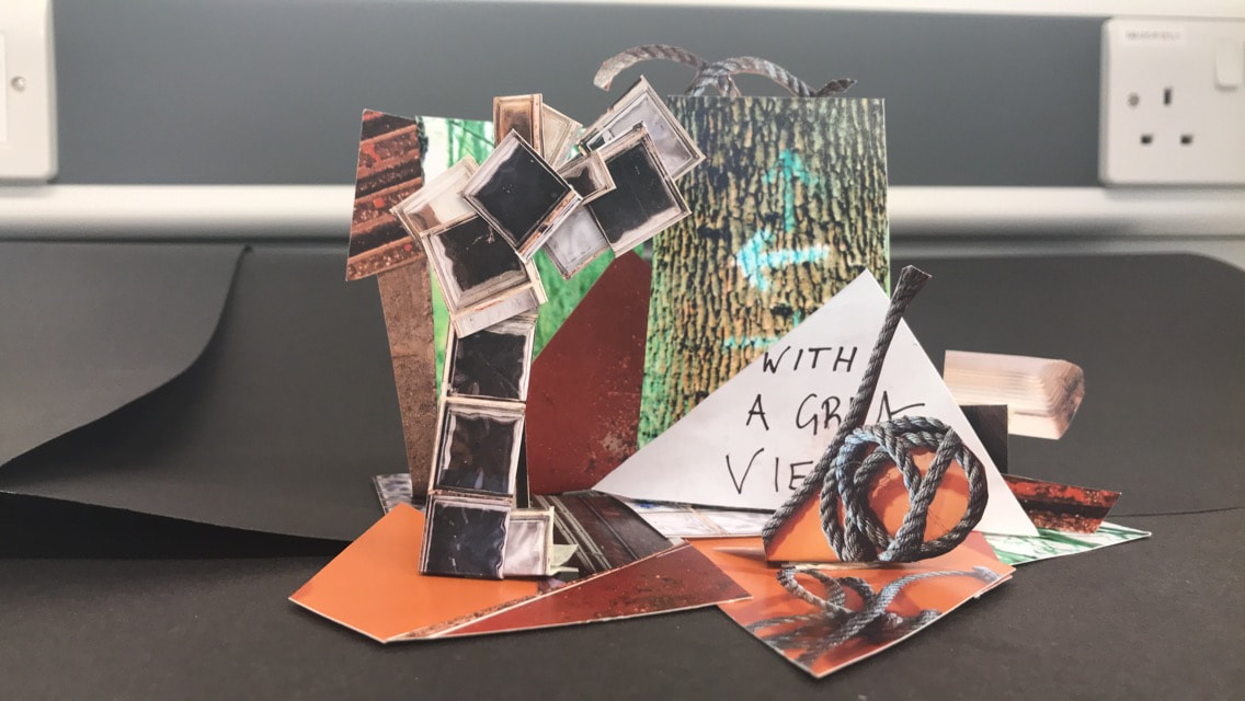
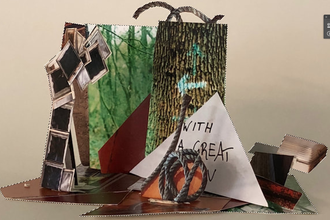
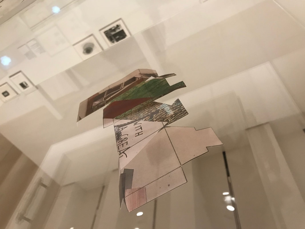
Part Two:
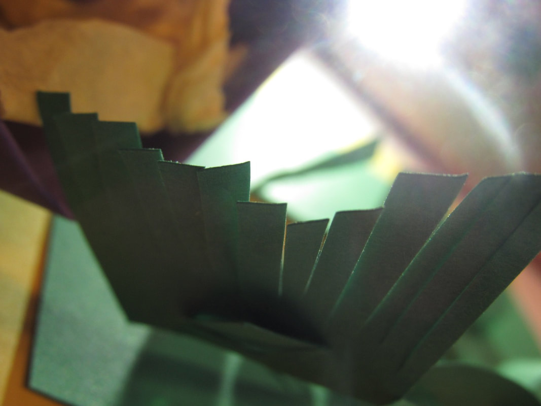
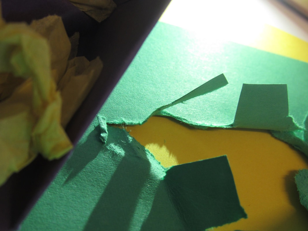
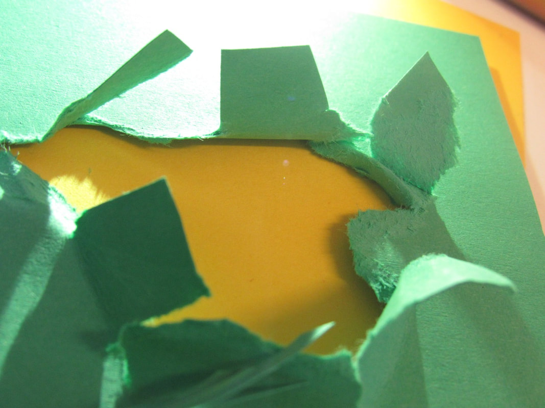
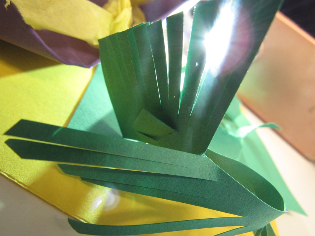
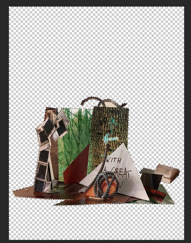
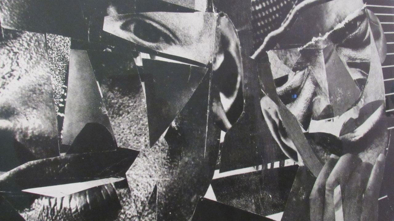
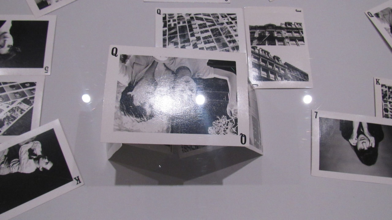
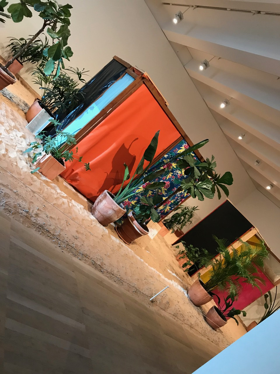
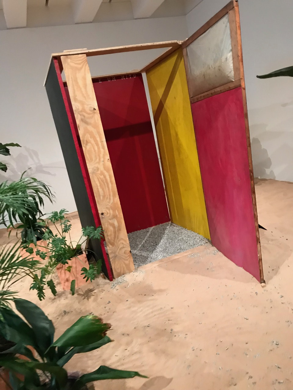
Now we are in the final part of the assessment. For this activity we need to create a photo-sculpture using just the 5 pictures we chose. Every single piece count.
We used just tape and scissors.
We used just tape and scissors.
To do the sculpture we cut all the pictures. It doesn't to be in a specific way. No answer is wrong.
For the base of the sculpture, some people used a single picture, but I had a go using different pieces to create it. I took all the pieces I wouldn't use in the sculpture to make the base.
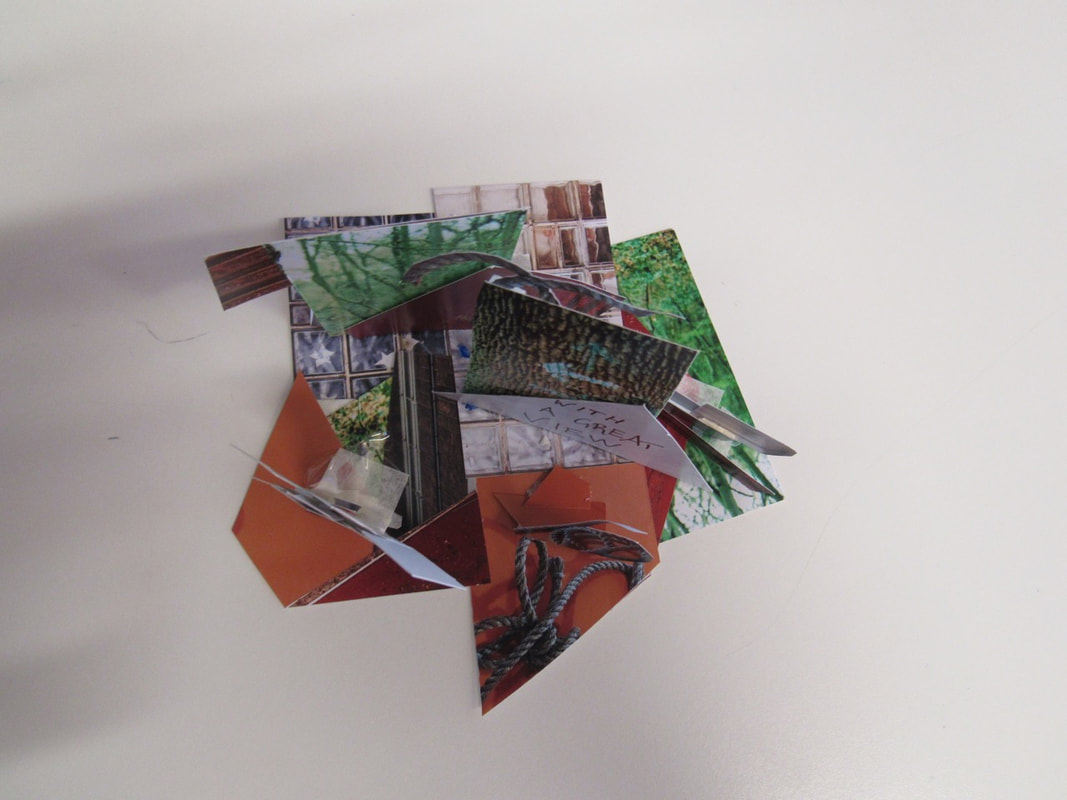
I didn't have a plan to do the activity. I tried different cuts and different ways to put the pieces up.
I really like how it looks. I think I did a good work!
I really like how it looks. I think I did a good work!
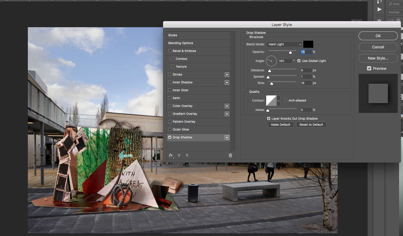
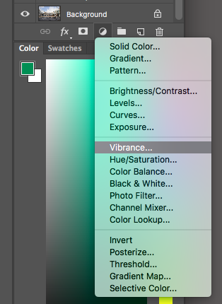
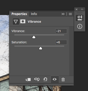
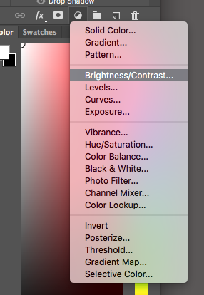
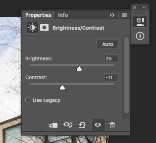
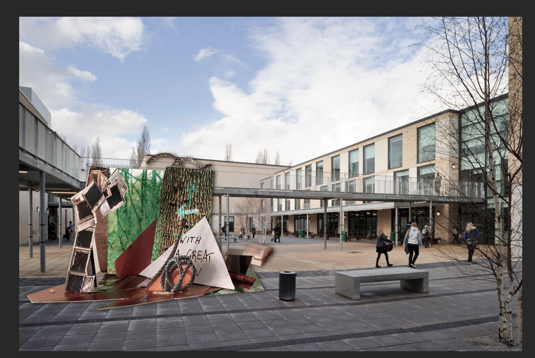
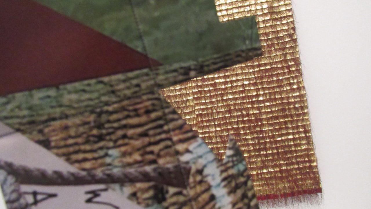
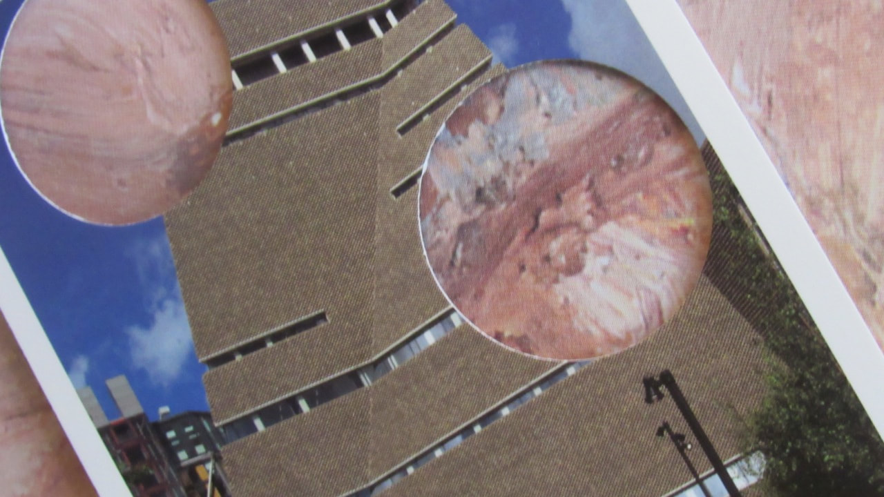
Photoshop:
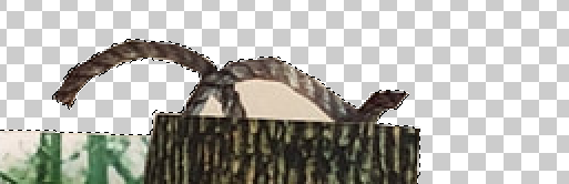
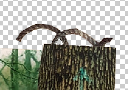
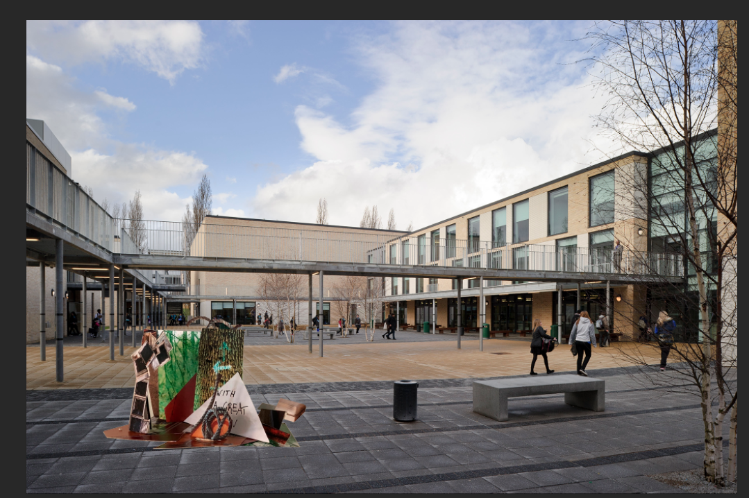
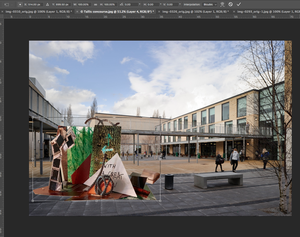
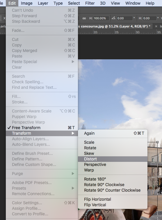
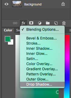
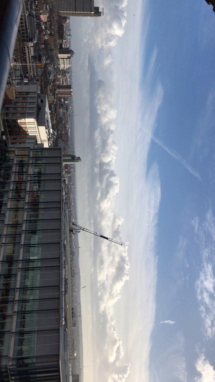
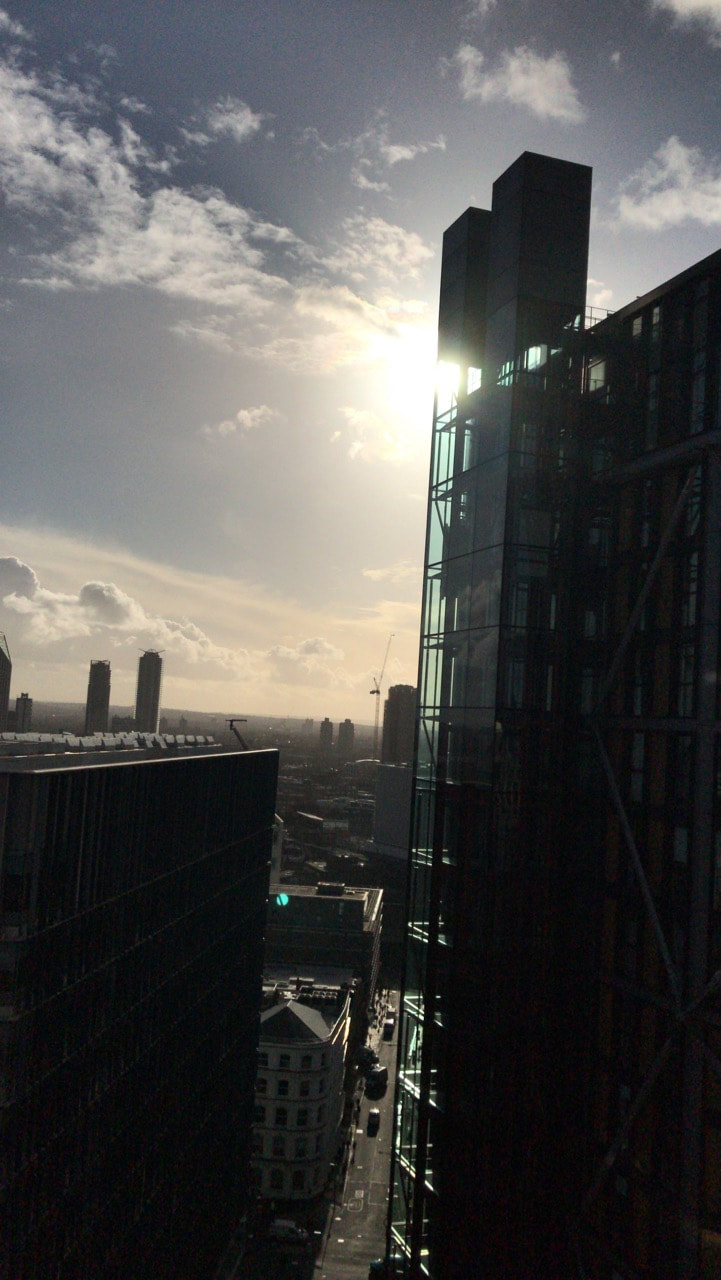
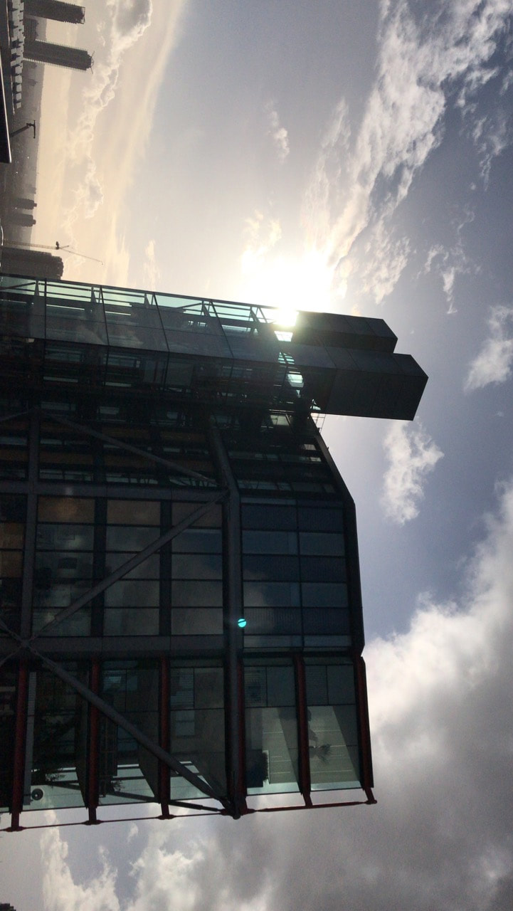
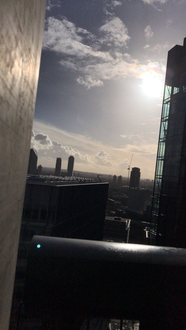
Mr. Nicholls gave us a task related to photoshop. We were ask to put our photo-sculptures somewhere in school using photoshop.
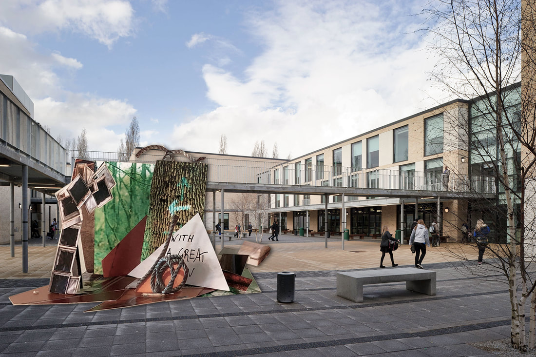
Process:


Evaluating: |
WWW&EBI: I've used photoshop so many times before, so I have a bit of confidence using it, but I think I can improve my editing skills by learning how to use more tools.
Edges Comparison:
|
|
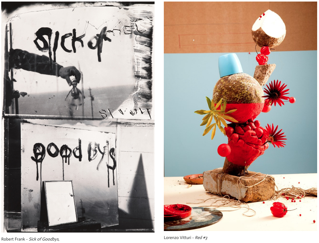
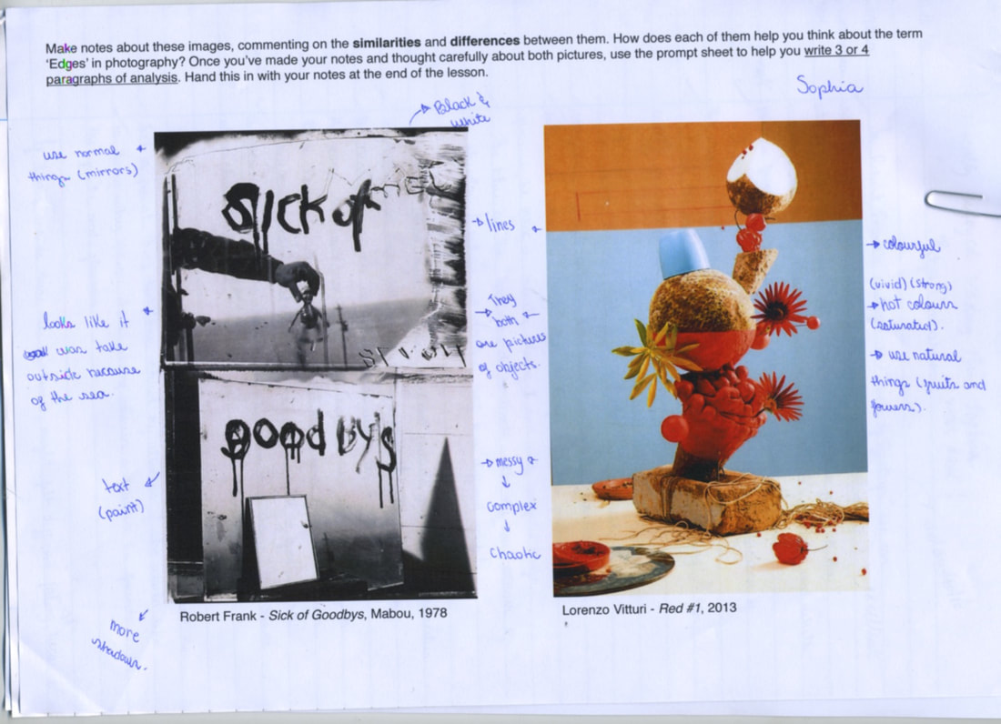
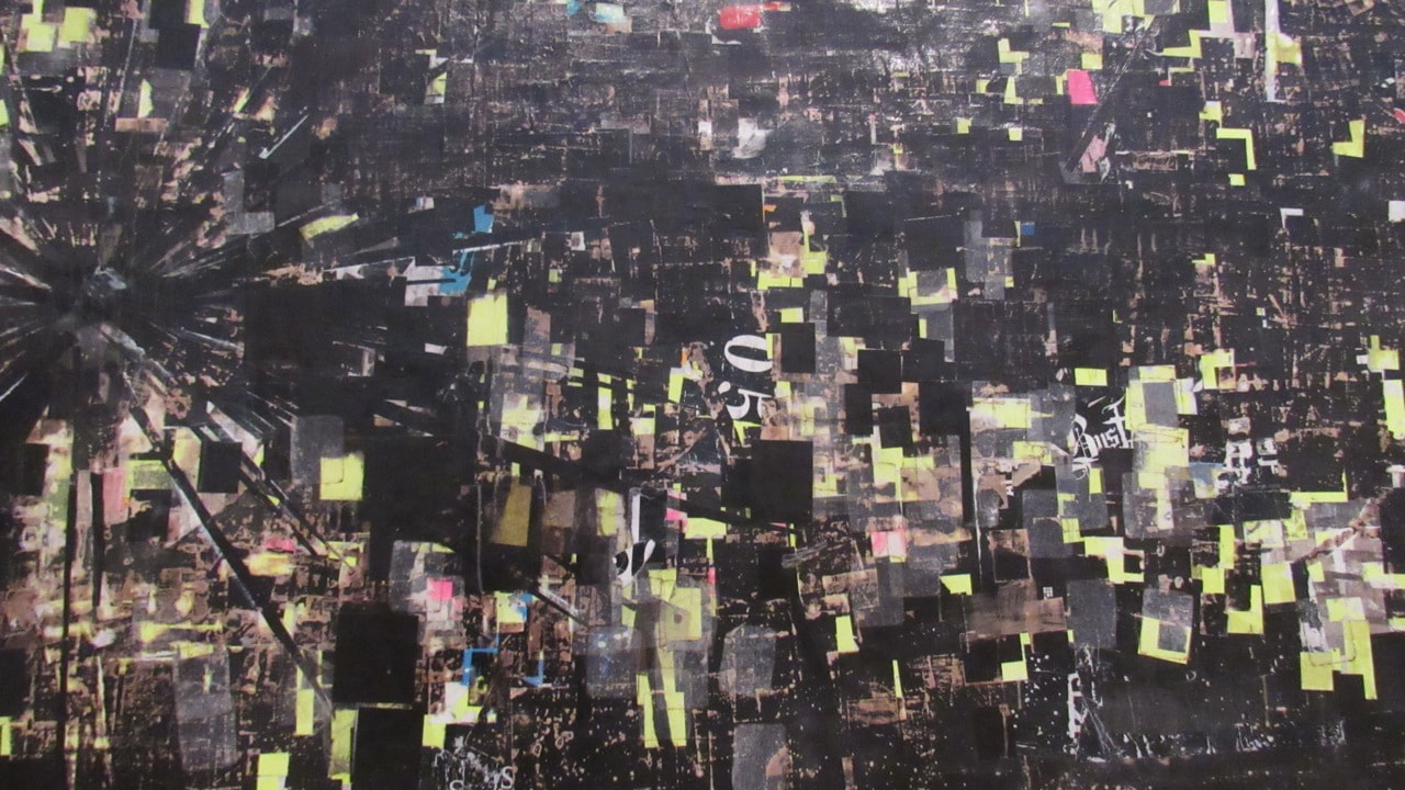
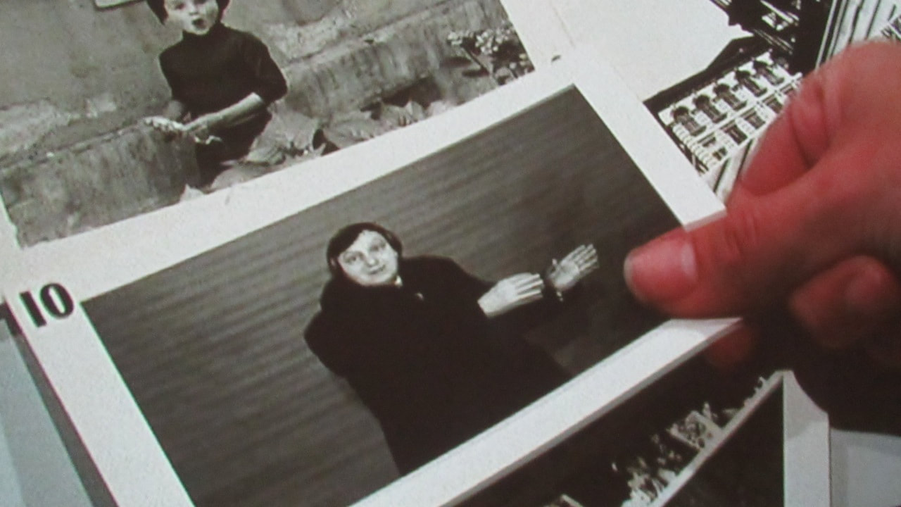
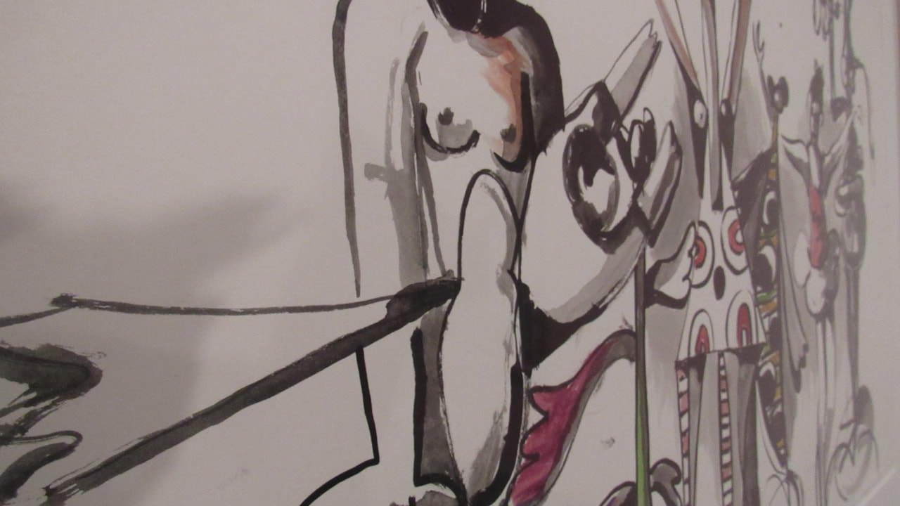
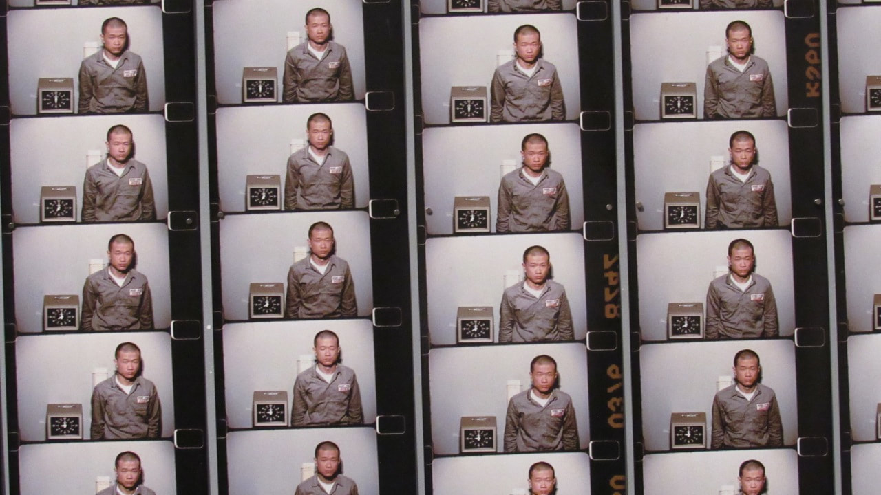
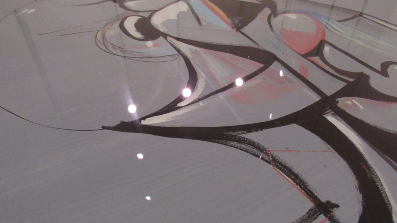
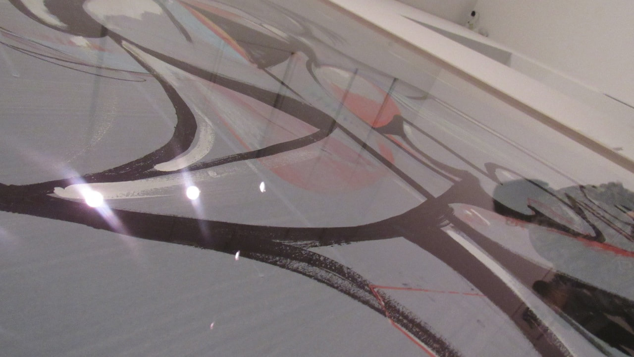
Robert Frank's photograph - "Sick of Goodbys" is a complex and chaotic picture. It has a melancholic atmosphere. The phrase "sick of goodbys" write in paint on the mirrors, the use of shadows and the fact that it's a black and white picture give us this sad feeling.
It could be describe as a landscape photograph, because of the sea in the background of the top image. I think the text in paint on the mirrors is really interesting. It can catch our attention and make us think about it.
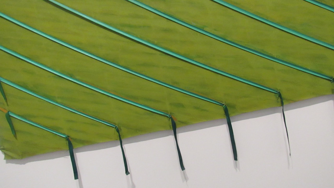
Lorenzo Viturri's photograph - "Red 1" is a completely different picture. Viturri chose a variety of saturated and warm colours. Using natural things such as fruits and flowers, he made a really colourful and also, complex image.The blue at the "background" contrast with the vivid colours of the objects. It catches our attention, but in a different way.
However, these two completely different pictures have their similarities. They both have lines and really specific edges. Frank's picture has the sea line which is very similar with the table line or the orange line in Viturri's picture. They also are made using objects. Frank using mirrors and Viturri using fruits and flowers.
They have different as well. "Sick of Goodbys" has a sadder atmosphere, but "Red 1" has a happier and vibrant atmosphere.
I'd like to know why Frank chose mirrors and why he wrote the text in paint and specifically on the mirrors . These two points catched my attention. I also would like to know why Viturri chose strong colours and where he founds the fruits and flowers.
If I was inside Frank's pictures, I might felt depressed and sad, because his picture has this sad feeling. Viturri's picture has a happier feeling, might making me felt excited and "warm".
Honestly, I think Frank's picture is more interesting. It has the idea of death and it's really questionable, because we don't know what happened to him. I also think photography is a good way to express your feelings and thoughts. Apparently, Frank thinks the same thing as me, because his photograph is clearly a representation of his feelings.
Photographs can show us a lot about the person behind that picture. So, with this picture we can see a little bit about Robert Frank and Lorenzo Viturri.
It could be describe as a landscape photograph, because of the sea in the background of the top image. I think the text in paint on the mirrors is really interesting. It can catch our attention and make us think about it.
Lorenzo Viturri's photograph - "Red 1" is a completely different picture. Viturri chose a variety of saturated and warm colours. Using natural things such as fruits and flowers, he made a really colourful and also, complex image.The blue at the "background" contrast with the vivid colours of the objects. It catches our attention, but in a different way.
However, these two completely different pictures have their similarities. They both have lines and really specific edges. Frank's picture has the sea line which is very similar with the table line or the orange line in Viturri's picture. They also are made using objects. Frank using mirrors and Viturri using fruits and flowers.
They have different as well. "Sick of Goodbys" has a sadder atmosphere, but "Red 1" has a happier and vibrant atmosphere.
I'd like to know why Frank chose mirrors and why he wrote the text in paint and specifically on the mirrors . These two points catched my attention. I also would like to know why Viturri chose strong colours and where he founds the fruits and flowers.
If I was inside Frank's pictures, I might felt depressed and sad, because his picture has this sad feeling. Viturri's picture has a happier feeling, might making me felt excited and "warm".
Honestly, I think Frank's picture is more interesting. It has the idea of death and it's really questionable, because we don't know what happened to him. I also think photography is a good way to express your feelings and thoughts. Apparently, Frank thinks the same thing as me, because his photograph is clearly a representation of his feelings.
Photographs can show us a lot about the person behind that picture. So, with this picture we can see a little bit about Robert Frank and Lorenzo Viturri.
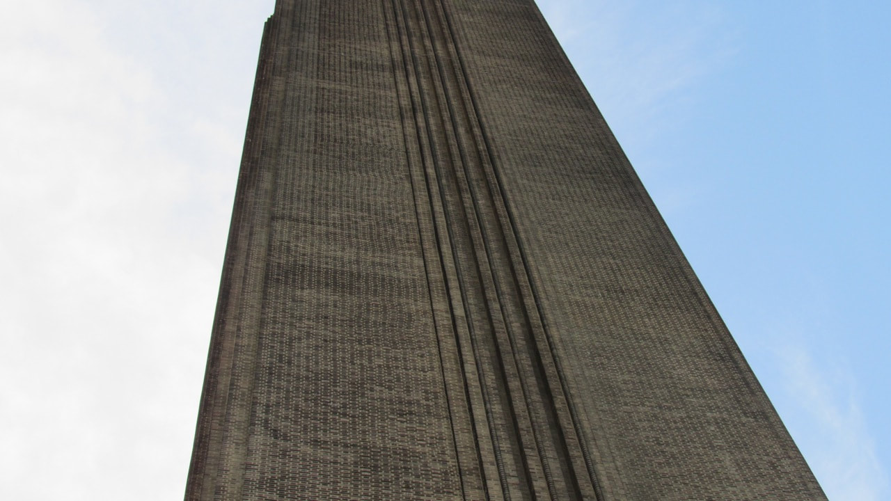
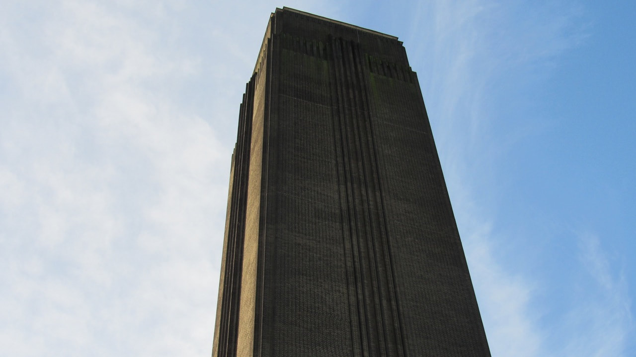
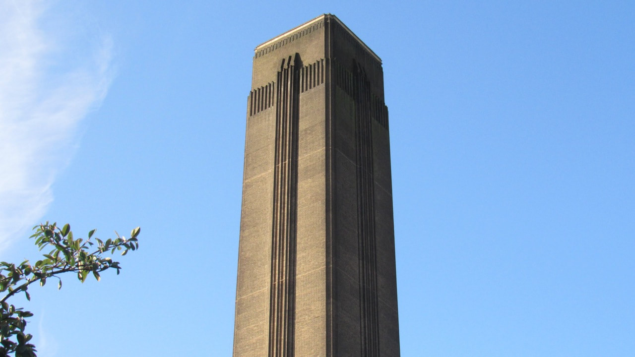
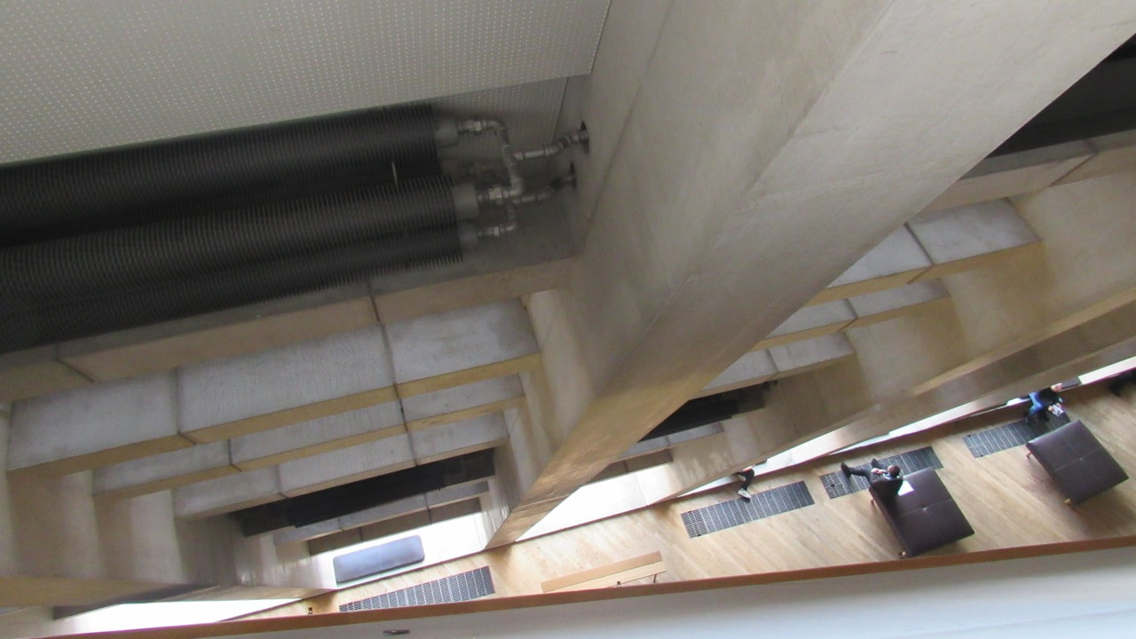
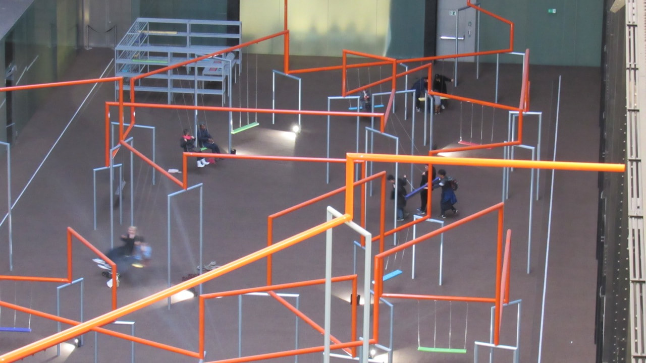
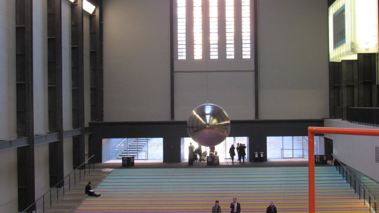
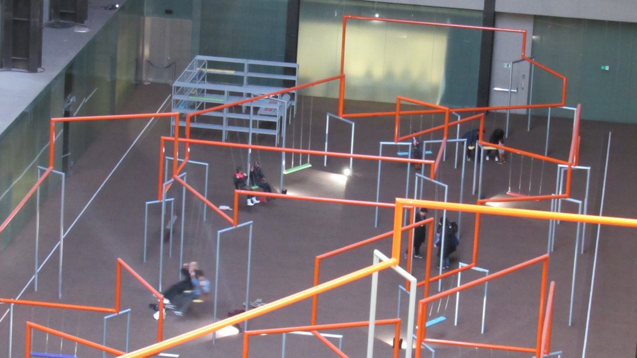
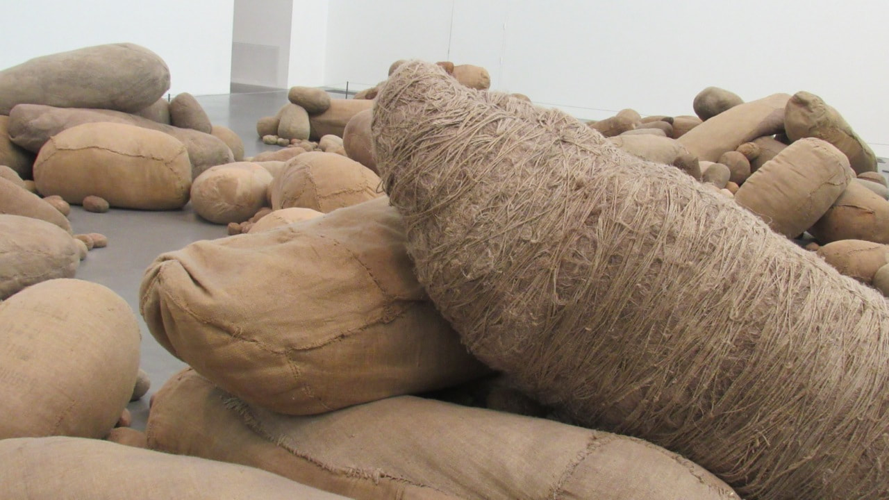
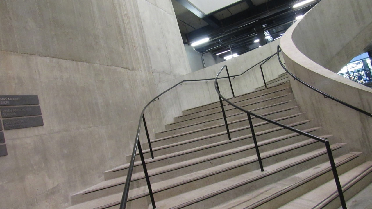
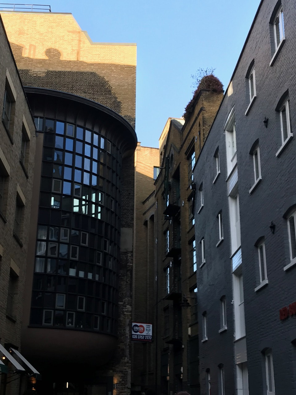
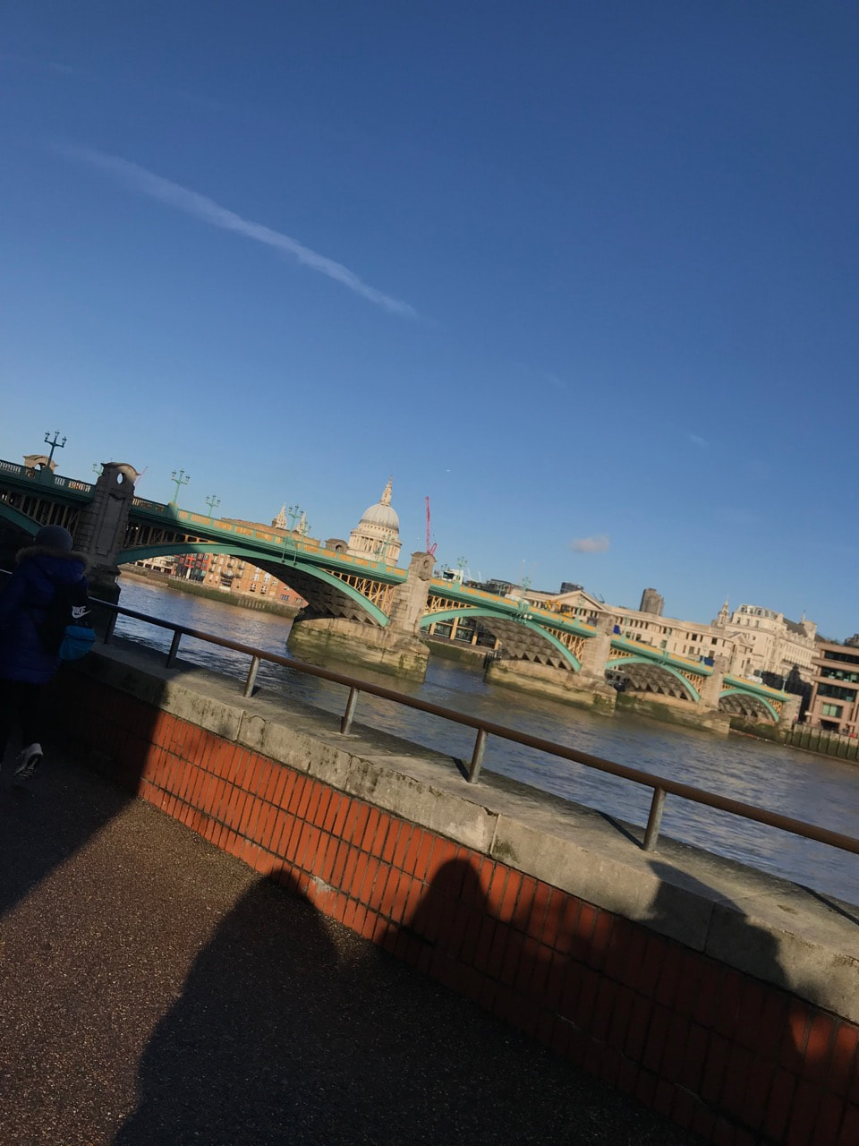
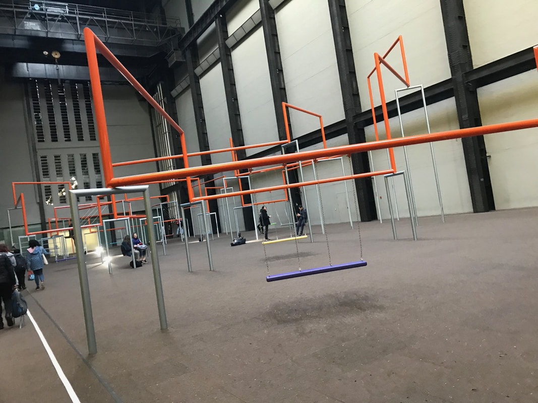
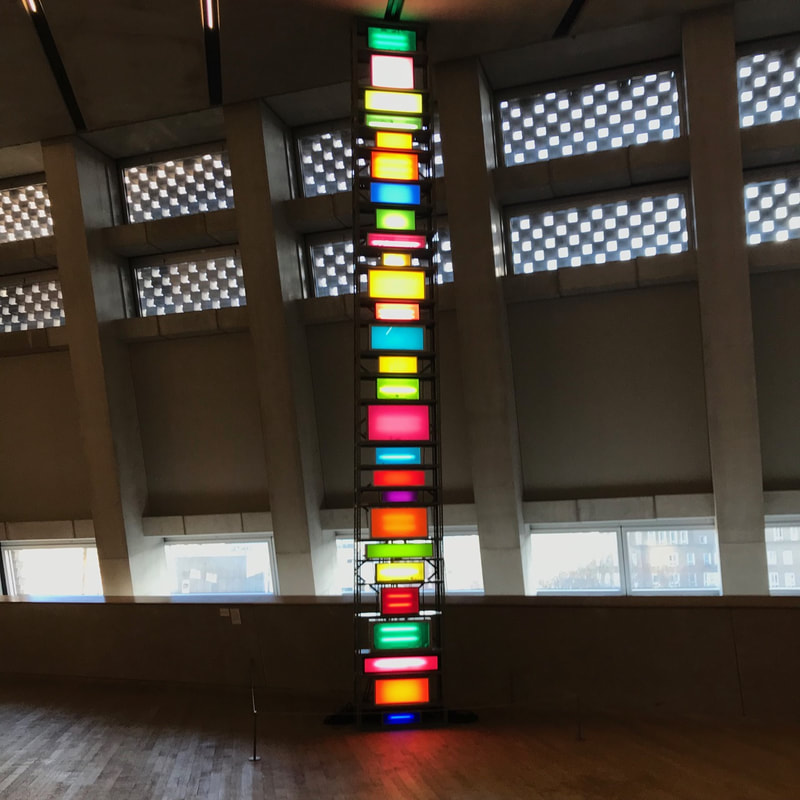
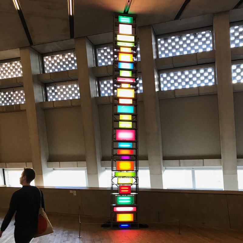
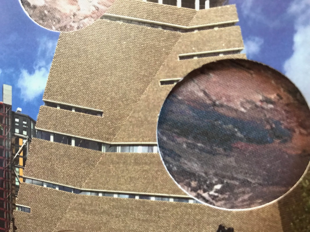
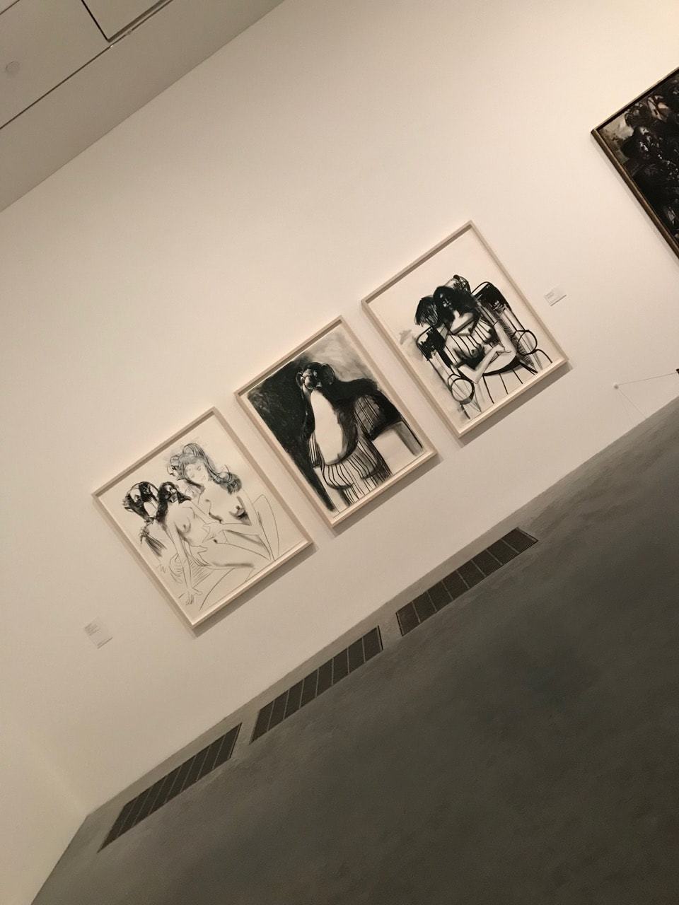
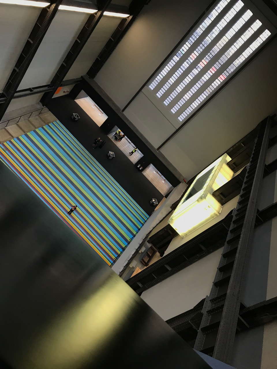
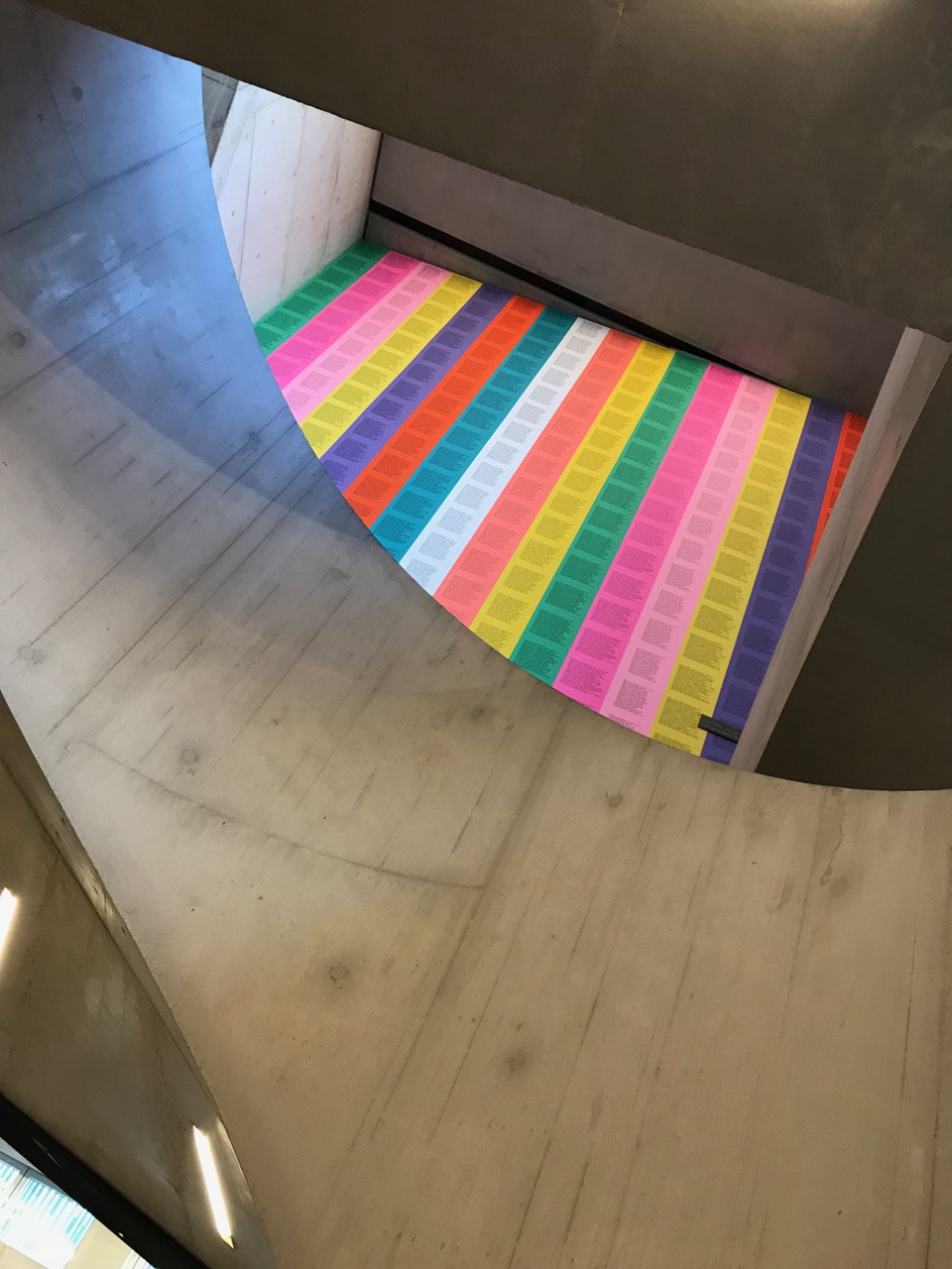
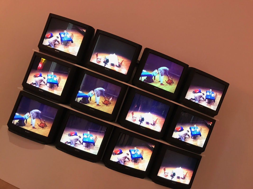
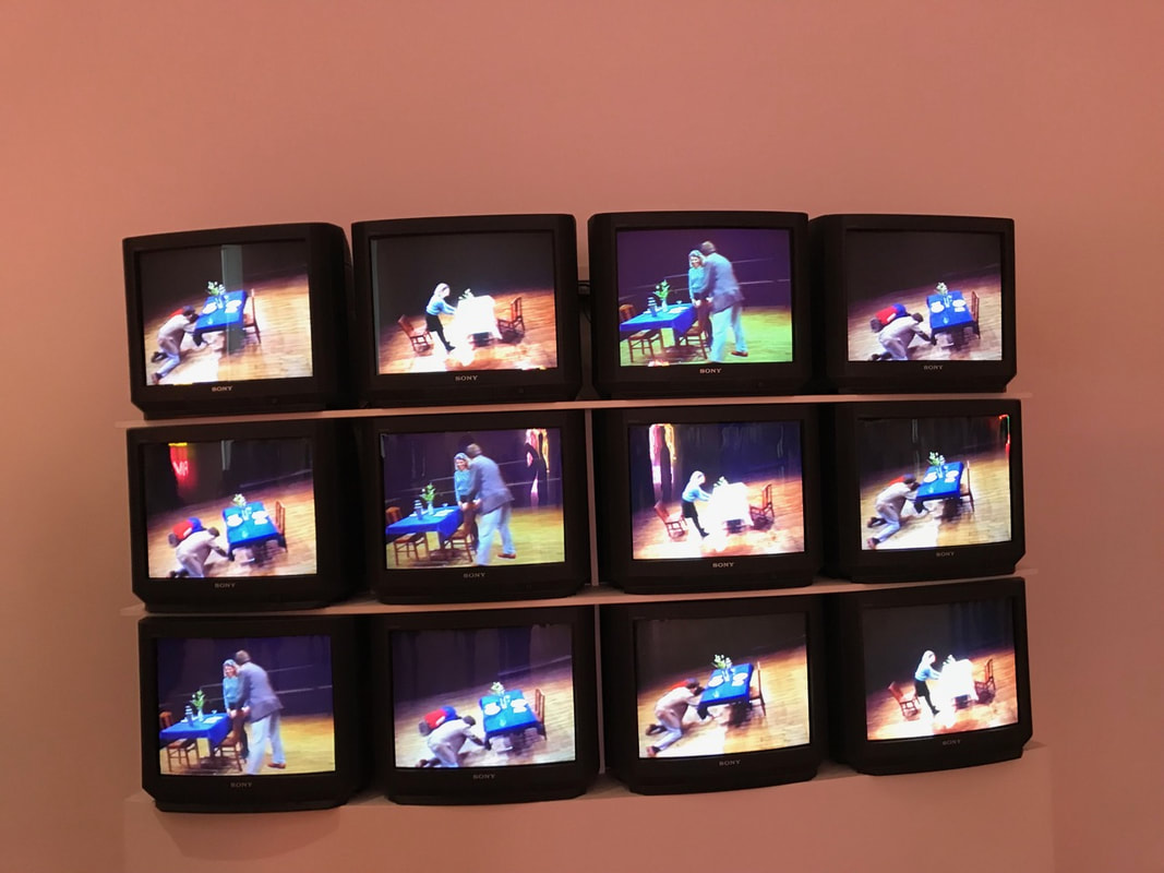
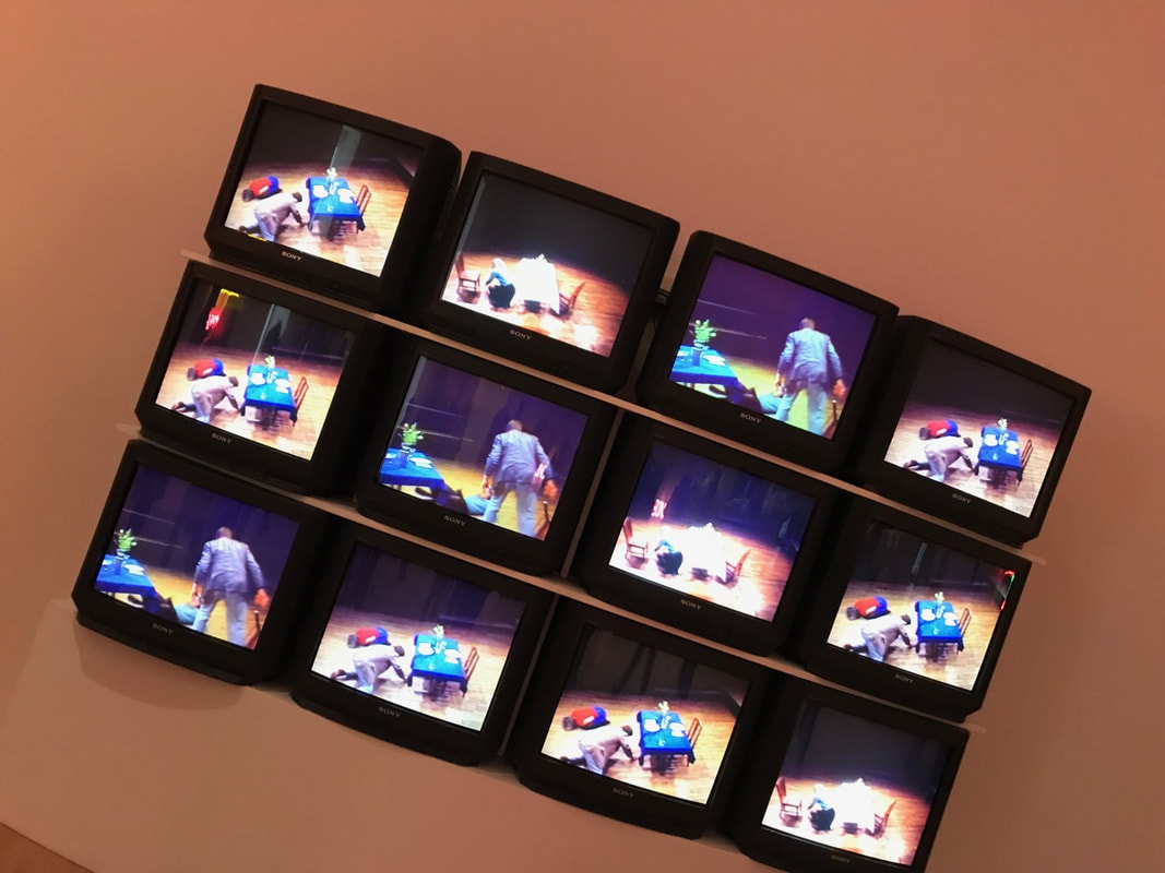
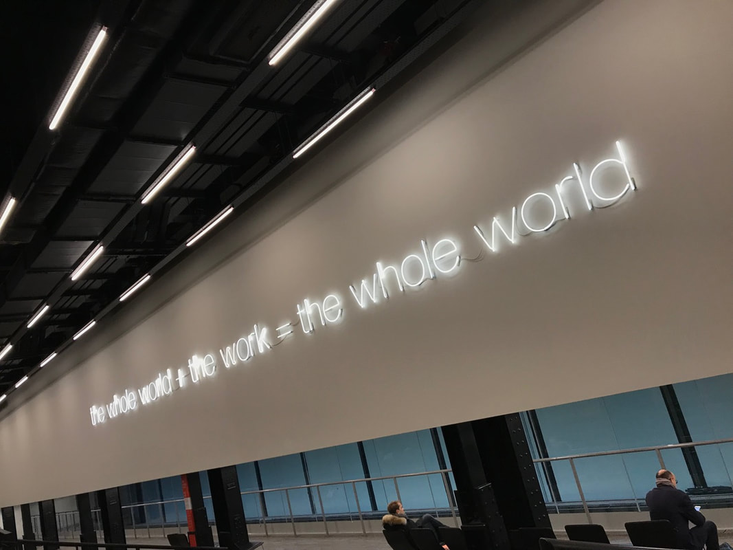
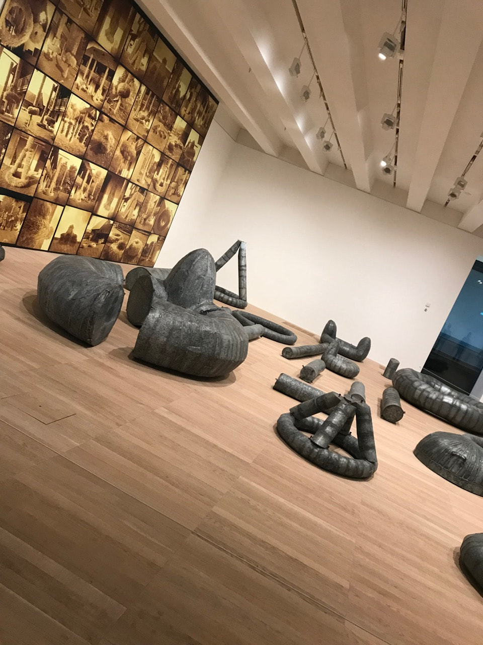
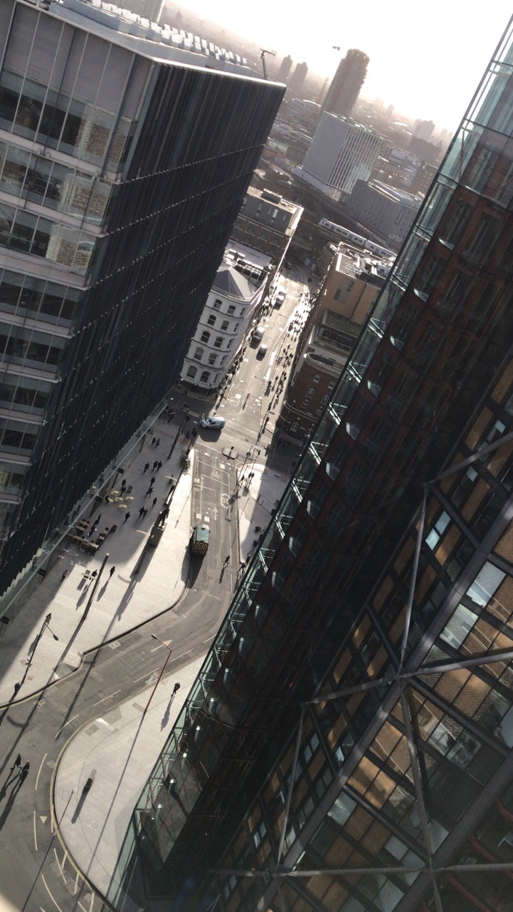
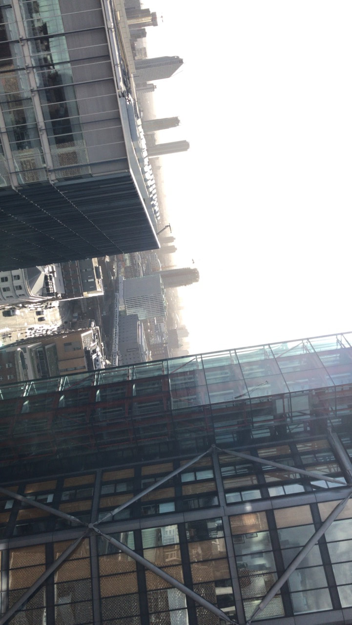
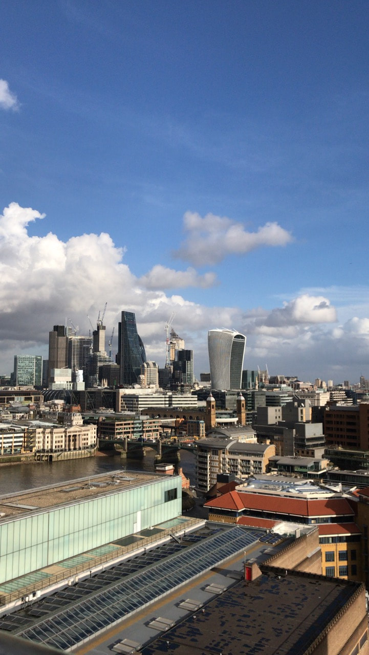
Tate Modern:


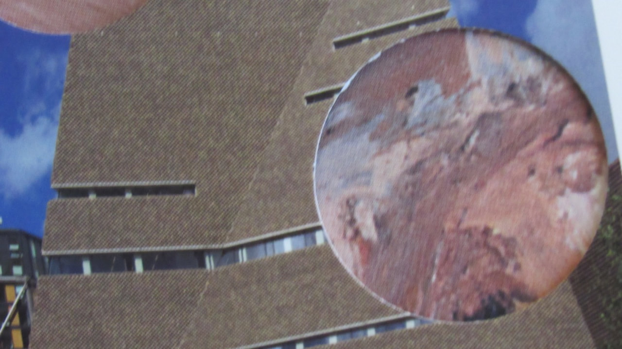
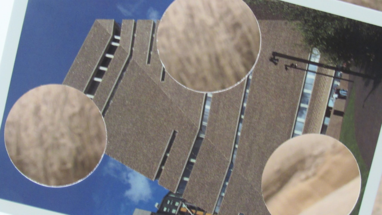
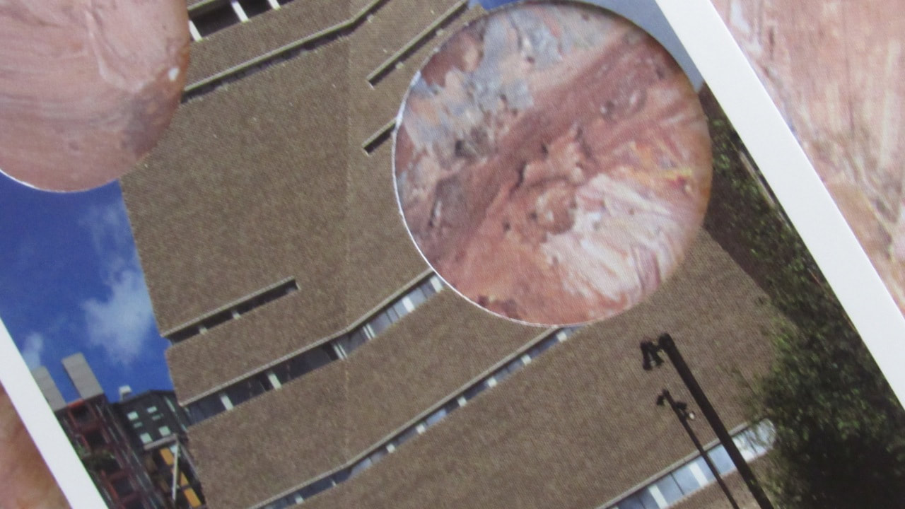
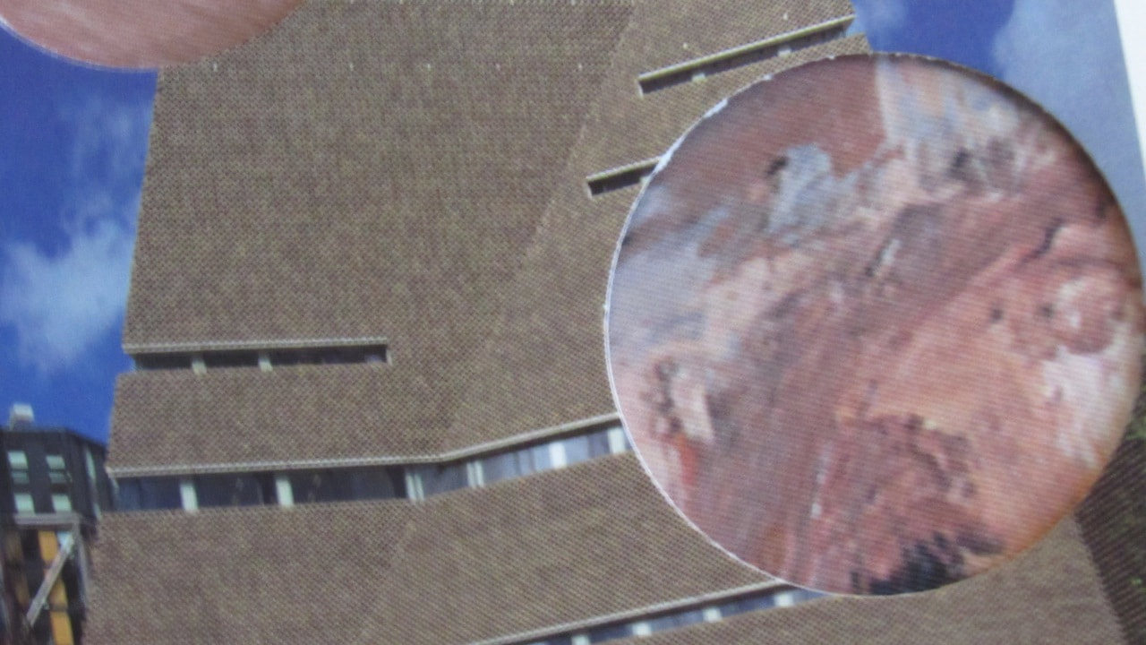
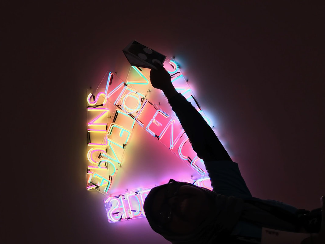
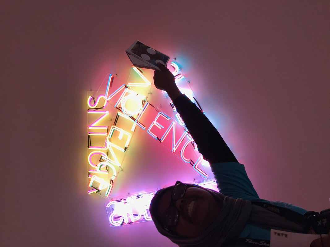


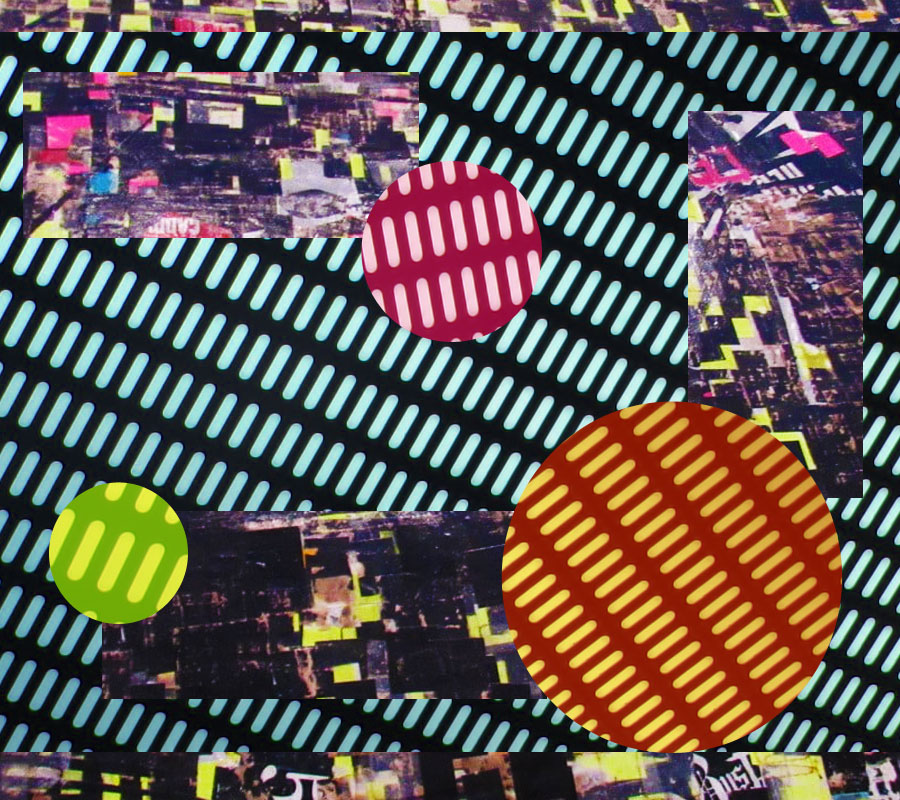
Photoshop:
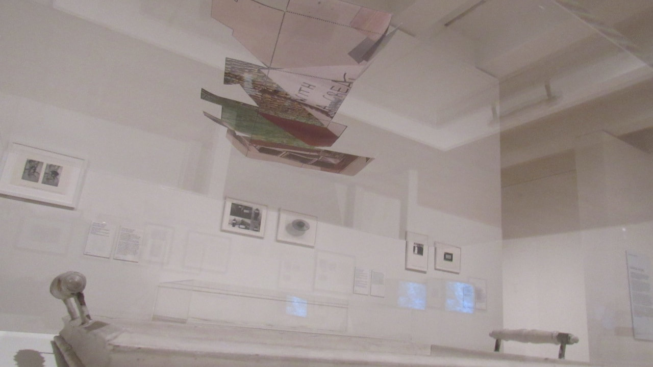
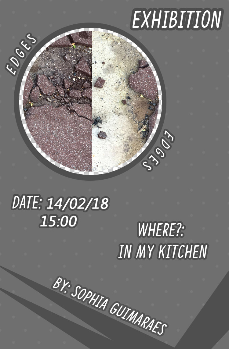
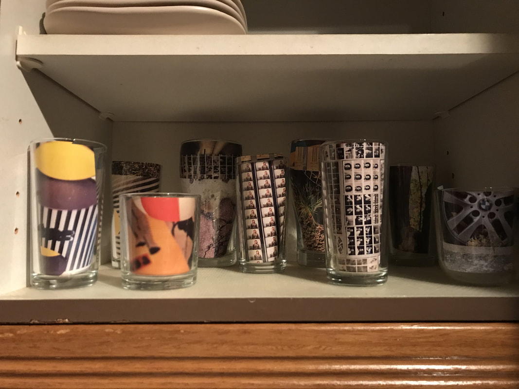
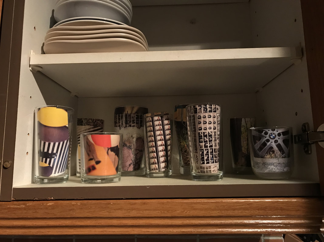
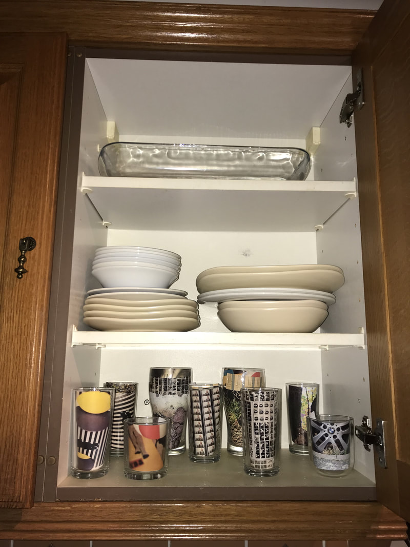
Exhibition - homework:
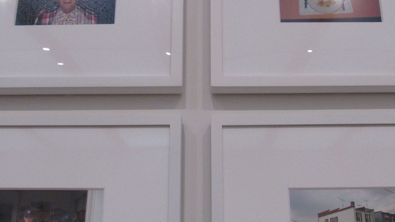
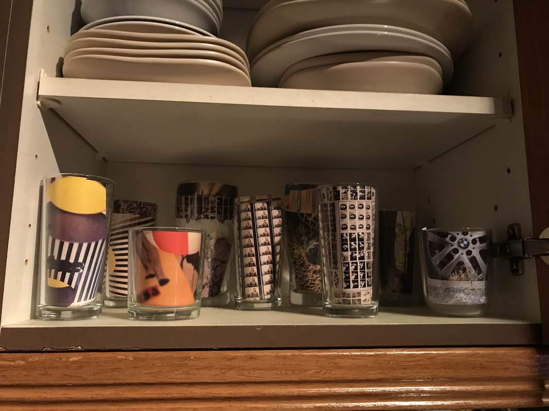
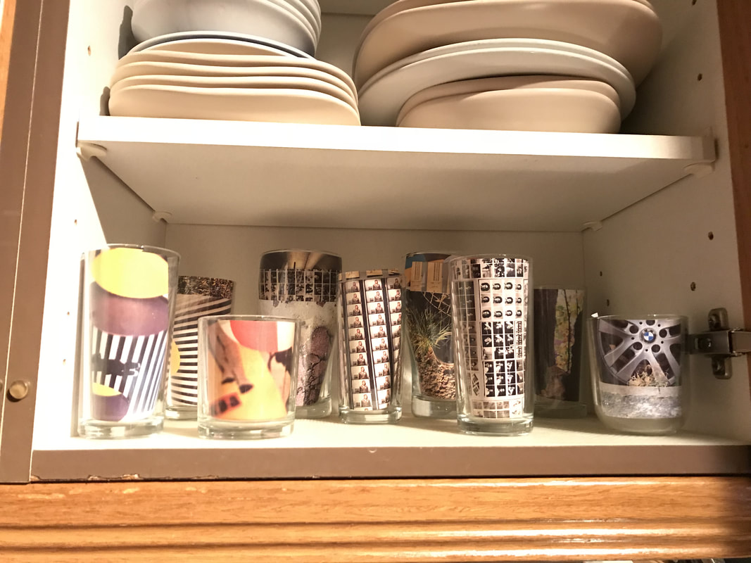
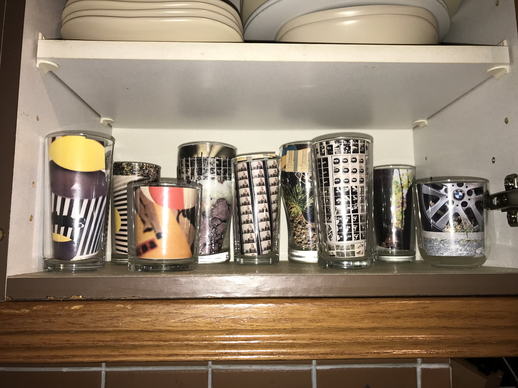
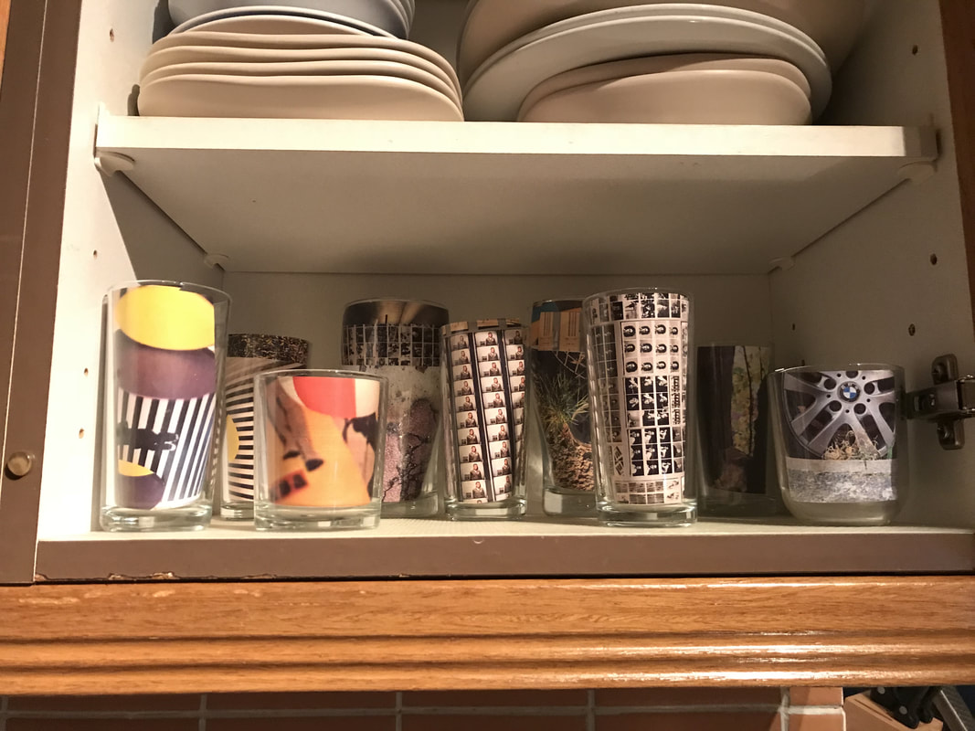
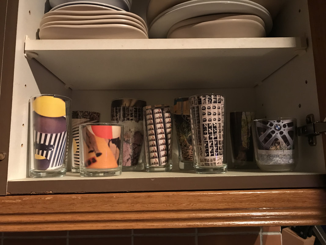
Mrs. Nicholls tell us to do a exhibition as homework. We need to do a exhibition using our own edges photos and also, make a poster to "promote" it!
I decided to do my exhibition in the kitchen cabinet placing the photos inside the glasses and to do my poster on photoshop:
I decided to do my exhibition in the kitchen cabinet placing the photos inside the glasses and to do my poster on photoshop:
|
|
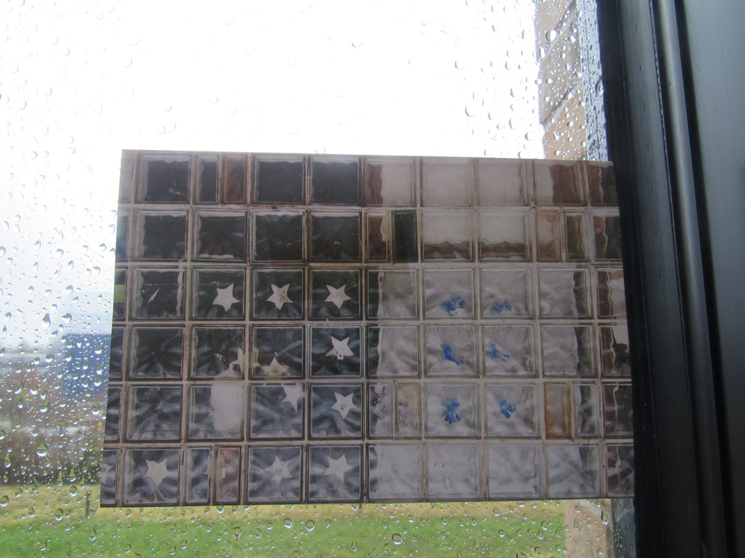
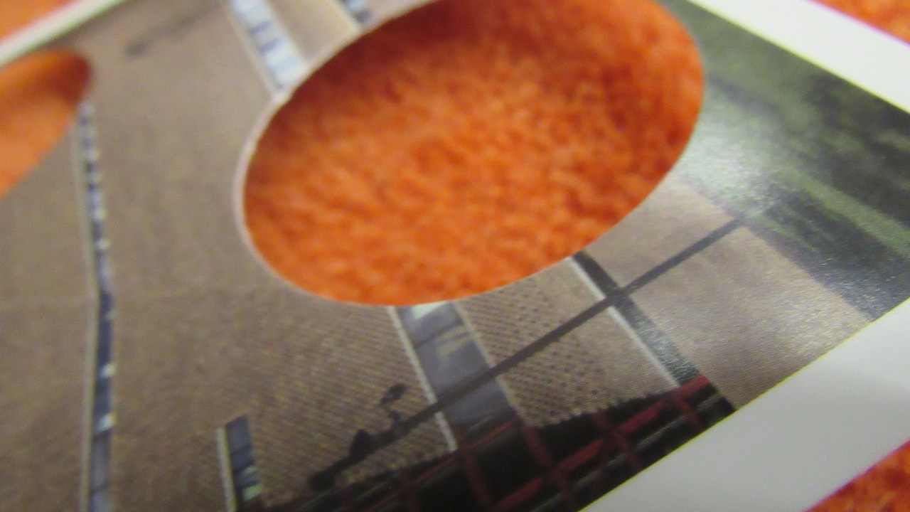
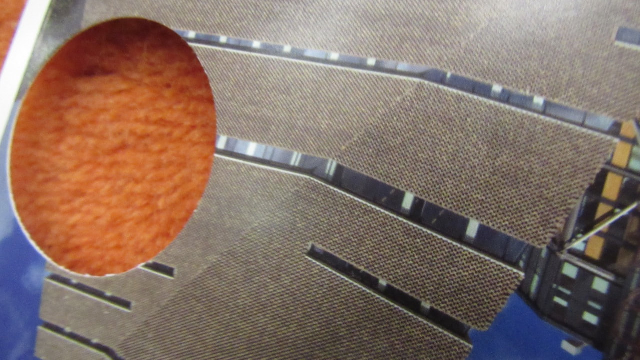
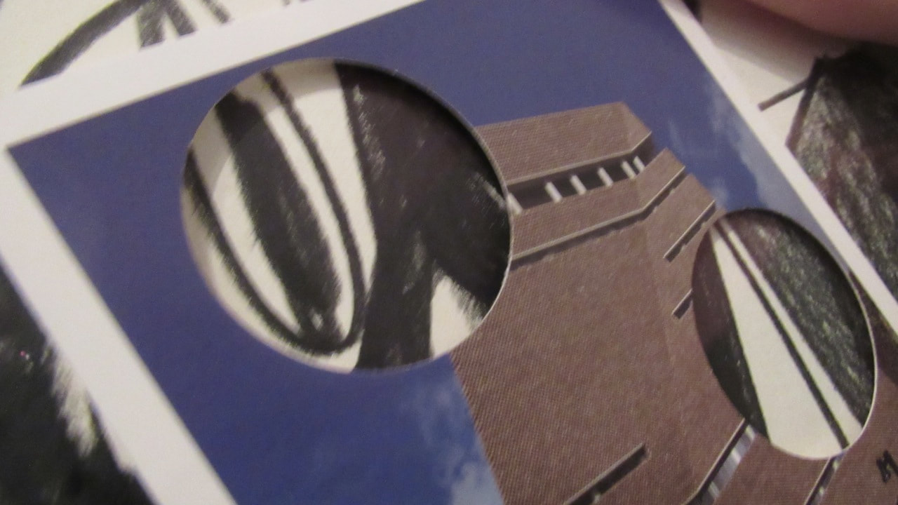
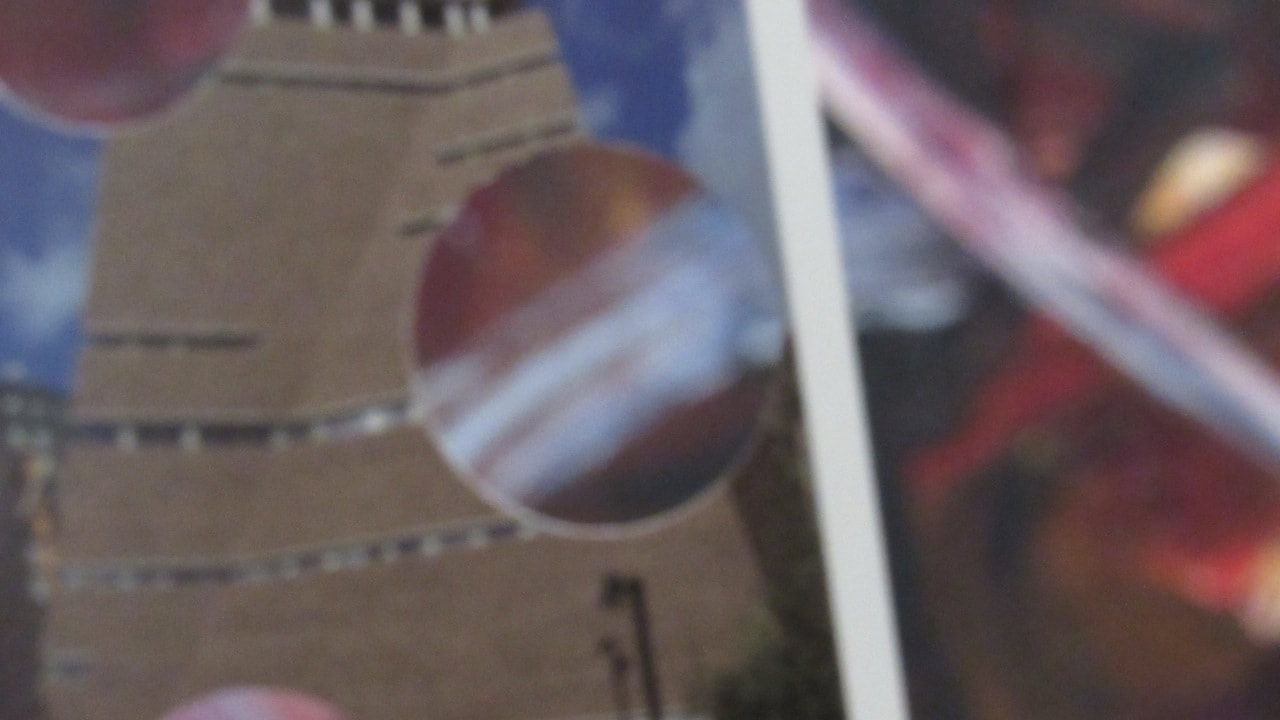
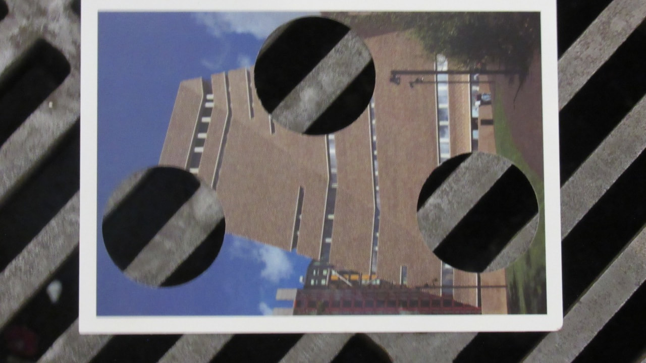
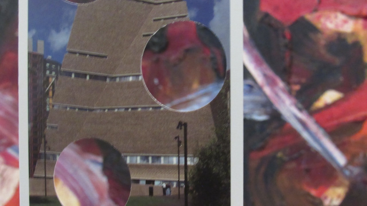
Edges Final Outcome:
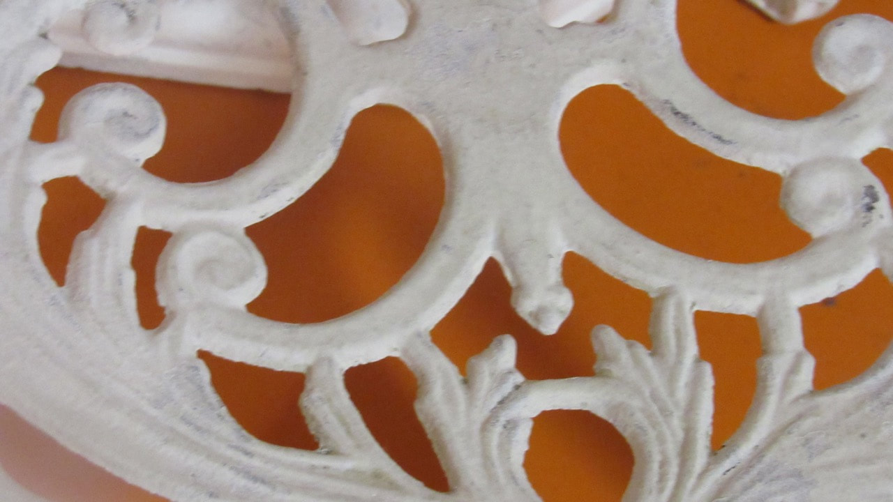
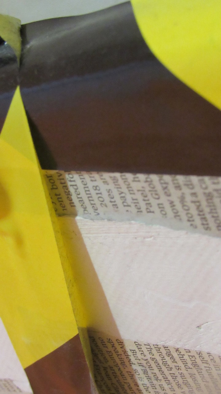
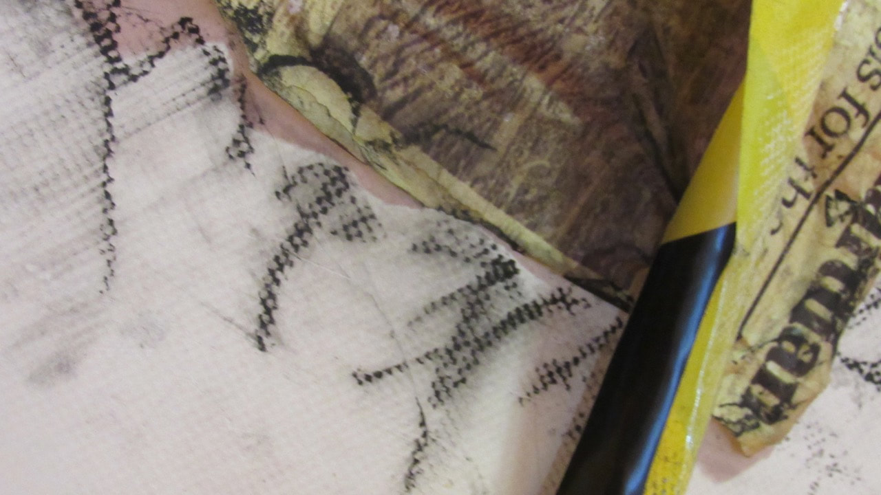
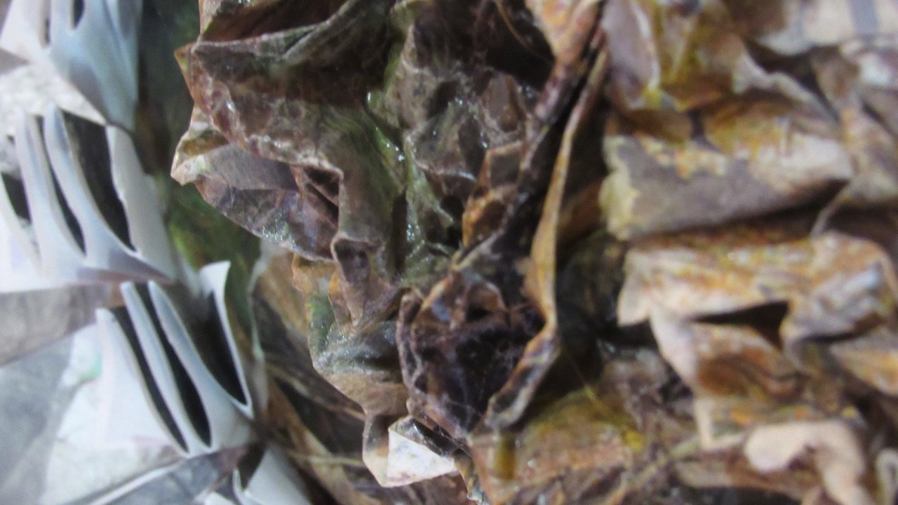
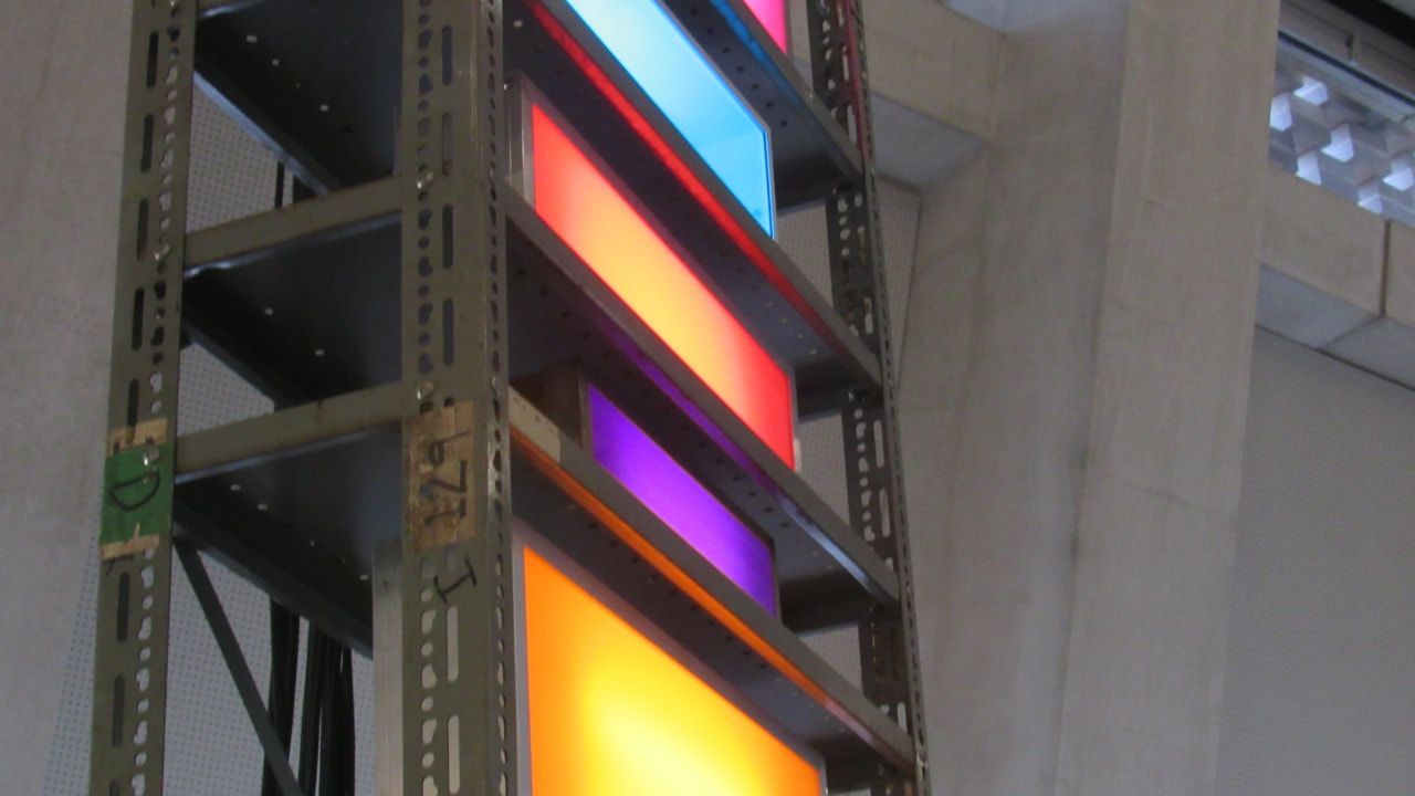
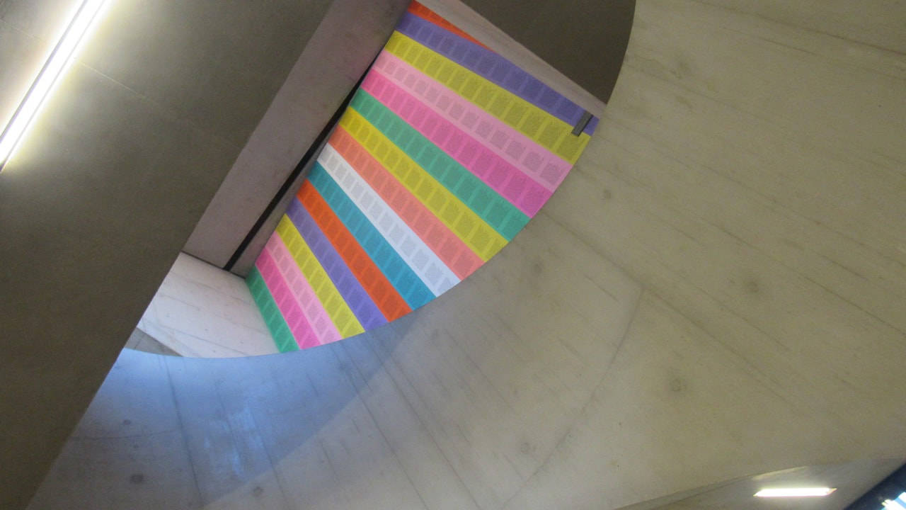
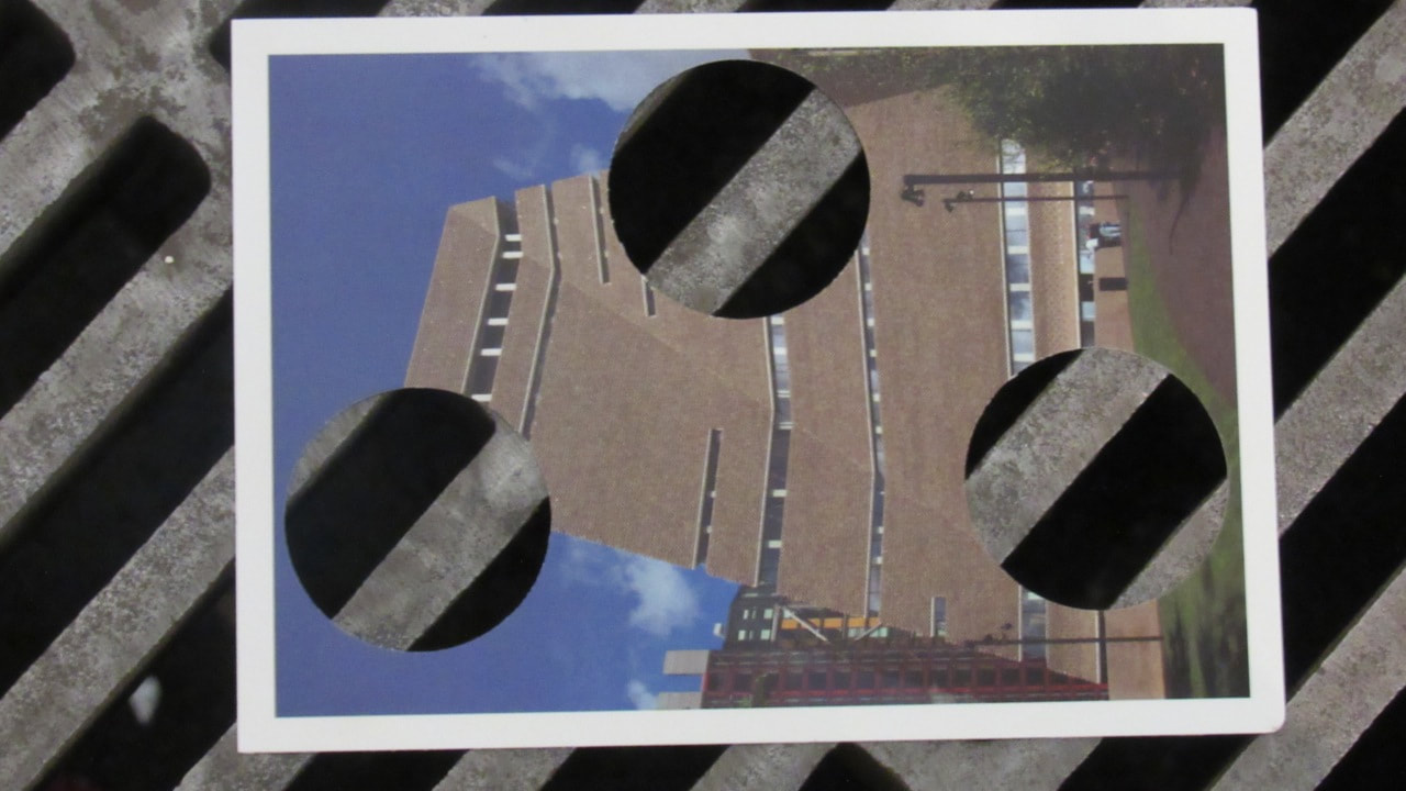
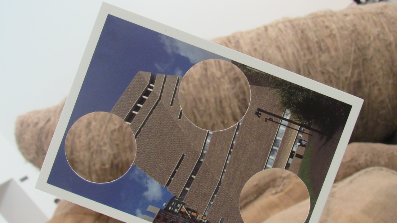
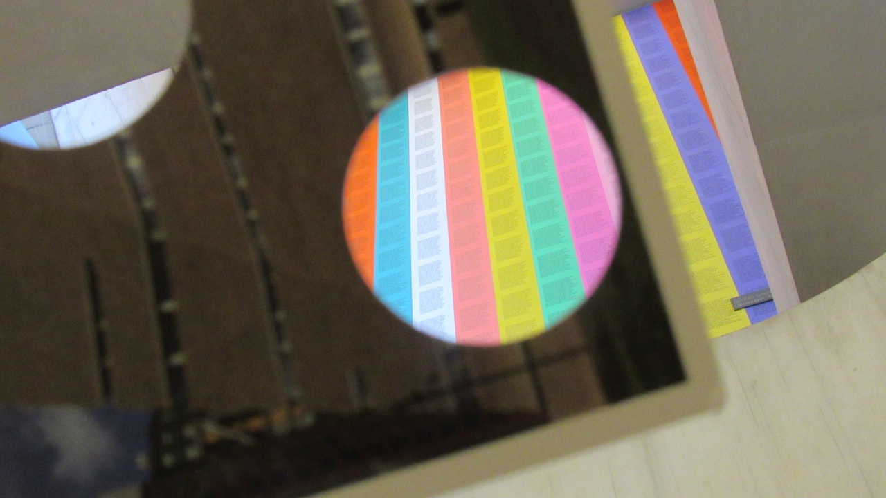
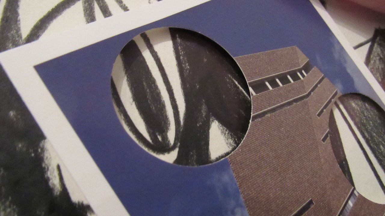
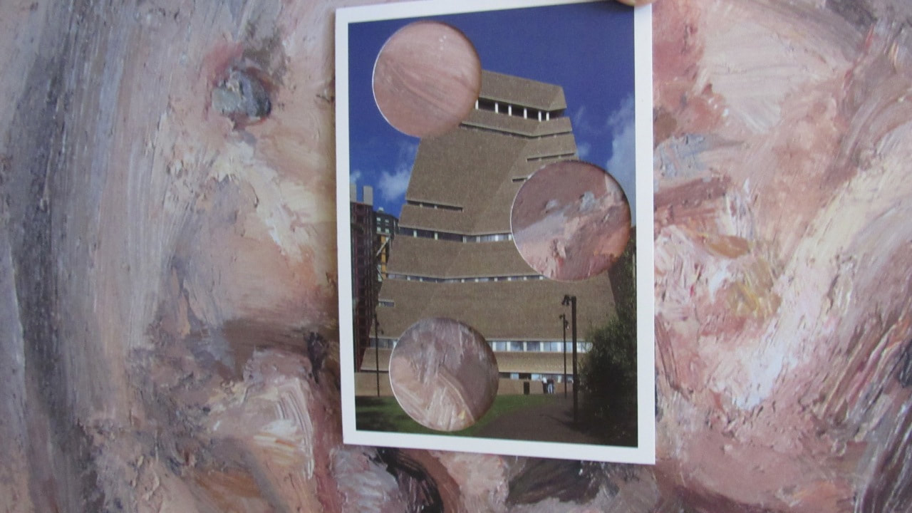
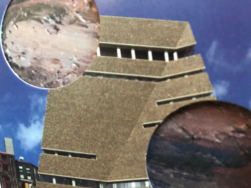
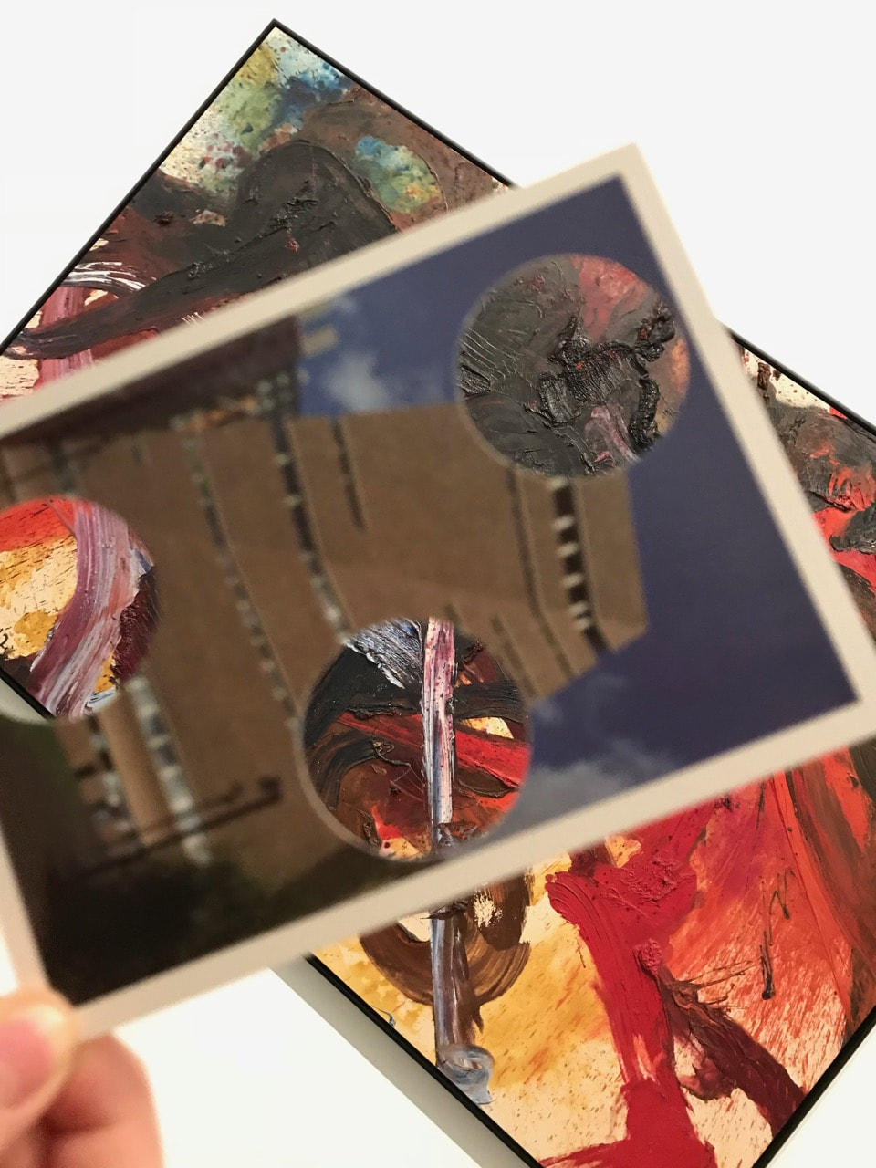
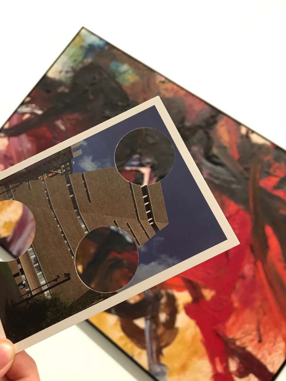
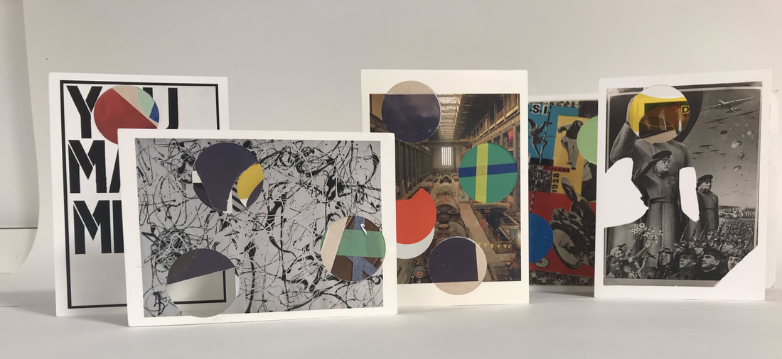
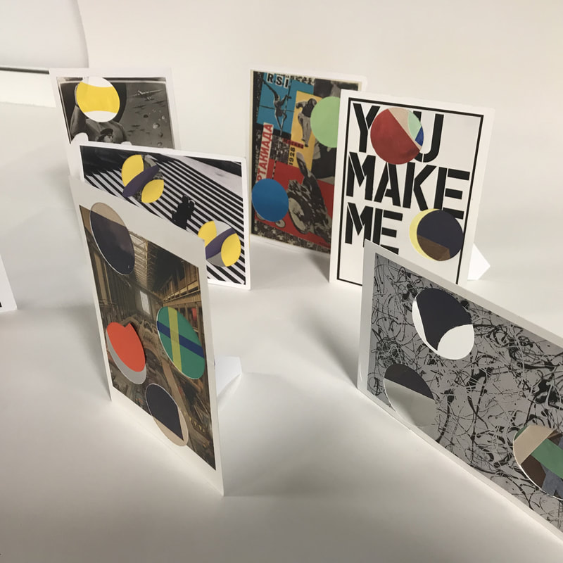
For my edges final outcome I decided to do something with the cards with holes in them because I felt I didn't make such a successful work using the cards last time. In my last project I felt my work was too simple, as I only used one material. I tried to improve it using different materials with the cards such as tape, paper and acetate/cellophane paper.
I liked the brighter and warm colours of the papers and cellophane contrasting with the cold tones of the cards, the different shapes and how these make them more interesting. I also liked the way I photographed them in various angles.
I this project ending more successful than the other and that really satisfies me.
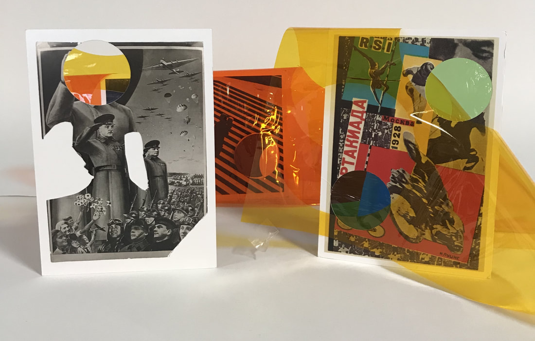
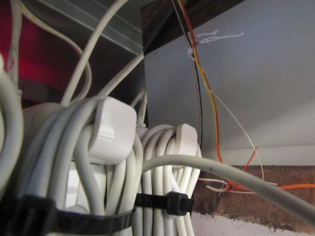
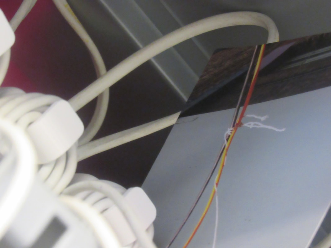
Our final work should be something we could exhibit, so I printed these 3 photos and Mr. Nicholls helped me with making the frame. I chose those photos because they are different from each other (materials and angels) and I thought they represent my idea in exactly way I wanted.
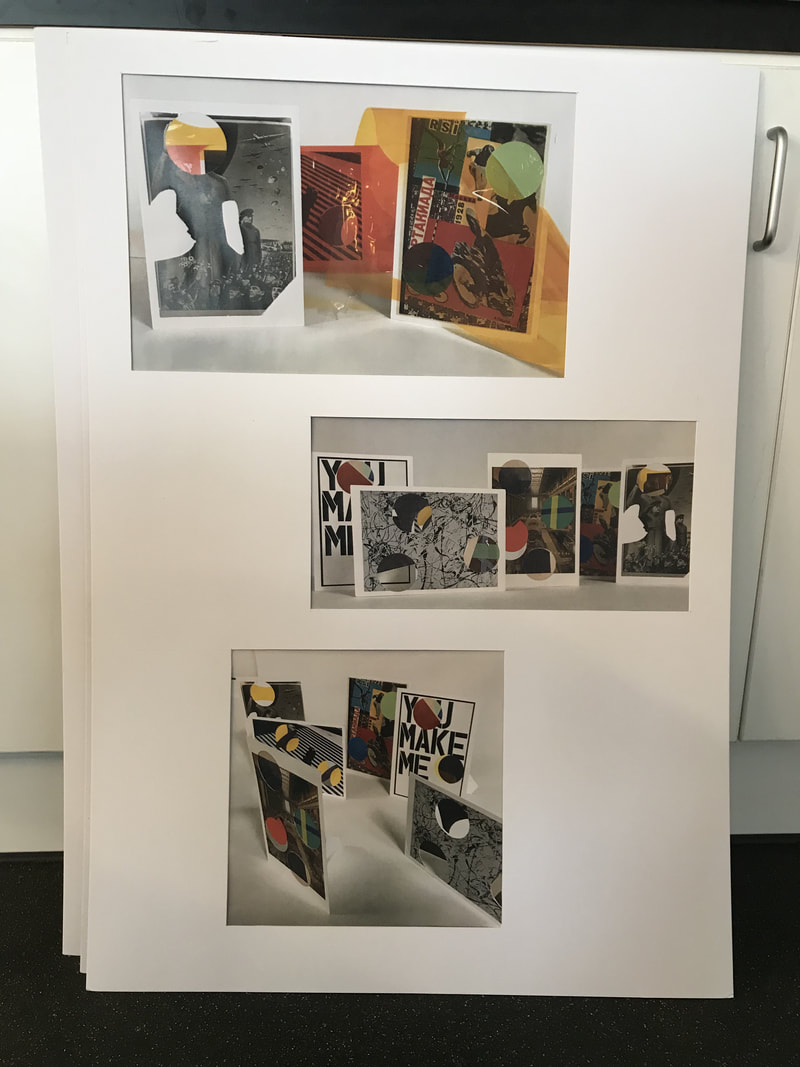
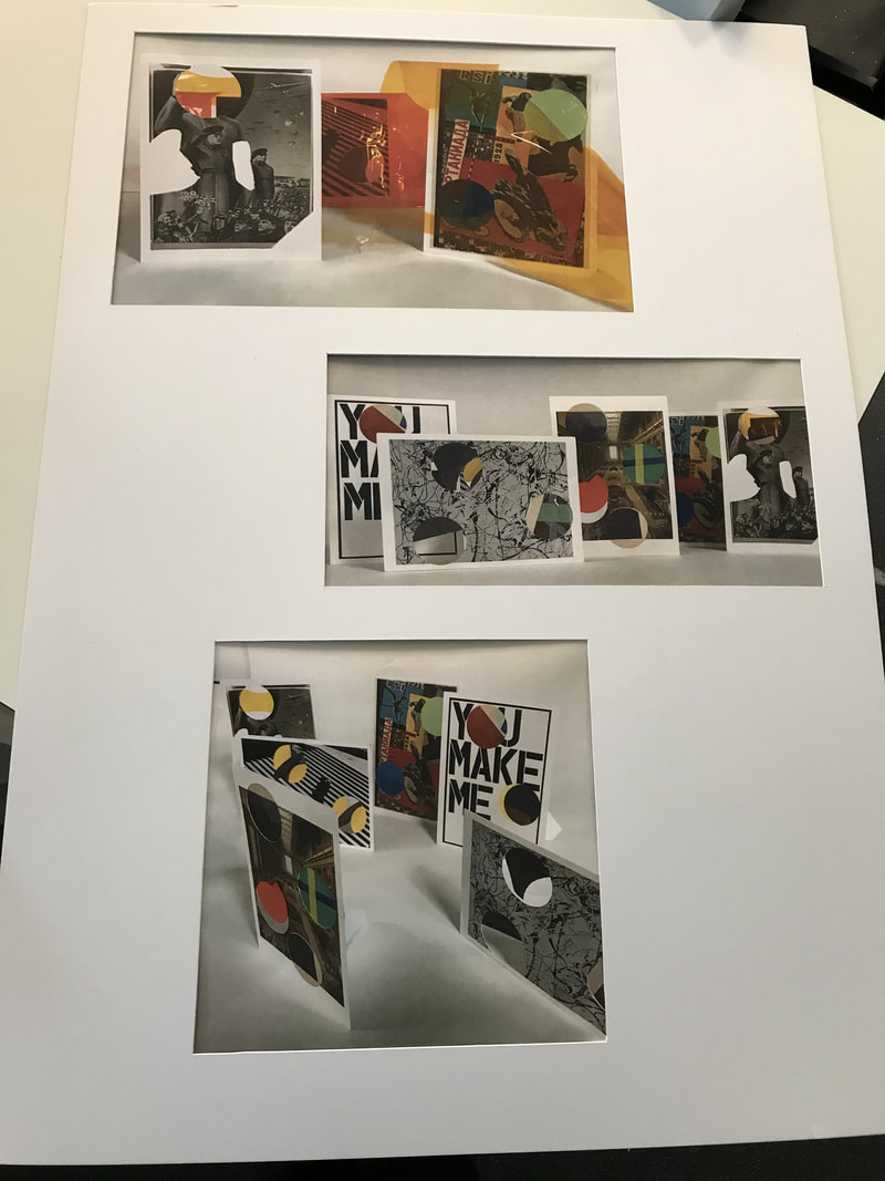
This project showed me that I can work on my own and do a good work which I am happy with it. I feel more confident to use my ideas even if they are a bit risky.
Edges Evaluation:
Through the Edges Project, we have researched about various artists and their work, including Robert Frank and Lorenzo Vitturi. I found interesting how the two works we looked at (Sick of Goodbys and Red 1) were completely different but also they had some similarities that we normally don't notice.
